Project Duration 3-4 months
Team Members Sona Harris, Sanjna Gupta, Aditi Ashok & Tessy Thomas
Team Members Sona Harris, Sanjna Gupta, Aditi Ashok & Tessy Thomas
Key roles Design research / Design development / Visual design & identity / UX/UI design / Illustrator
Skills involved Design strategy / logo design / brand design & strategy / illustration / UI/UX design / information architecture / visual design
Tools used Adobe Illustrator / One by Wacom / Adobe XD / Adobe Animate
Developing the brand identity for Justo was one of the most exciting experiences I've had as a designer. Working together with my team at Backflip Design Studio, we started with brainstorming brand names to developing a cohesive visual identity that helped the brand stand out and spoke to its unique offerings in an untapped market.
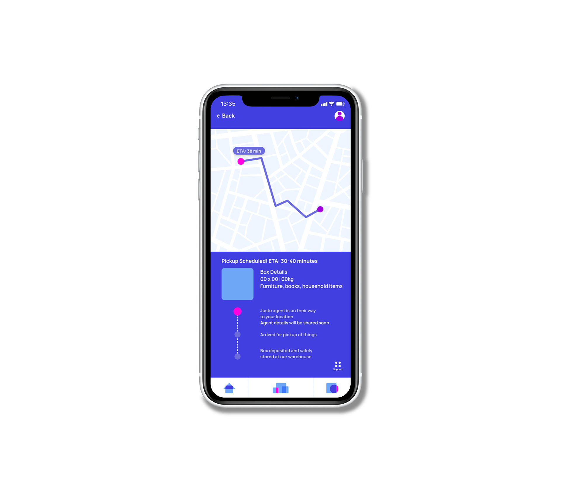
Justo's objective was to stand out and build a presence in Bangalore's market as a storage company that allows its consumers to let the company take care of their belongings through intuitive digital interfaces and systems that promise security, safety and convenience. Their model would allow users to book the company's storage units via an application, through collection of necessary details (in a secure manner) which would then pick up their things and store them in a mobile container. Any access to the container afterwards would only be possible for the owner through a digital locking system.
Our task was then to help the client come up with their name (Justo was our brainchild after many brainstorming sessions!), build a strong visual identity and even build the screens and system for their digital application.
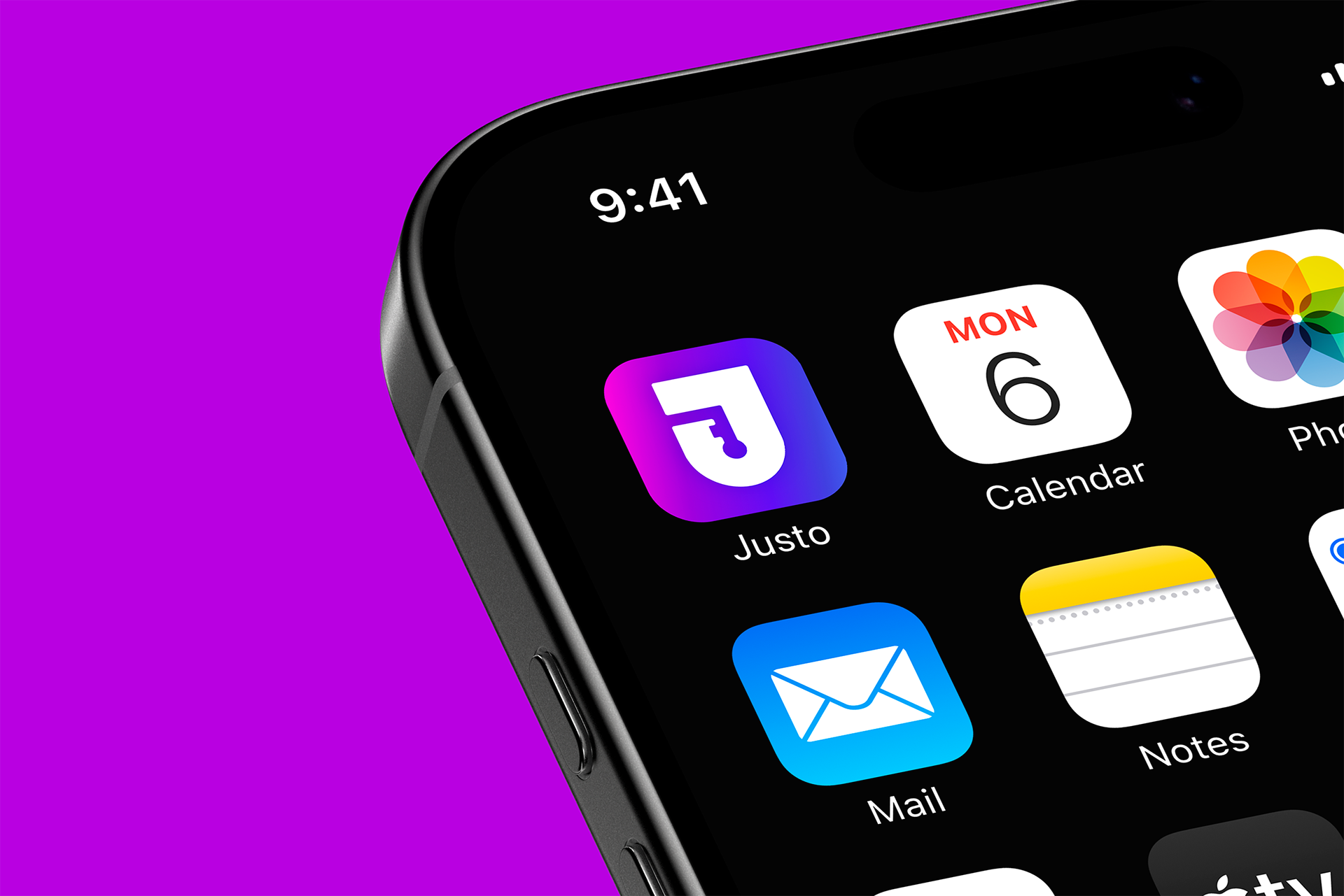
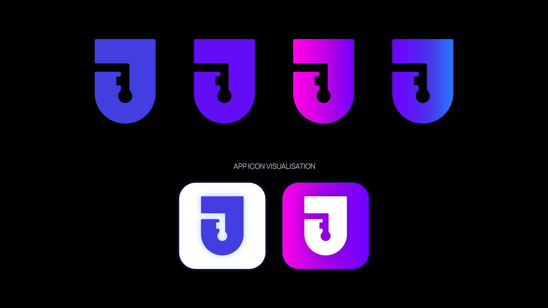
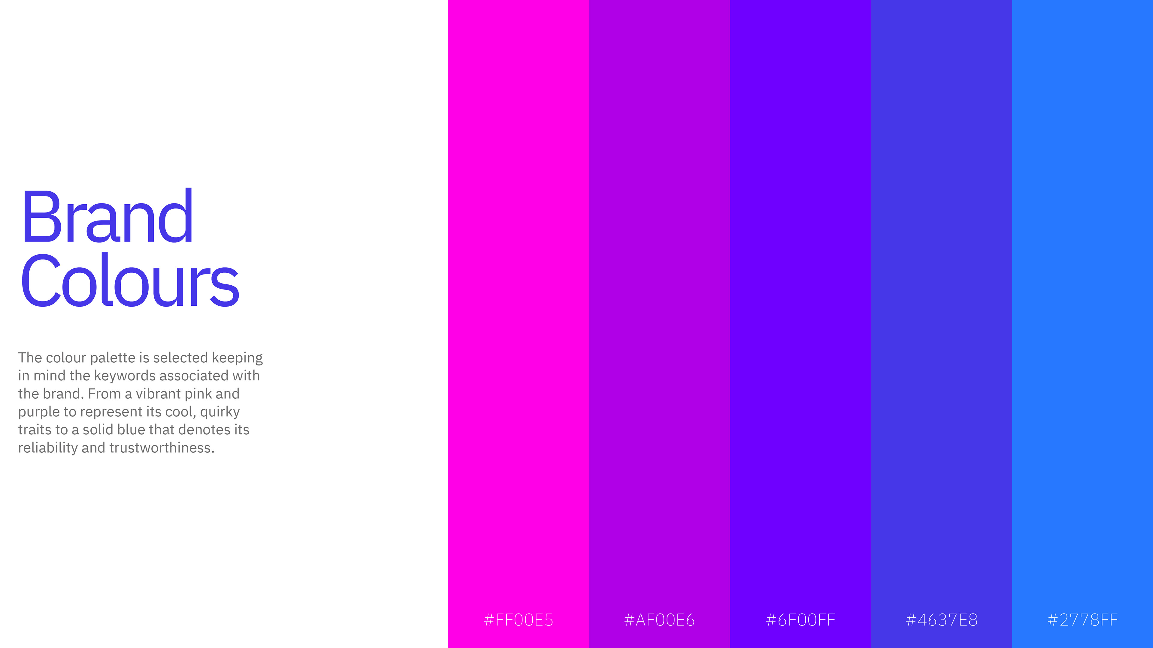
Developing Justo's logo & colour palette
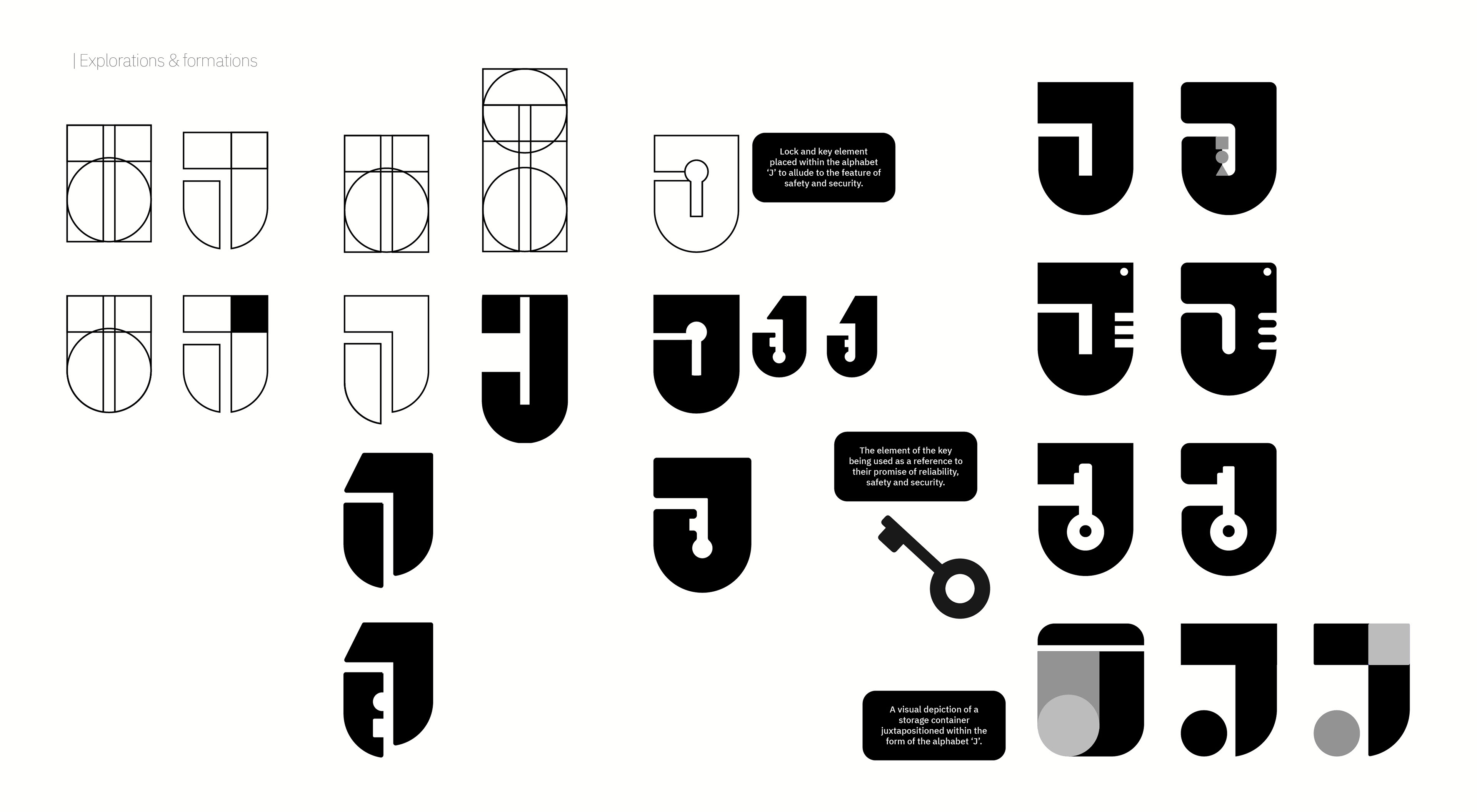
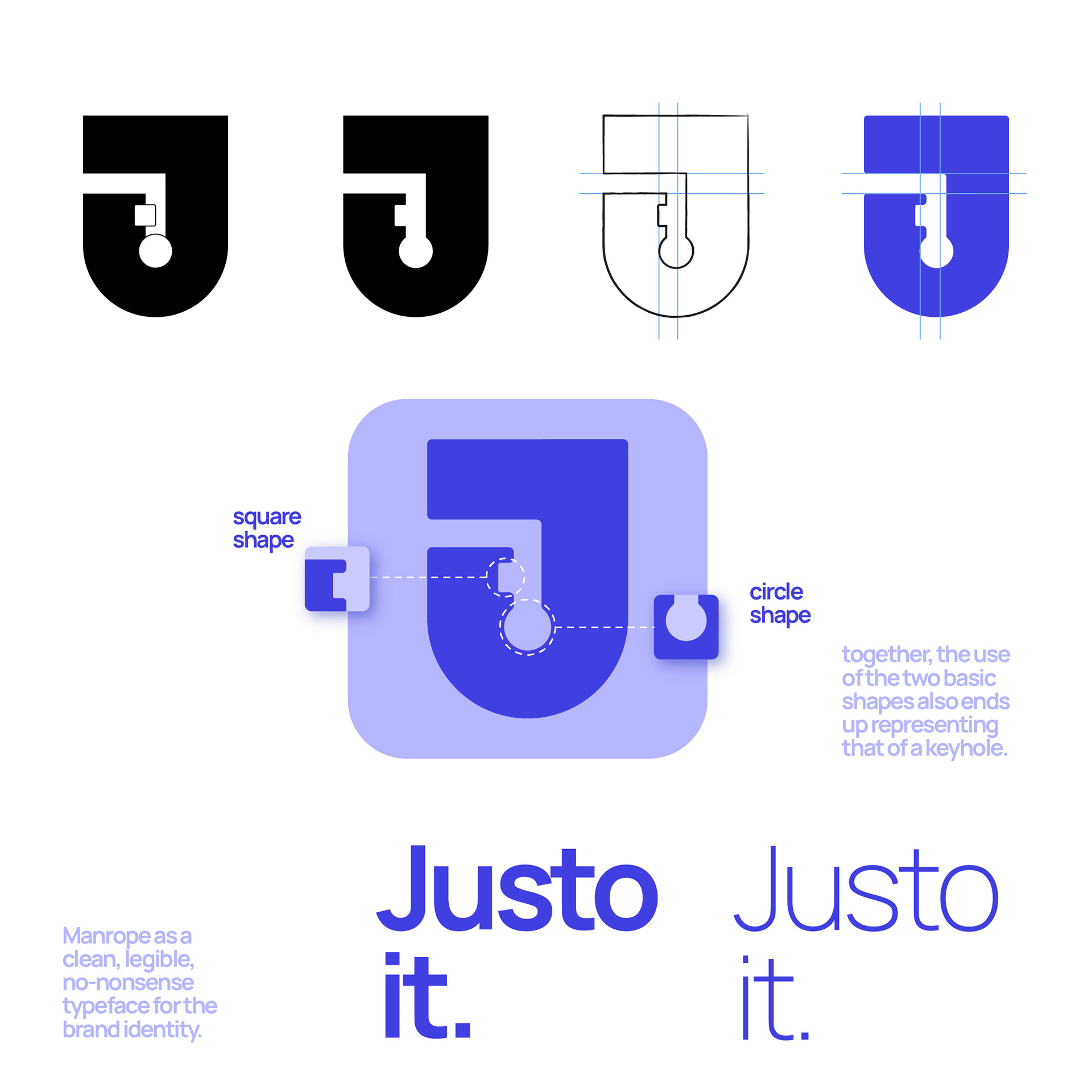
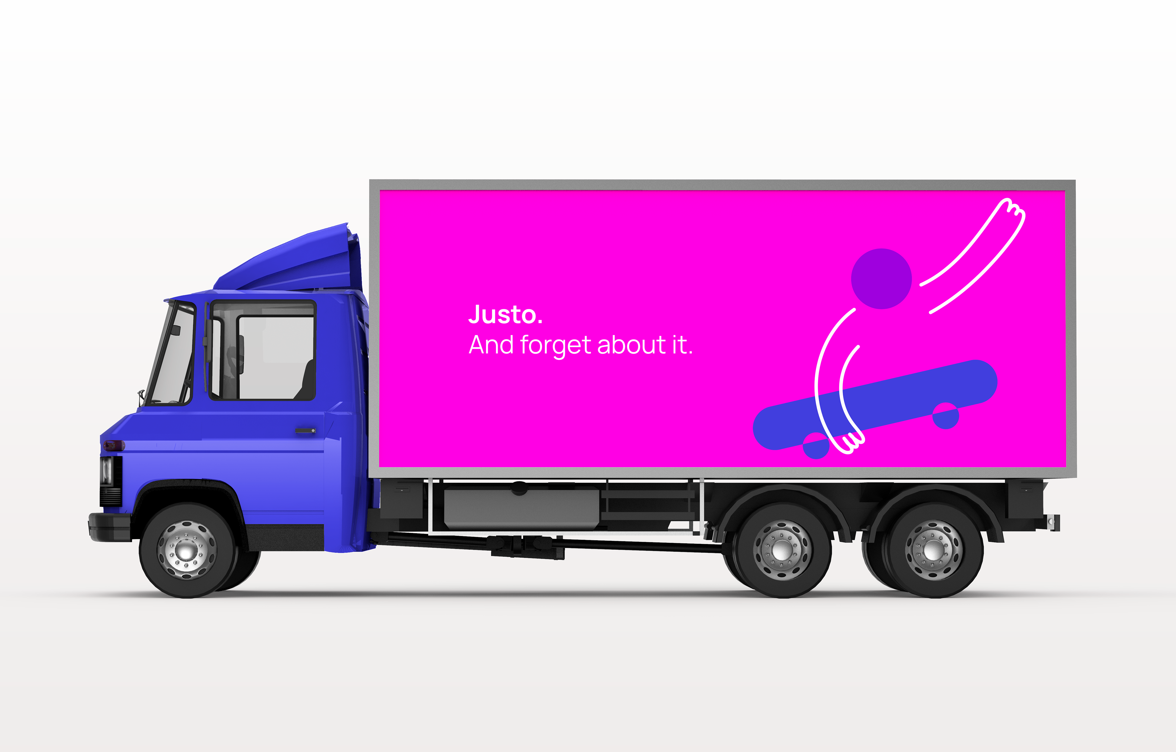
The logo was visualised keeping in mind the key attributes of the brand — safety, tech-savviness and undoubtedly, its quirkiness. As a brand that will mostly be recognised on digital platforms, it was imperative to design a symbol that would become synonymous with the brand and what it stands for. Iterations included combining the letter J with various shapes and forms to create a brandmark that would represent Justo throughout.
Final, selected logo
Visual language & elements
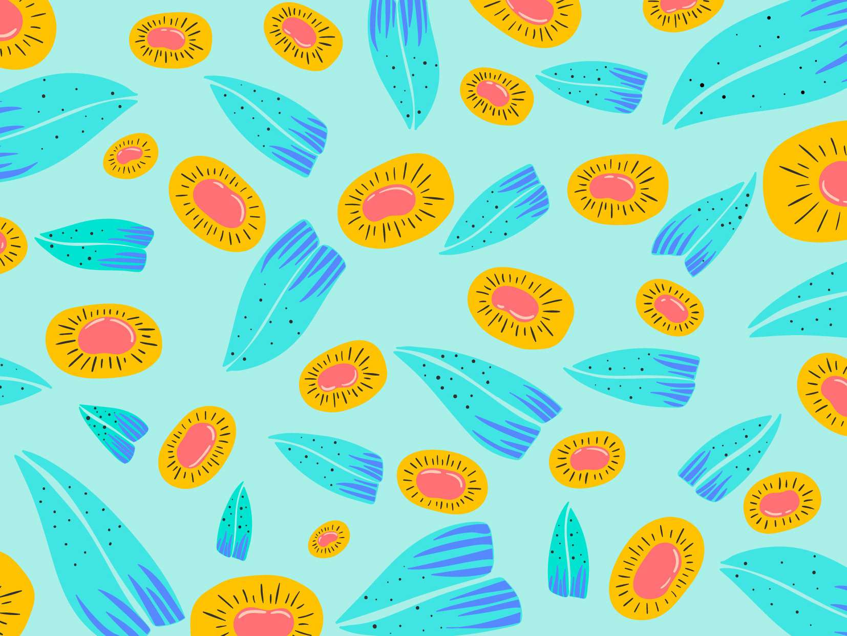
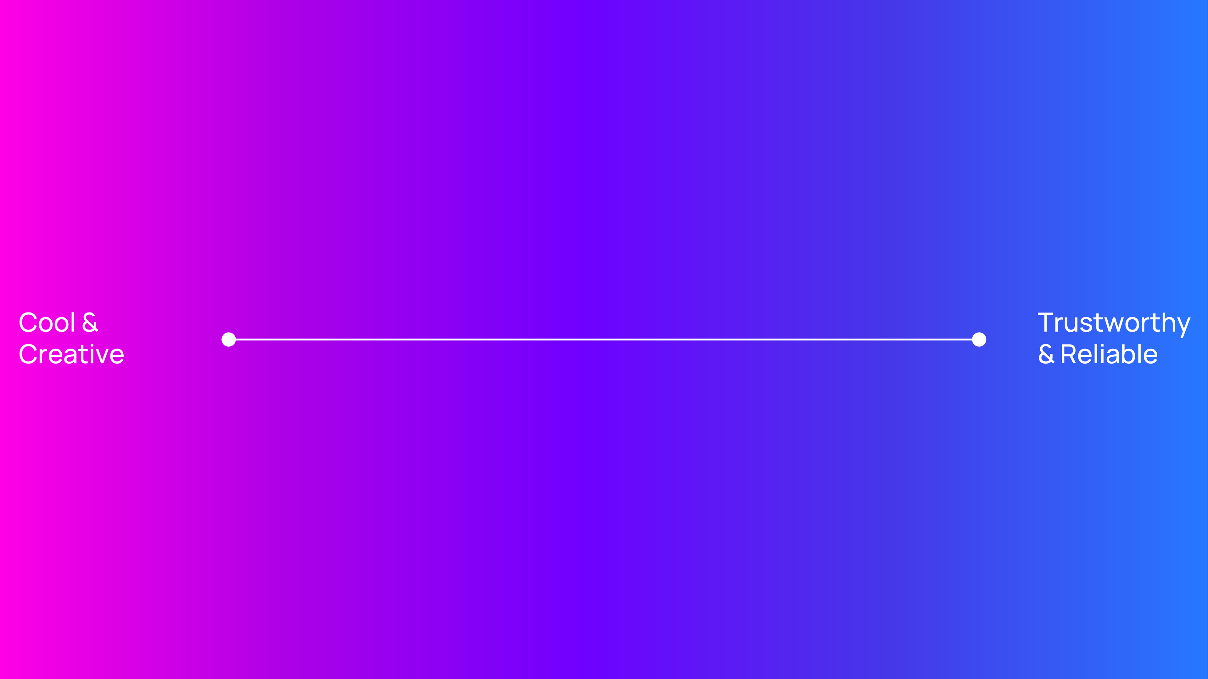
Playfulness + Reliability
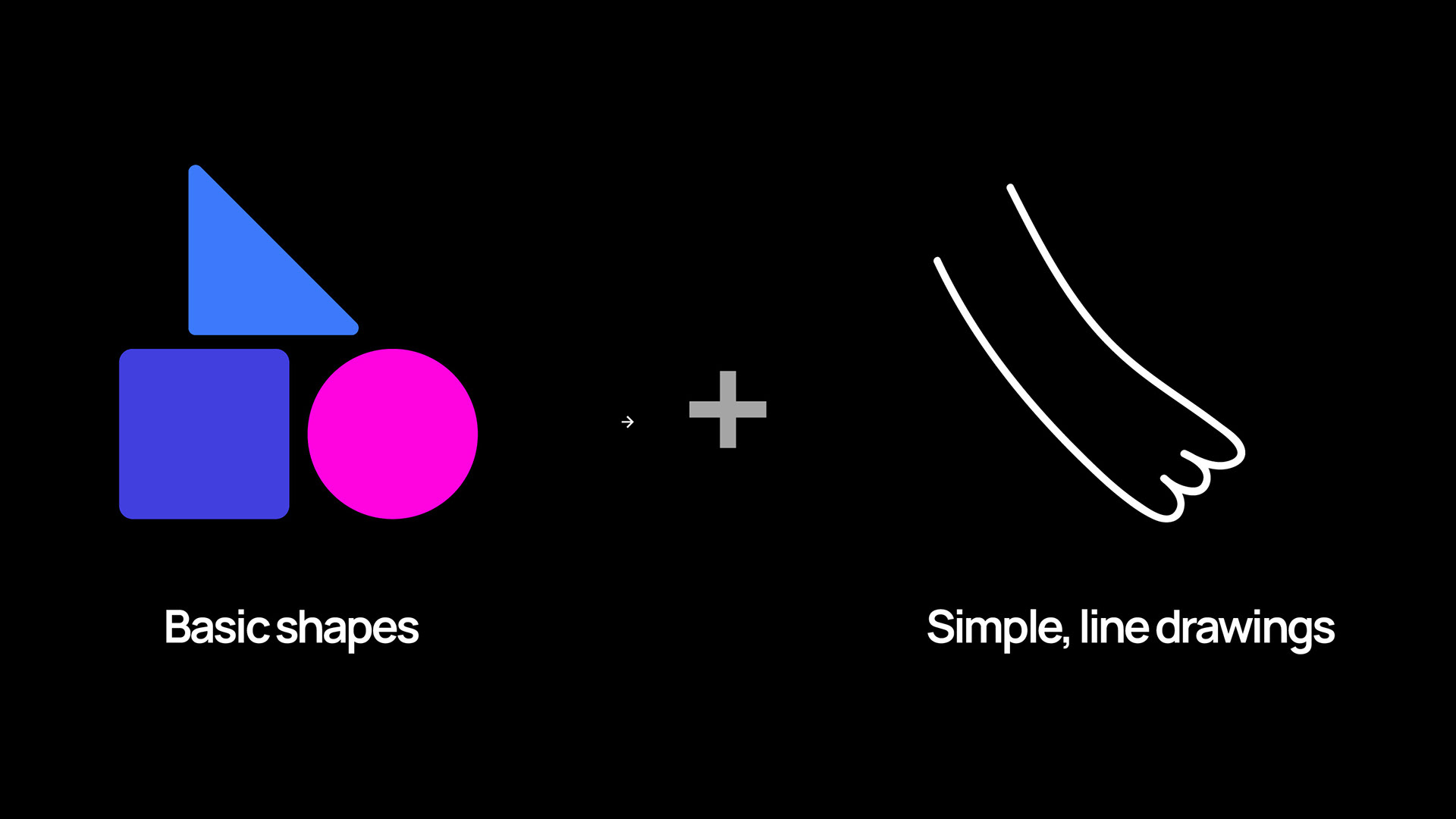
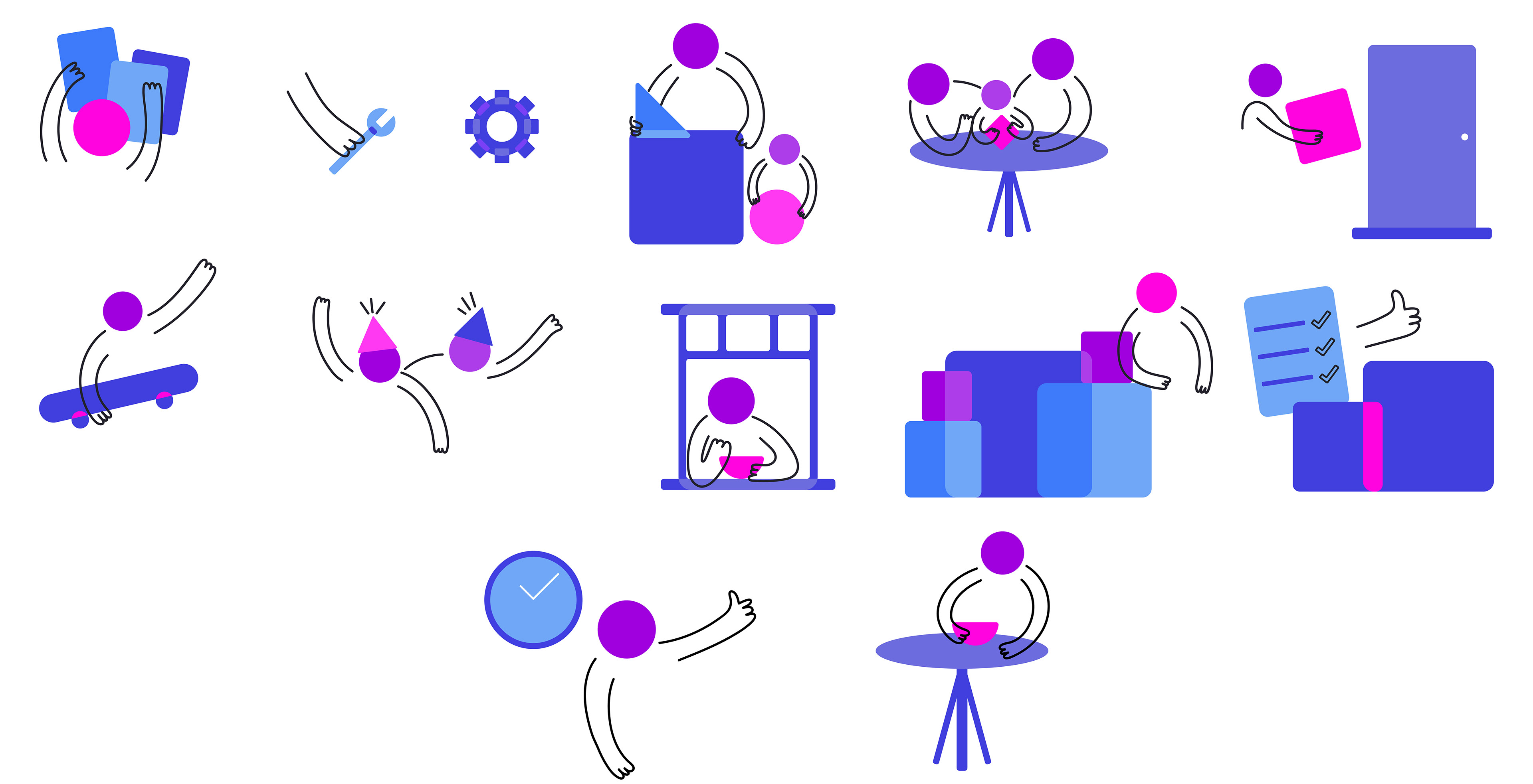
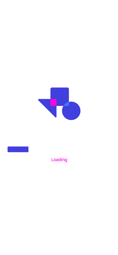
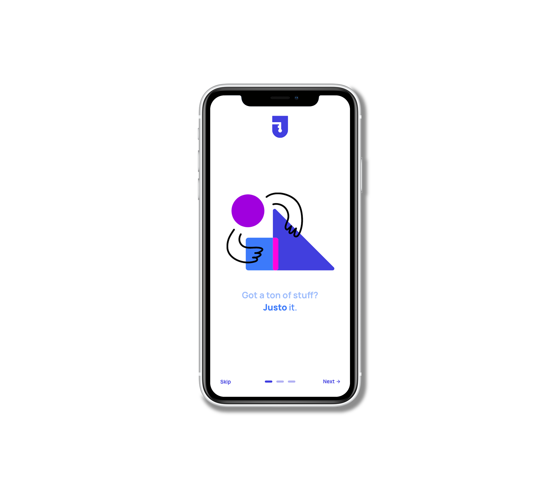
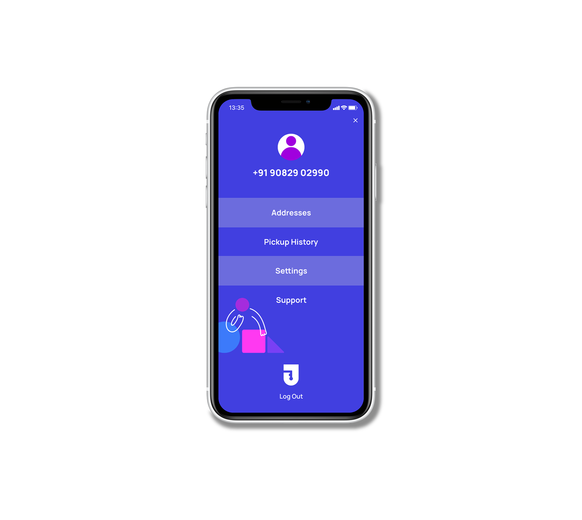
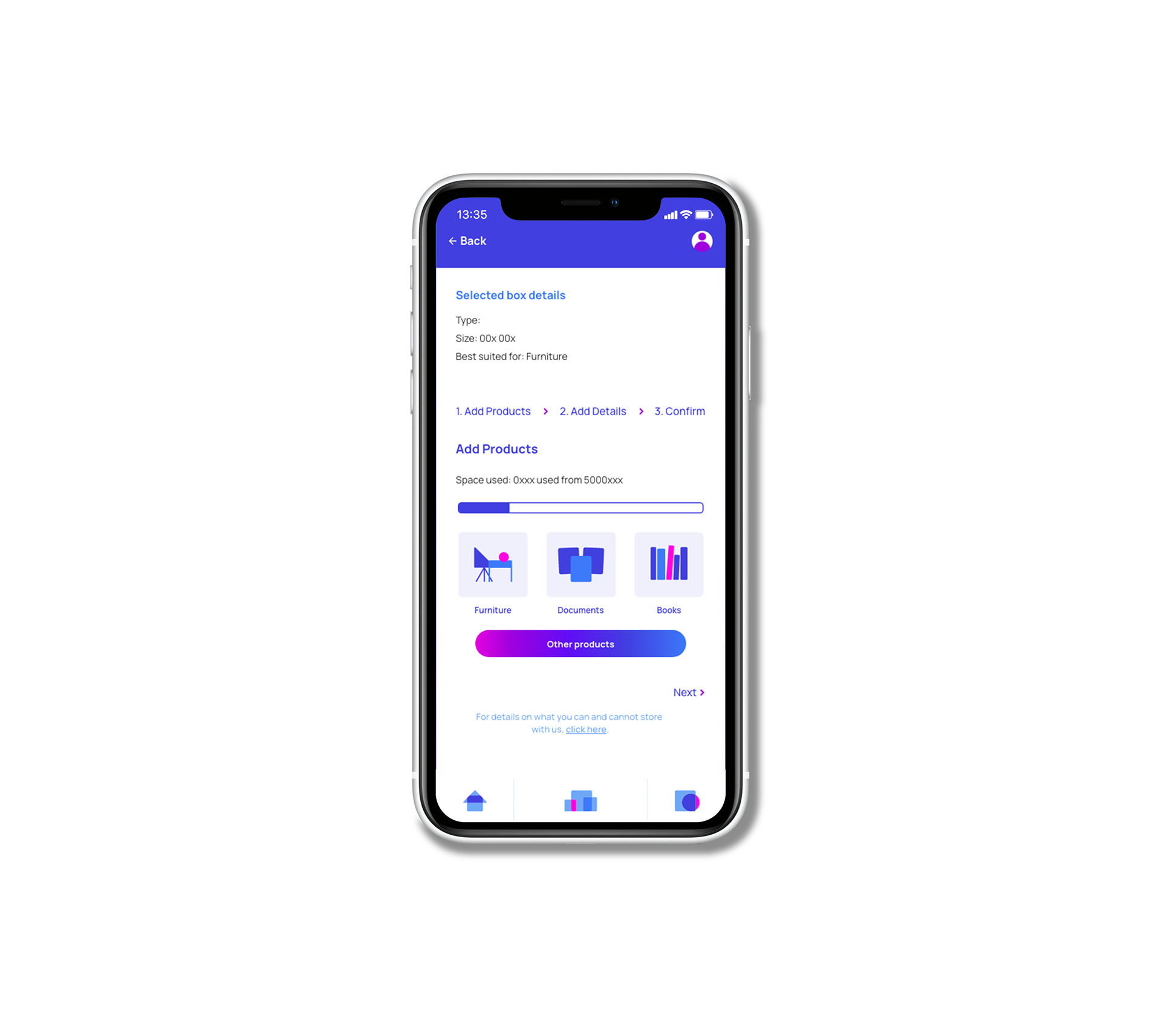
For the visual style of Justo, we combined playfulness with a touch of dependability. Simple line drawings paired with the most basic shapes of a circle, triangle, square, and rectangle, allow for the creation of dynamic compositions which represent the brand and its mission. The compositions include the different stages of the consumer-to-Justo experience and explain how the brand works. These visual elements were designed to ease the consumer's experience of using the app, and make it as simple to understand as possible.

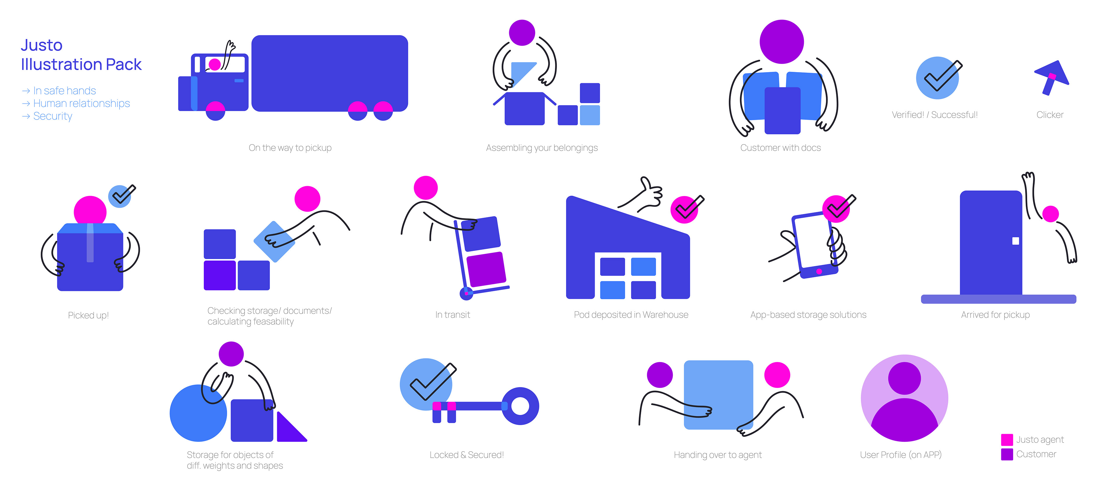
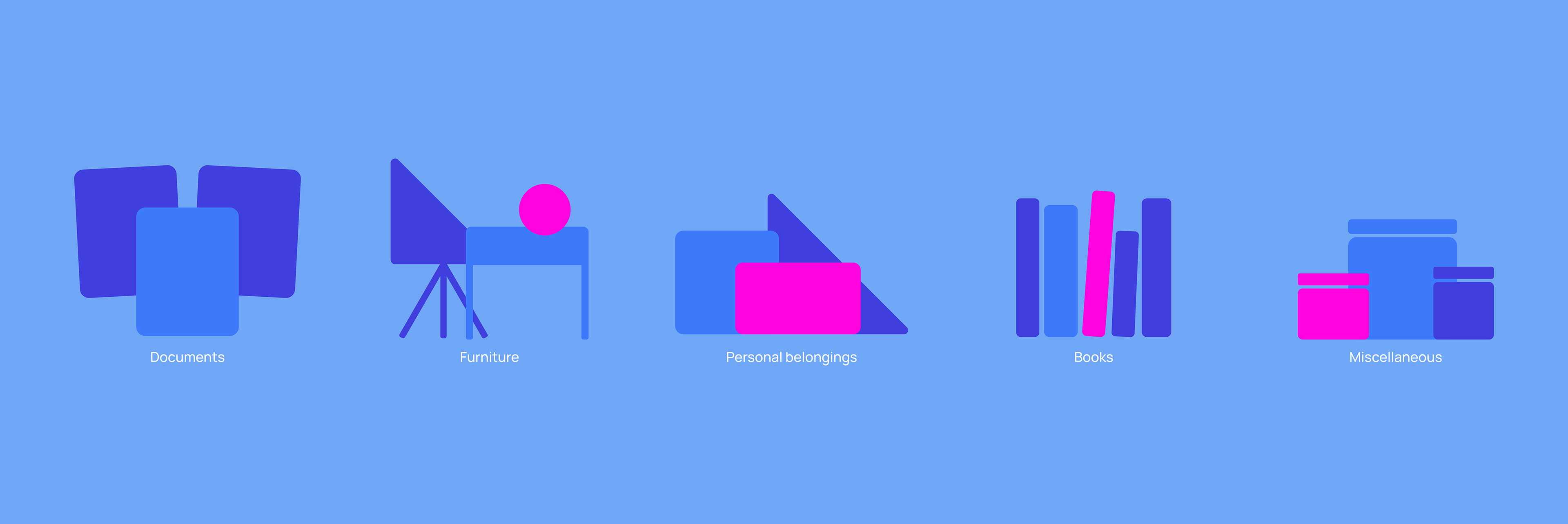
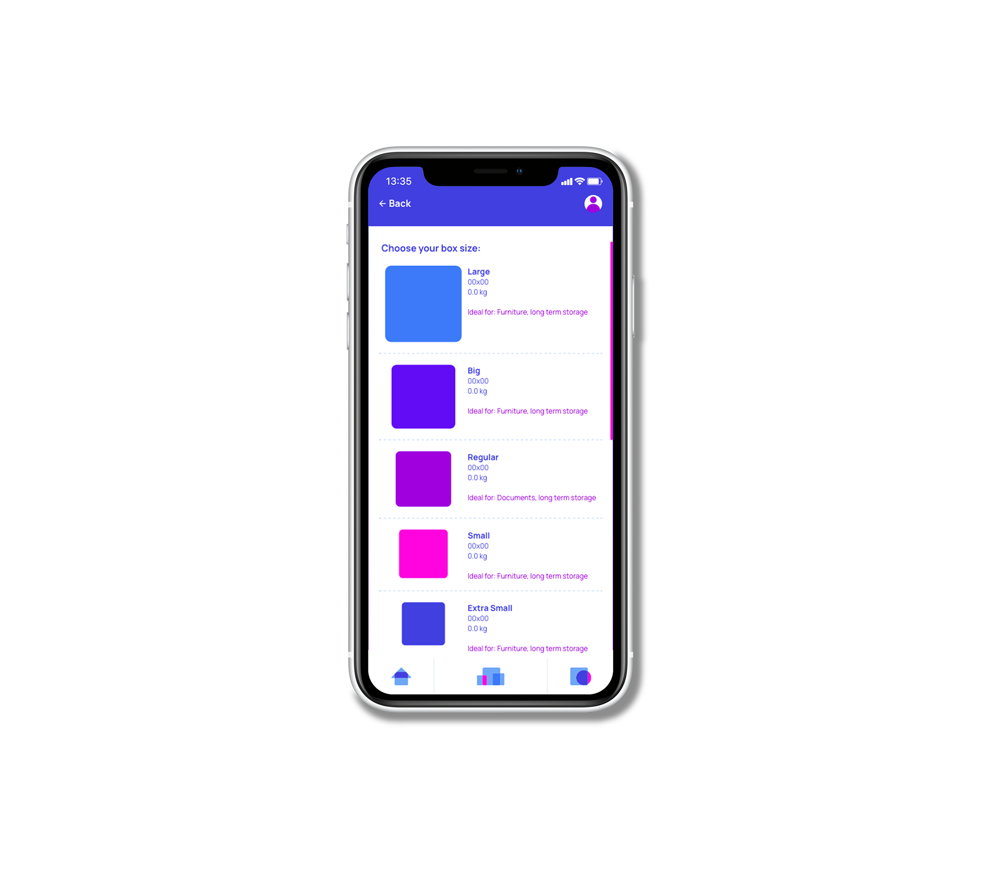
One of the traits that our client wanted to highlight was how their storage units could be utilised by a businesses or individuals, depending on what their needs may be. This factor was visually depicted through the iconography that would become a crucial part of the application design. Using the foundational basic shapes, we categorised items of belonging into different buckets, which would also help Justo determine the kind of unit and amount of space that a consumer would require.
UX/UI design for Justo's application
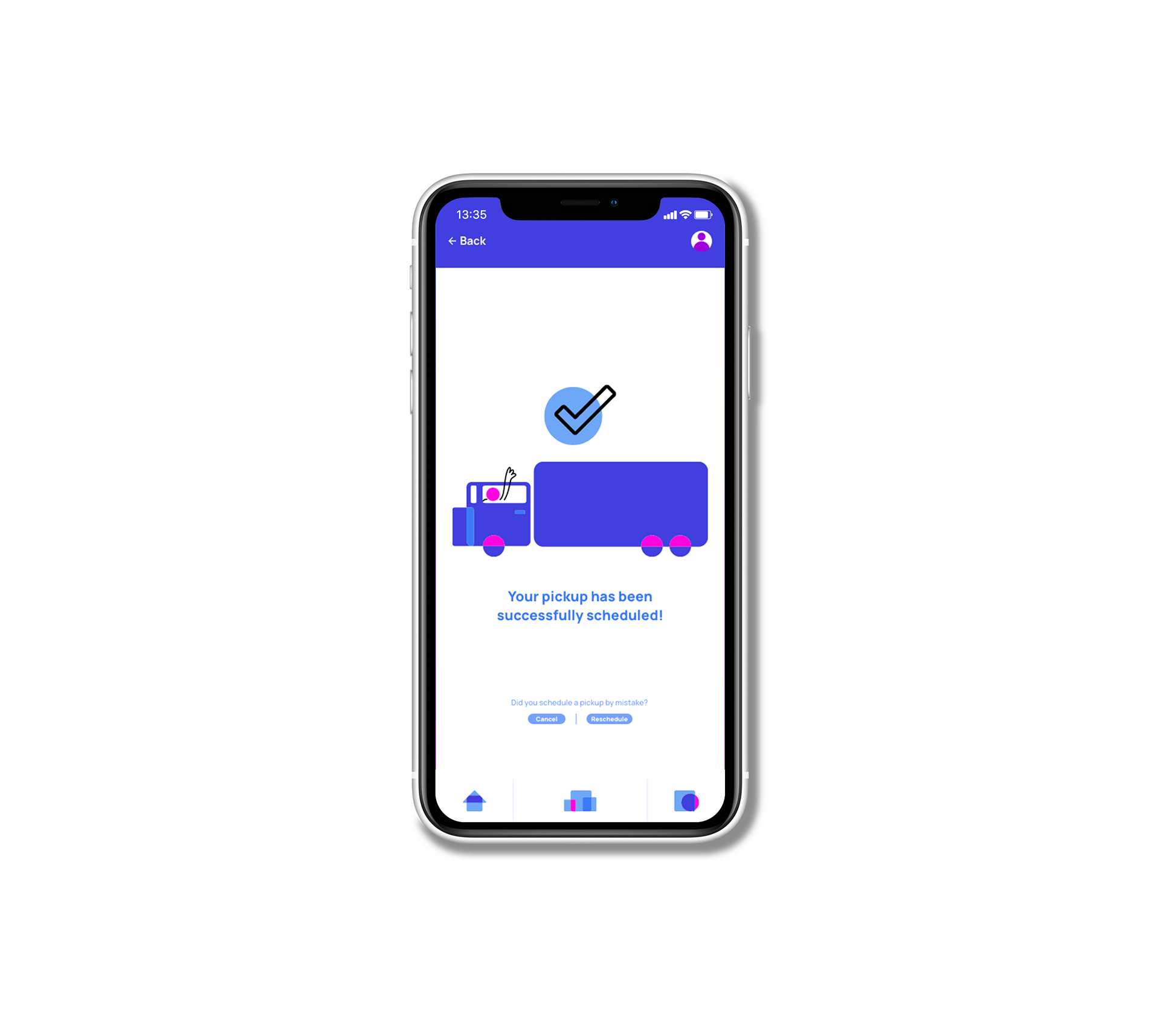
The next and very important step was translating this impactful and vibrant visual identity into their digital application. Using the wireframes and flow that they had in mind, we began to put in the visual elements and while doing so, even began to iterate on the different flows and requirements of different users.

Thank you! Hope you enjoyed the project.