Roles: Brand strategist / design research / brand and visual identity designer / competitor analysis / user researcher / creative composition / illustration
The goal of this project was to build the visual identity and branding collaterals for a household product of our choice right from the stages of the market analysis up until the creation of advertising collaterals.
The process of creating the brand and visual identity for a shampoo began with the research of already existing products within the market, defining the target audience and even approaching the potential consumers in order to define the brand and its personality.
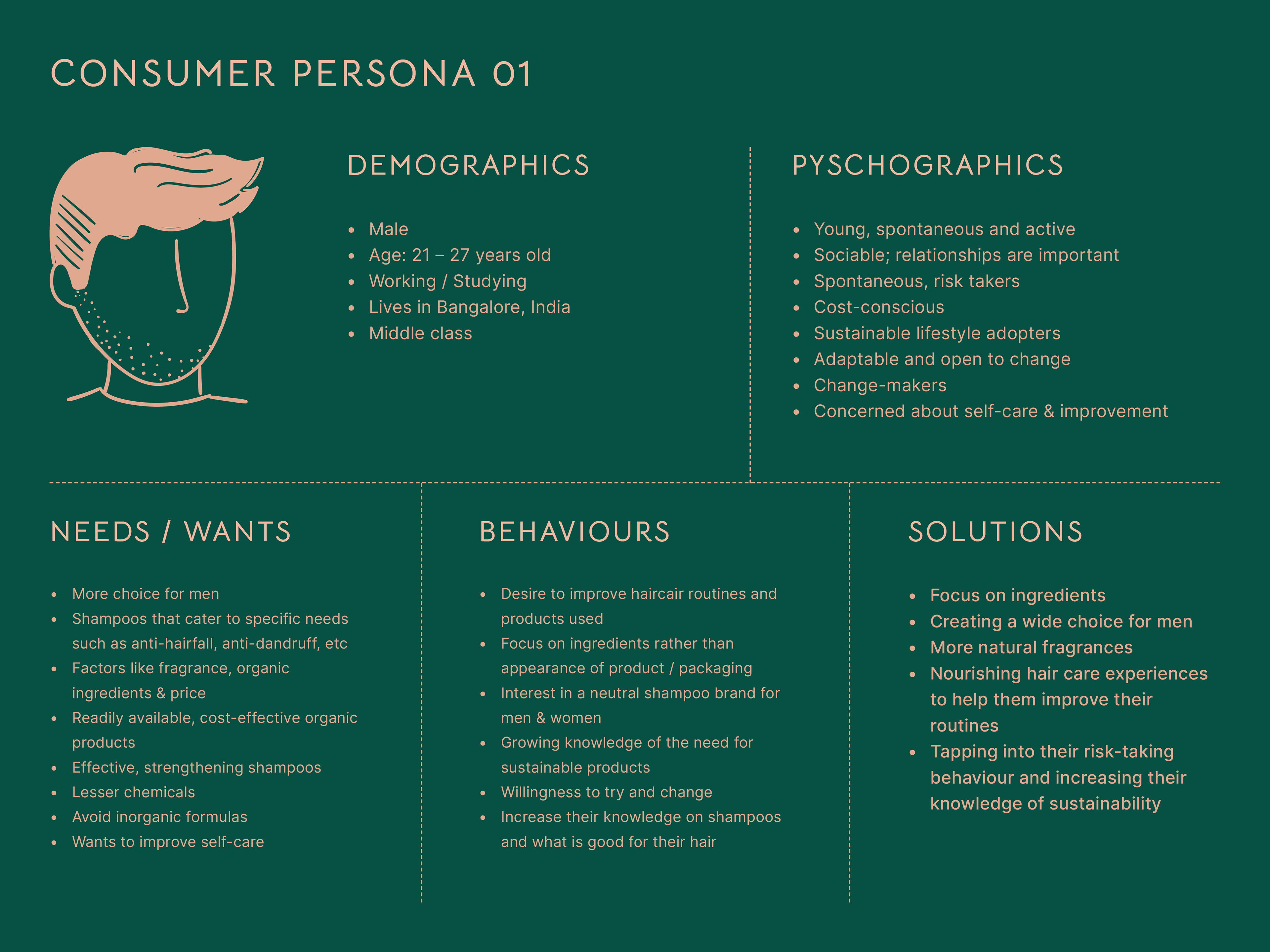
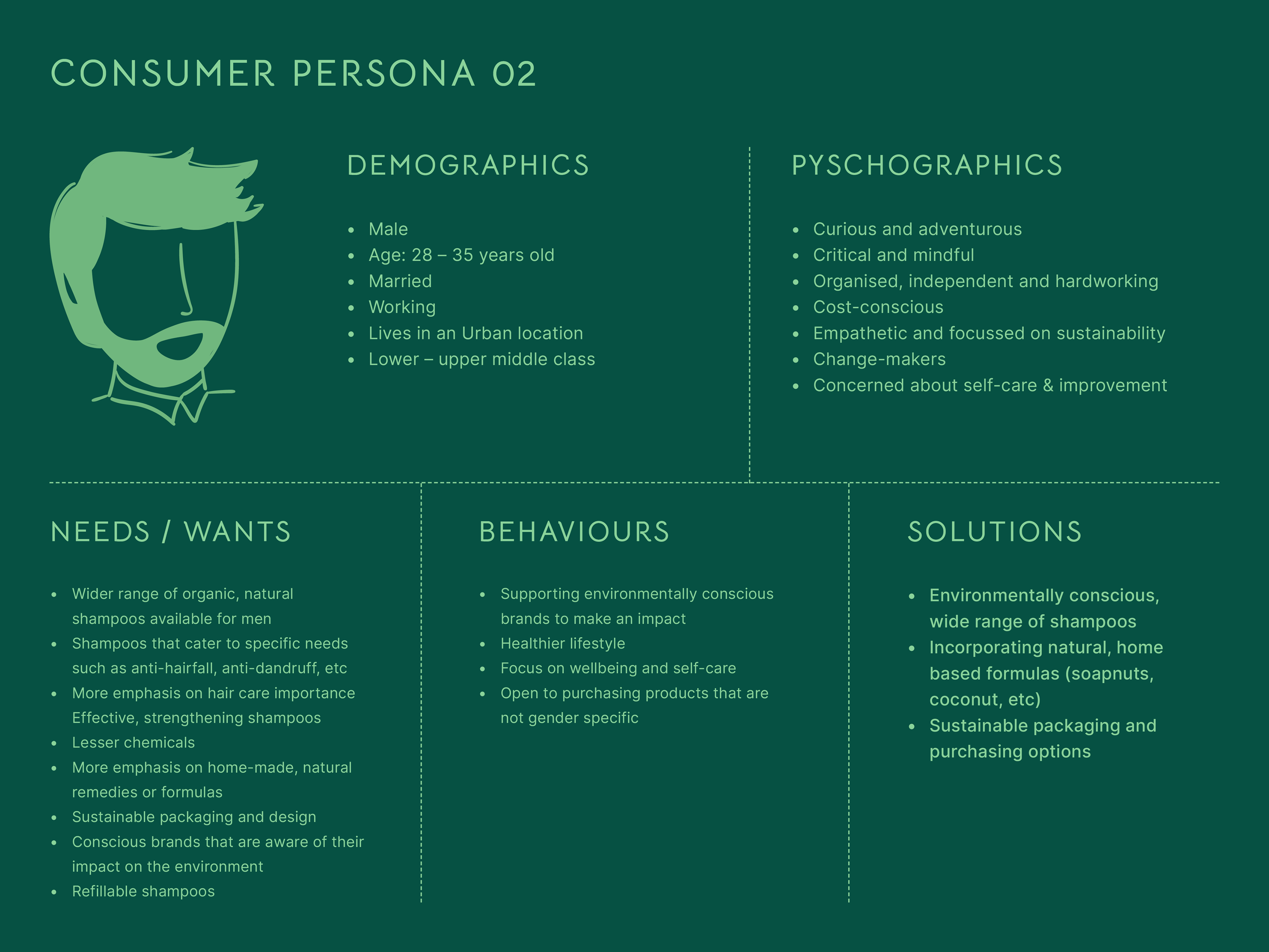
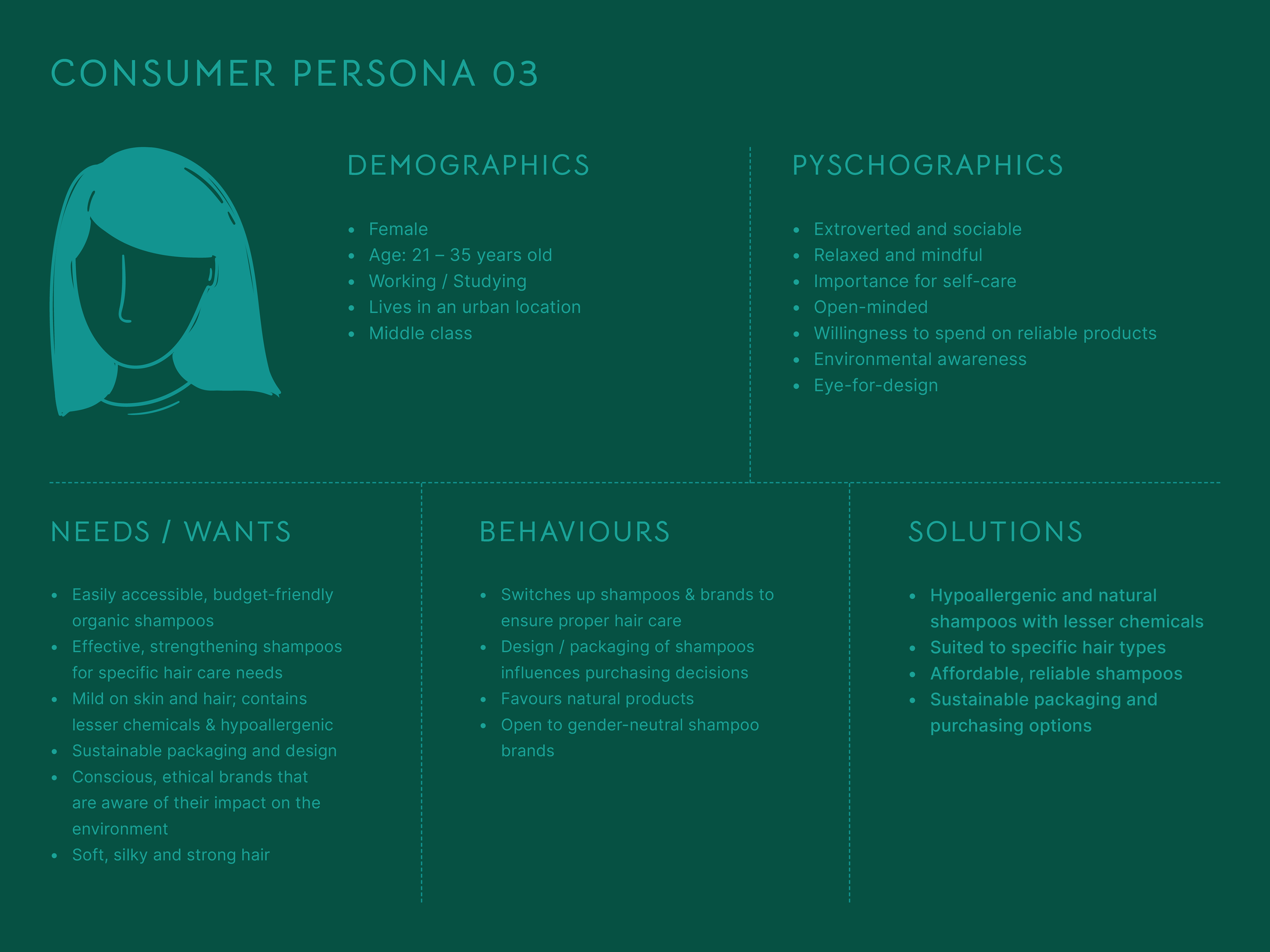
After the research of the other brands in the market, the next step was creating a survey of questions that would help to understand the user's needs and preferences, desires and aspirations and therefore, lead to the creation of a consumer persona which would represent the brand's ideal target group.
Disclaimer: This branding project is entirely conceptualised from start to end. This is not based on any existing brand or product but has been developed by me for the purpose of this assignment.
Consumer personas
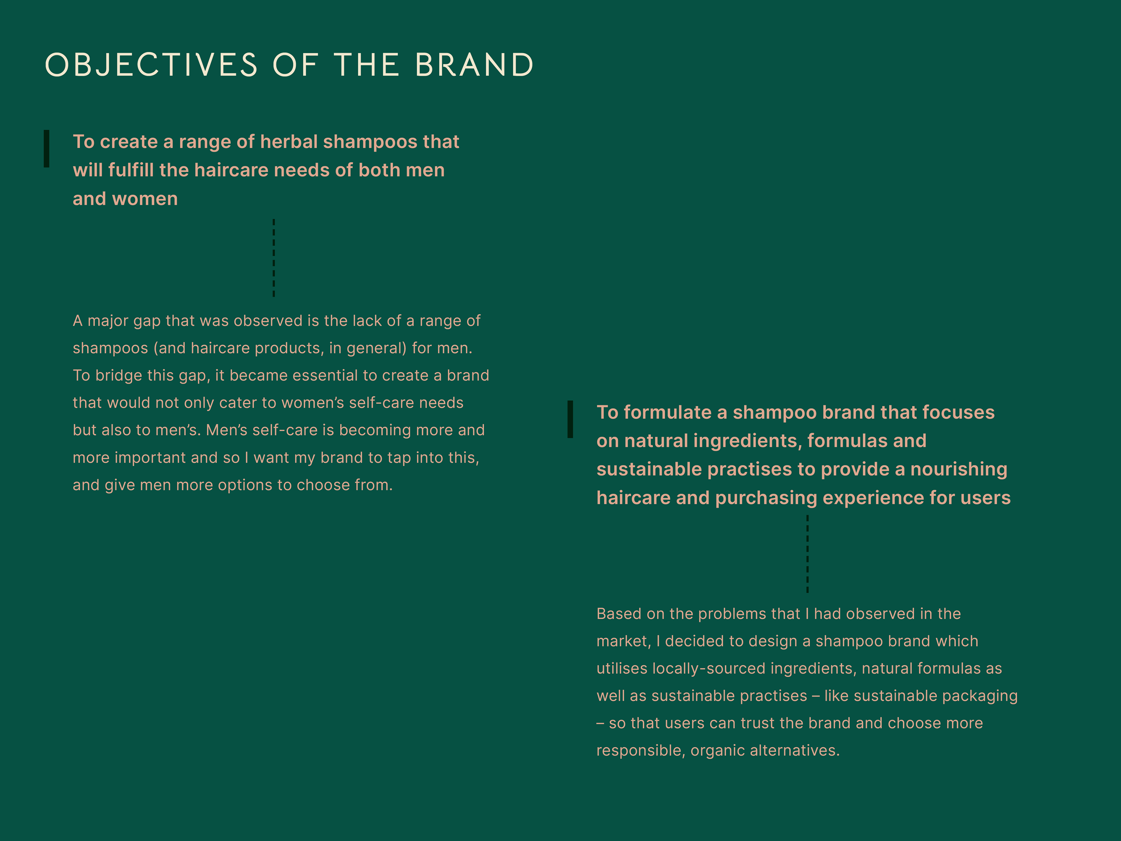
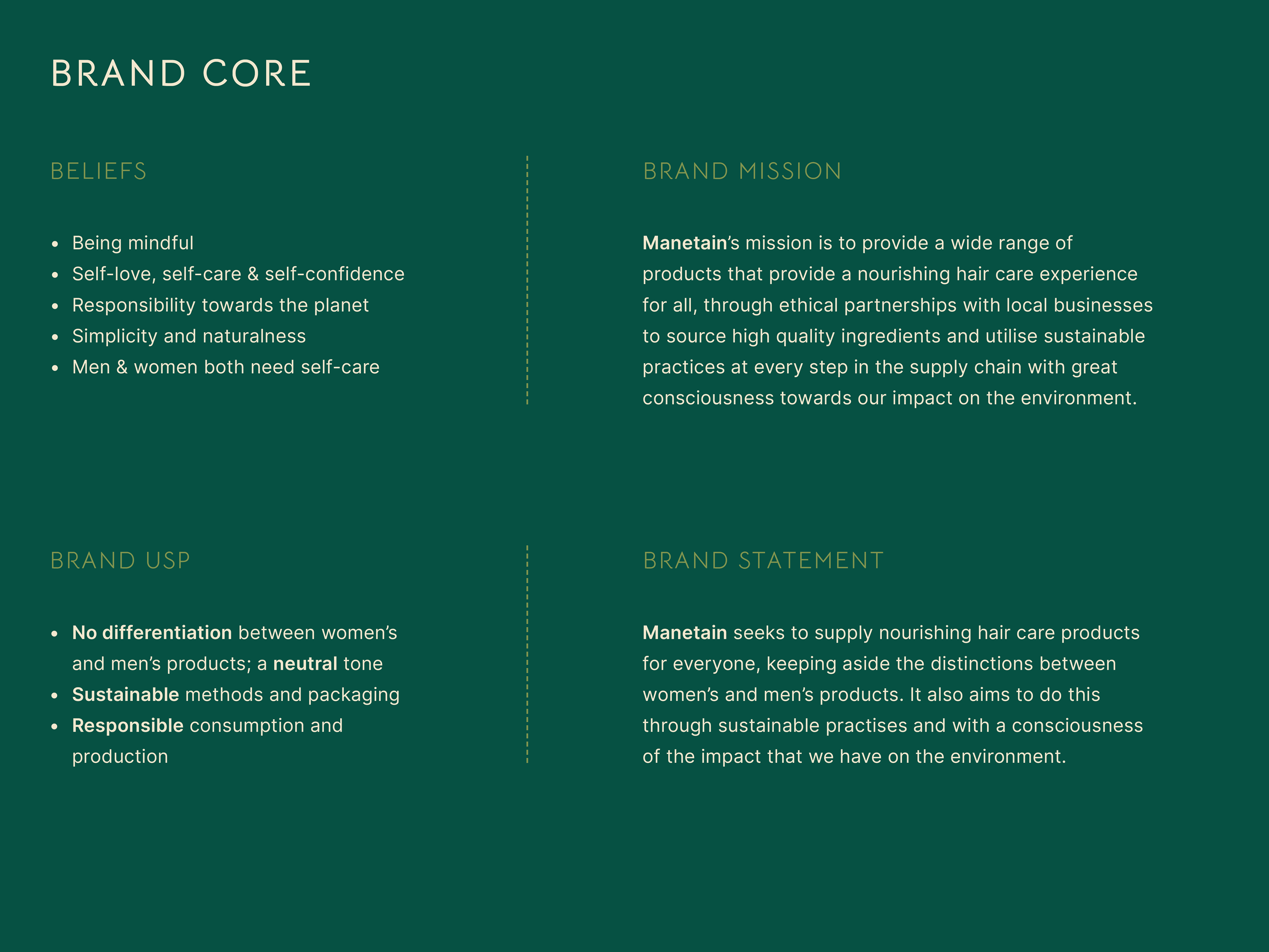
Based on the consumer personas, the following objectives and brand personality was arrived at.
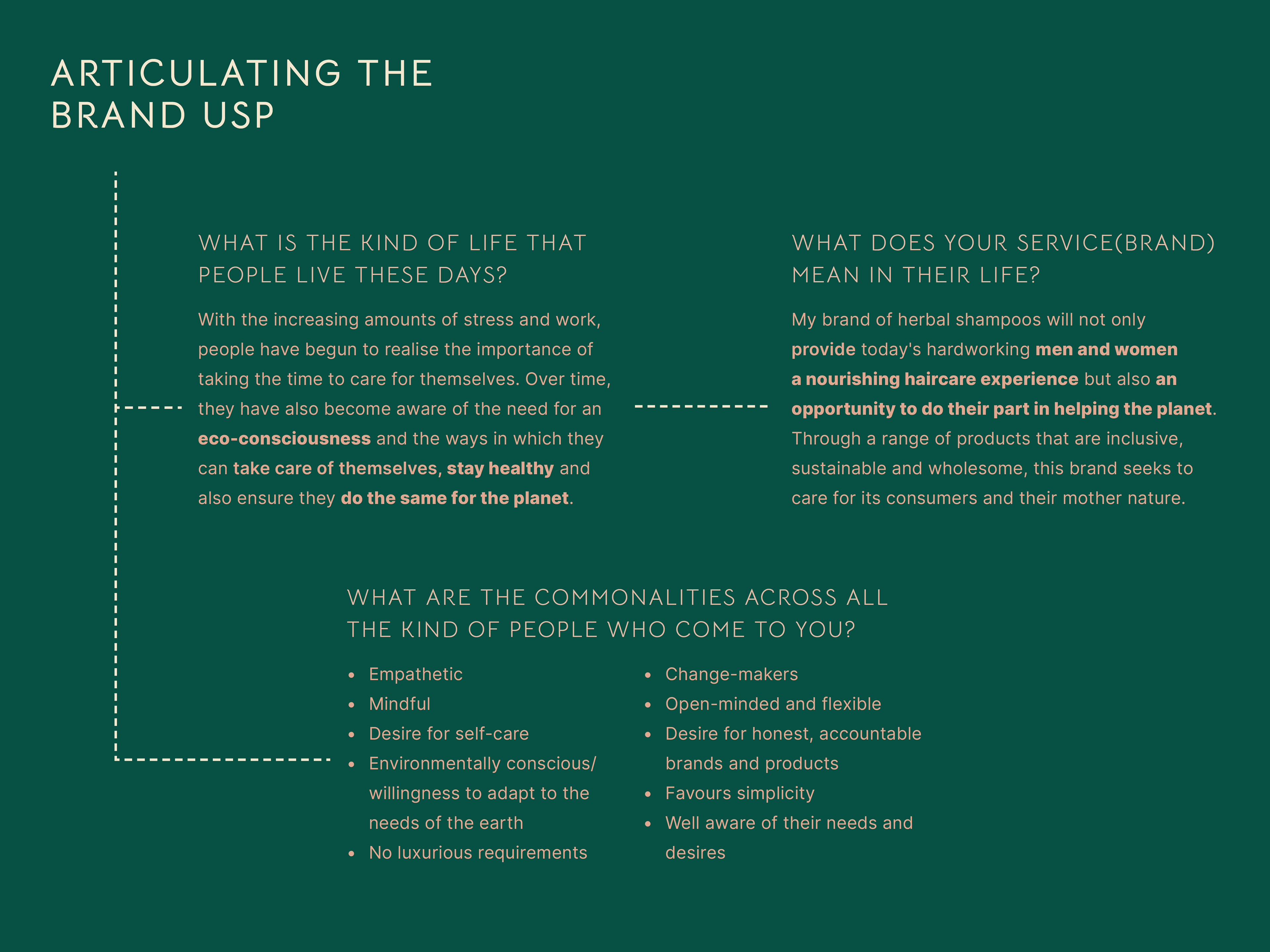
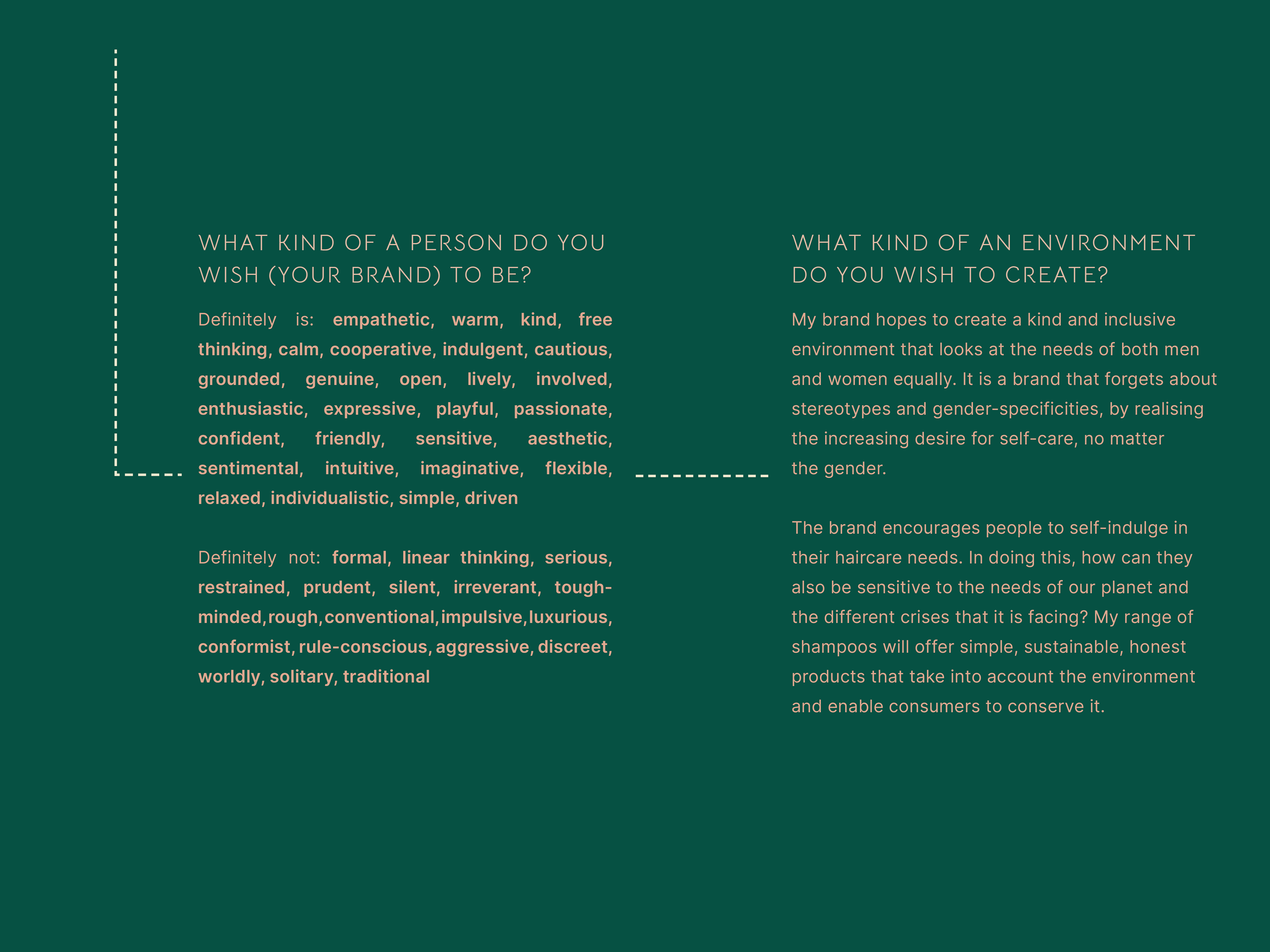
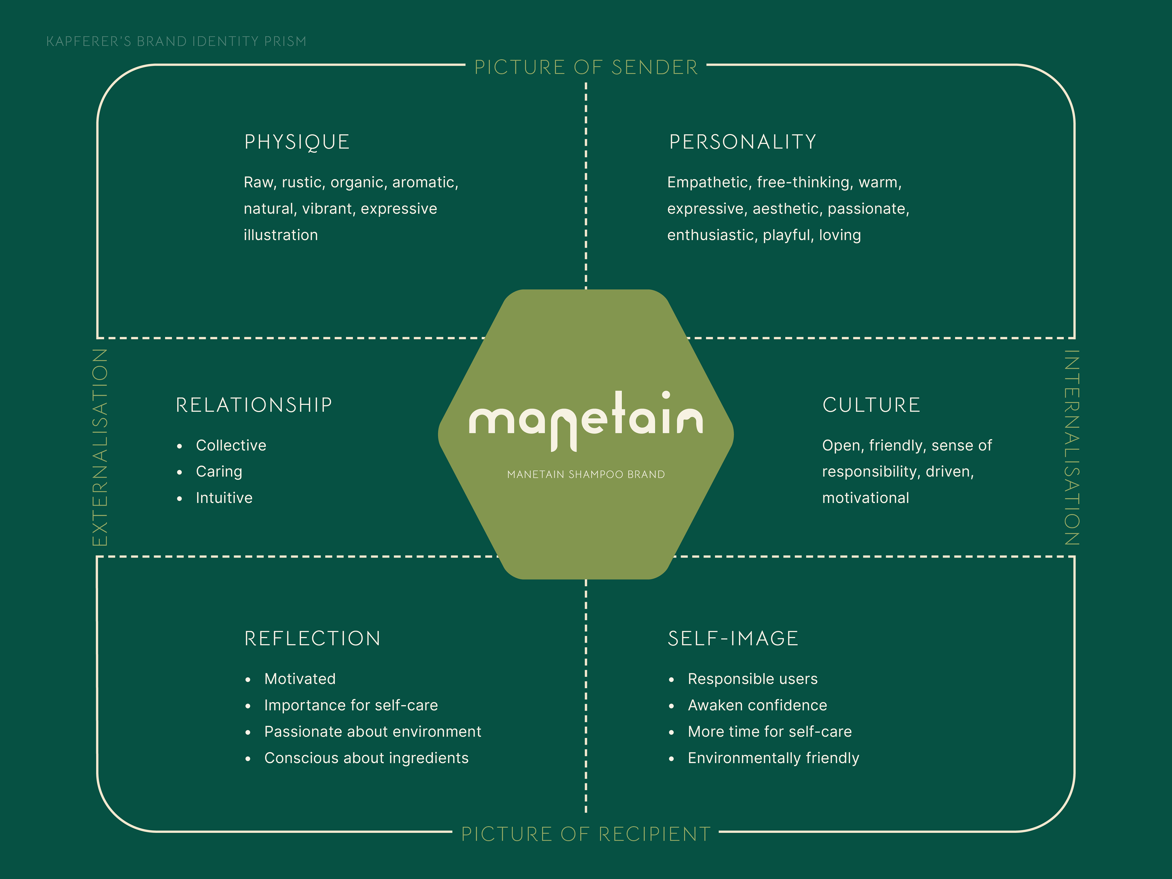
Brand Identity aspects defined as per Kapferer's Brand Identity Prism technique
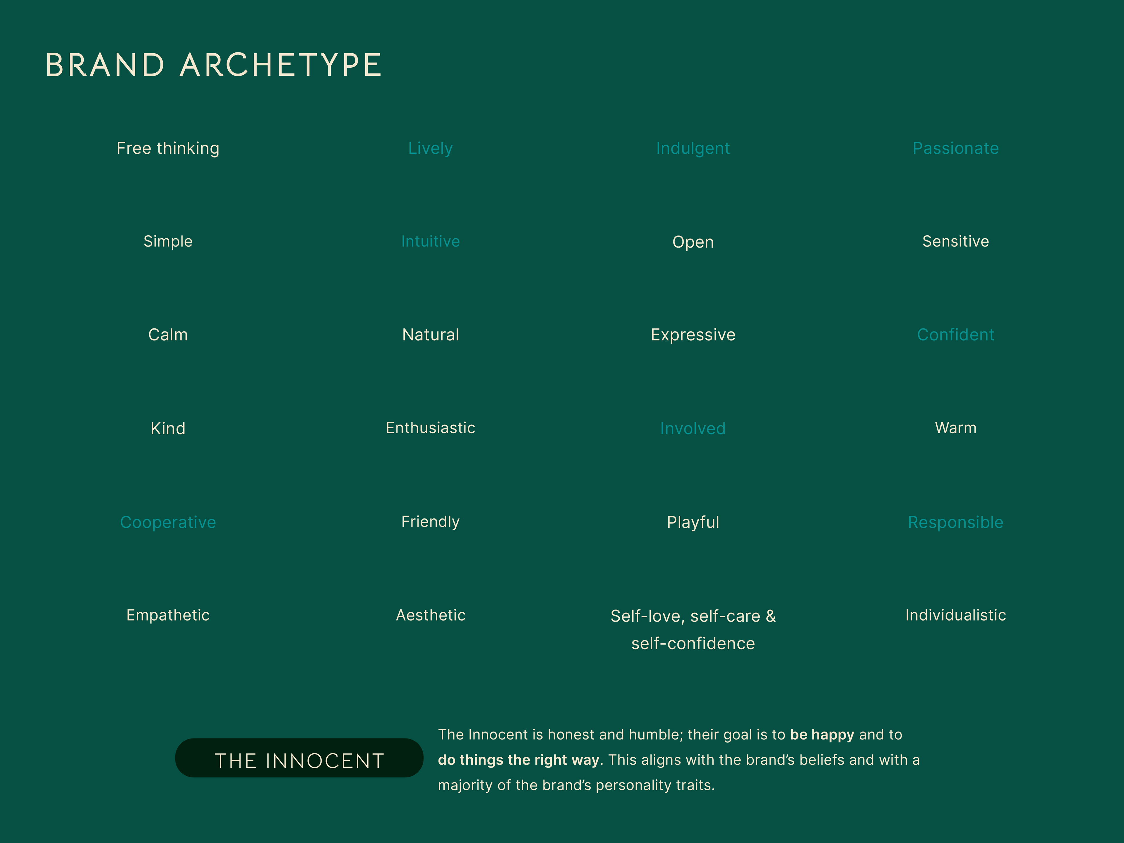
Once the brand USP and brand objectives were outlined, the next steps were to choose a brand archetype, ideate a brand name and brand tagline which would embody these personalities and objectives.
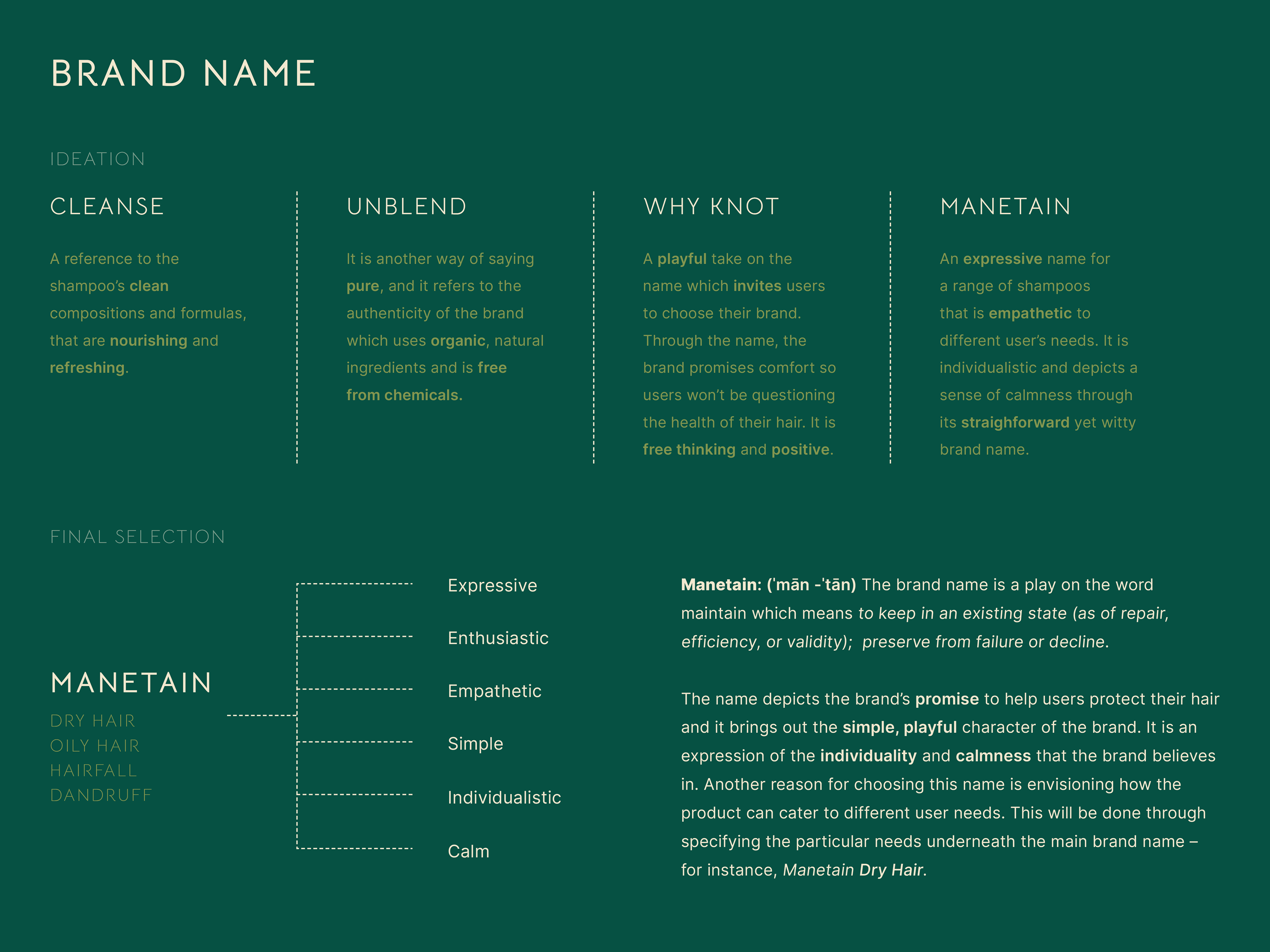
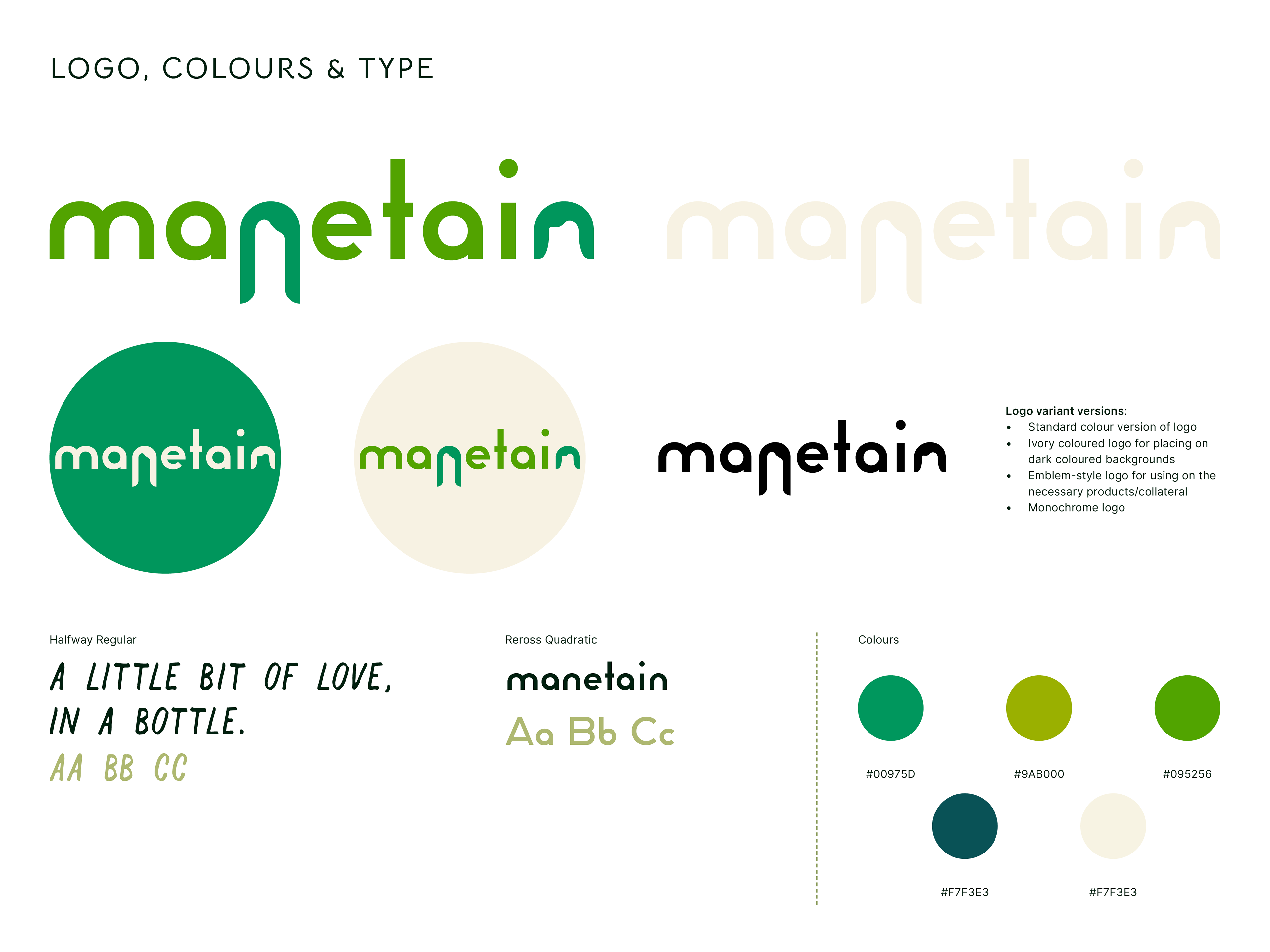
The various brand names that were ideated & the final selection – Manetain.
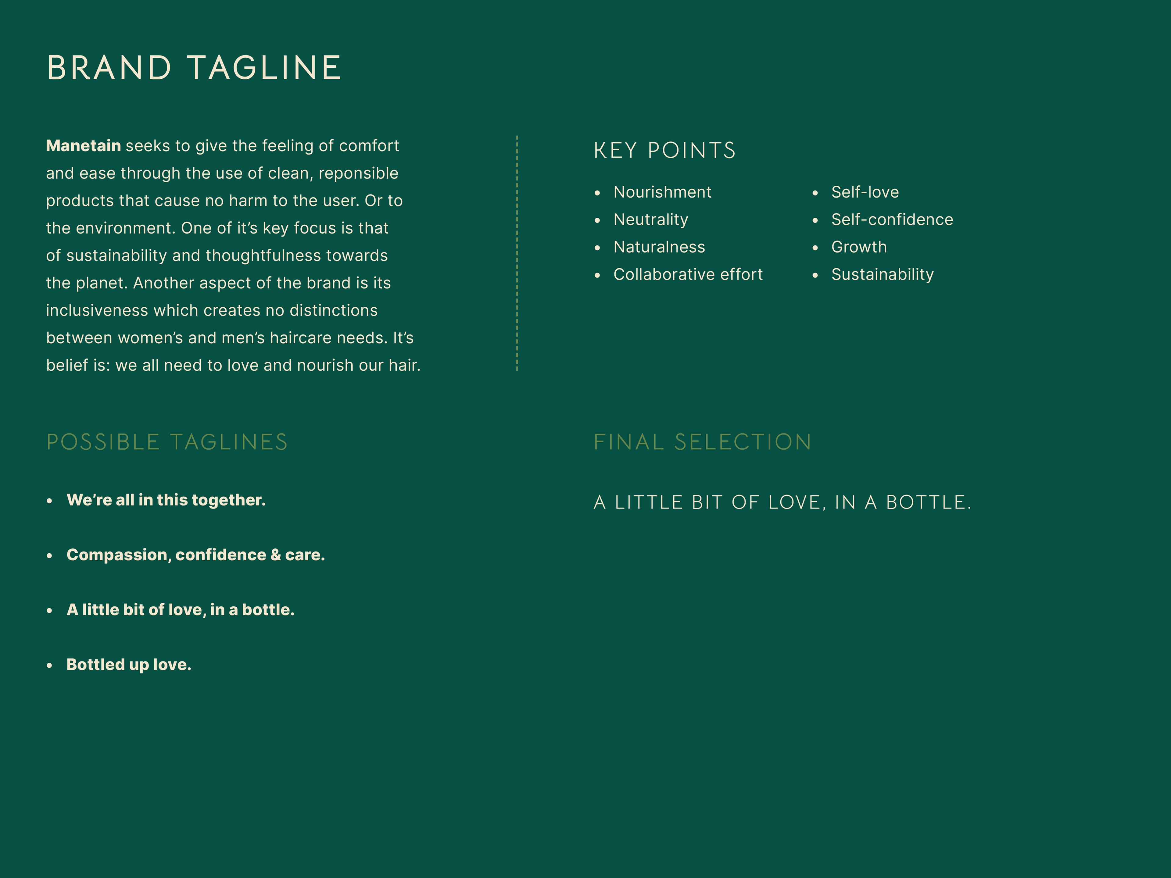
Brand tag lines & the final selection – A Little Bit of Love, in A Bottle.
Brand development & design
After deciding on the brand name, brand tagline and which archetype my brand fell under, the obvious next step was designing a logo that would depict the brand and what it does.
For this, I did three iterations of completely different concepts. Each iteration brought out some aspect of the brand's USP – either the organic, authentic nature or the inclusiveness the brand aimed at.
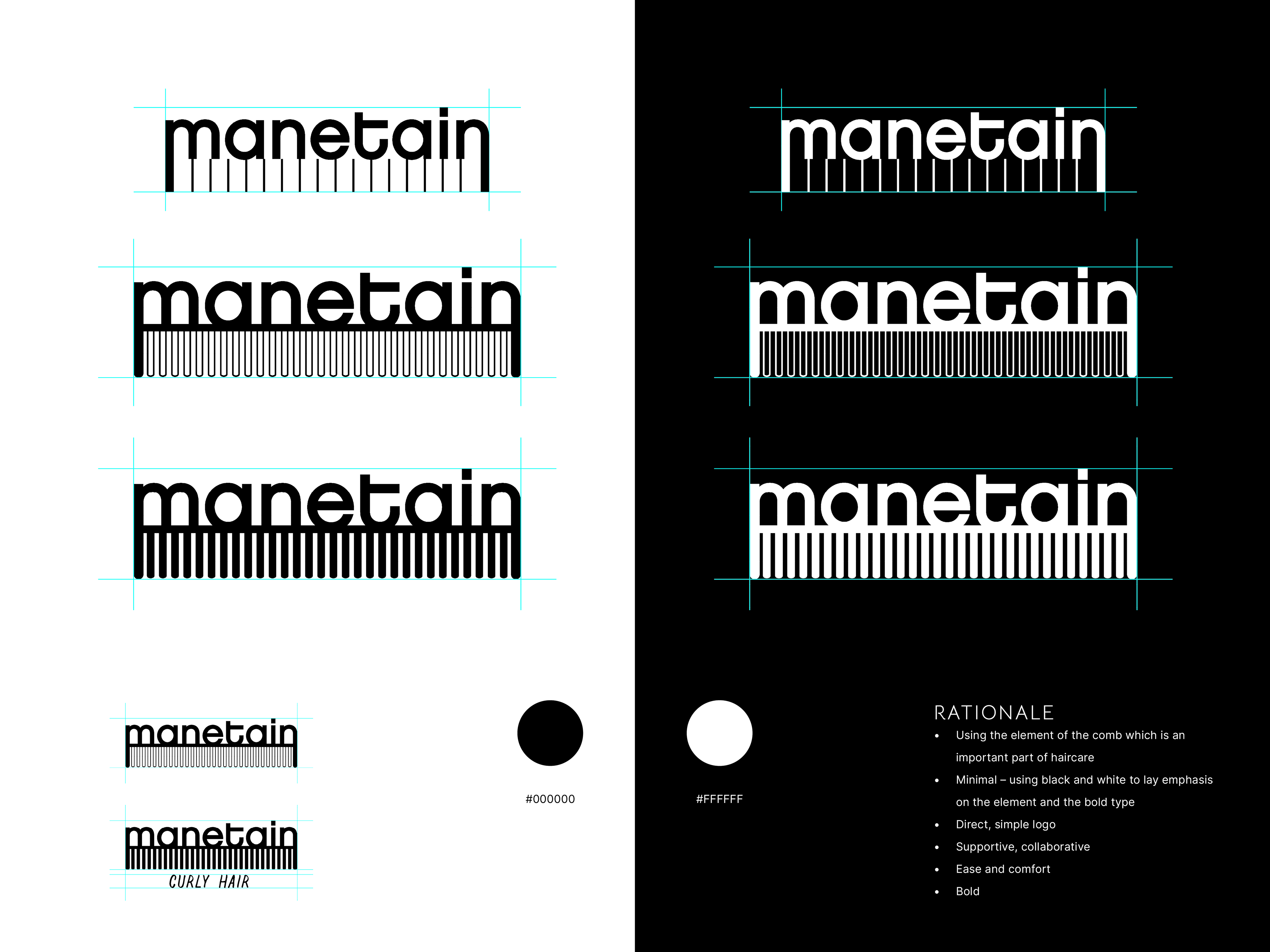
Iteration 01
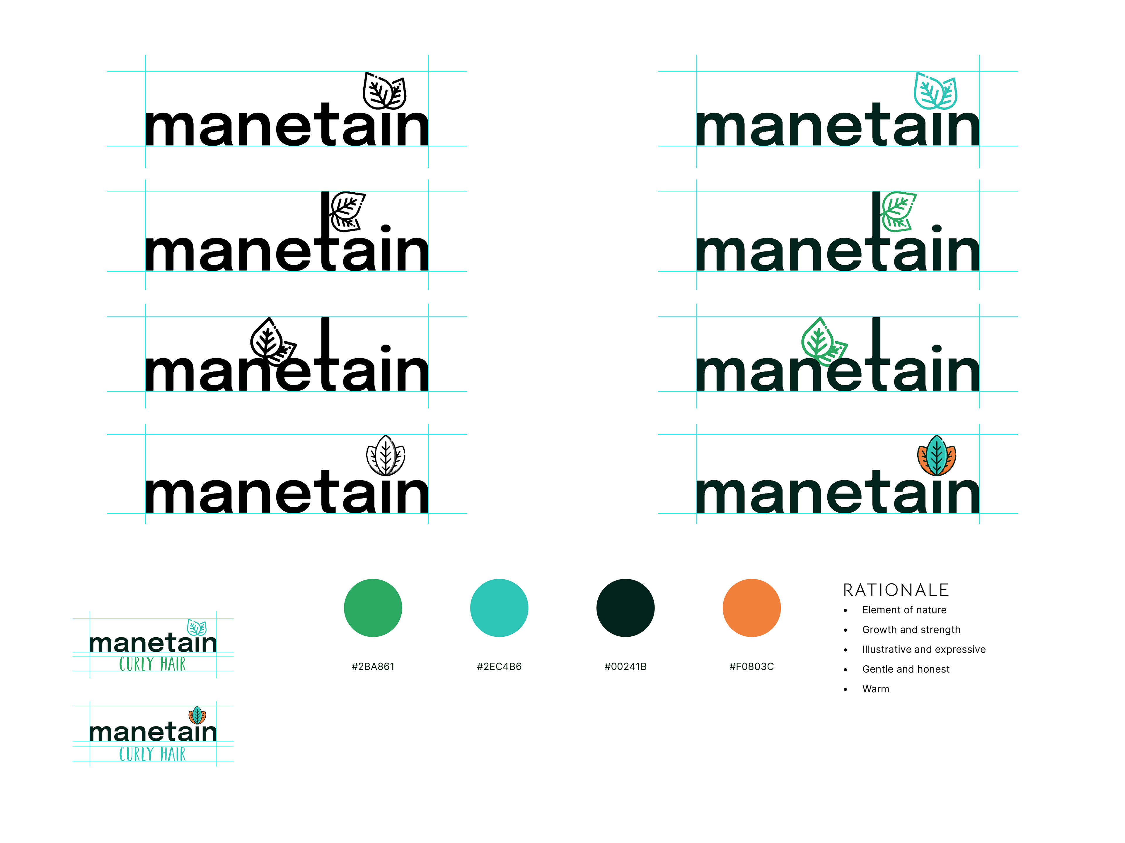
Iteration 02
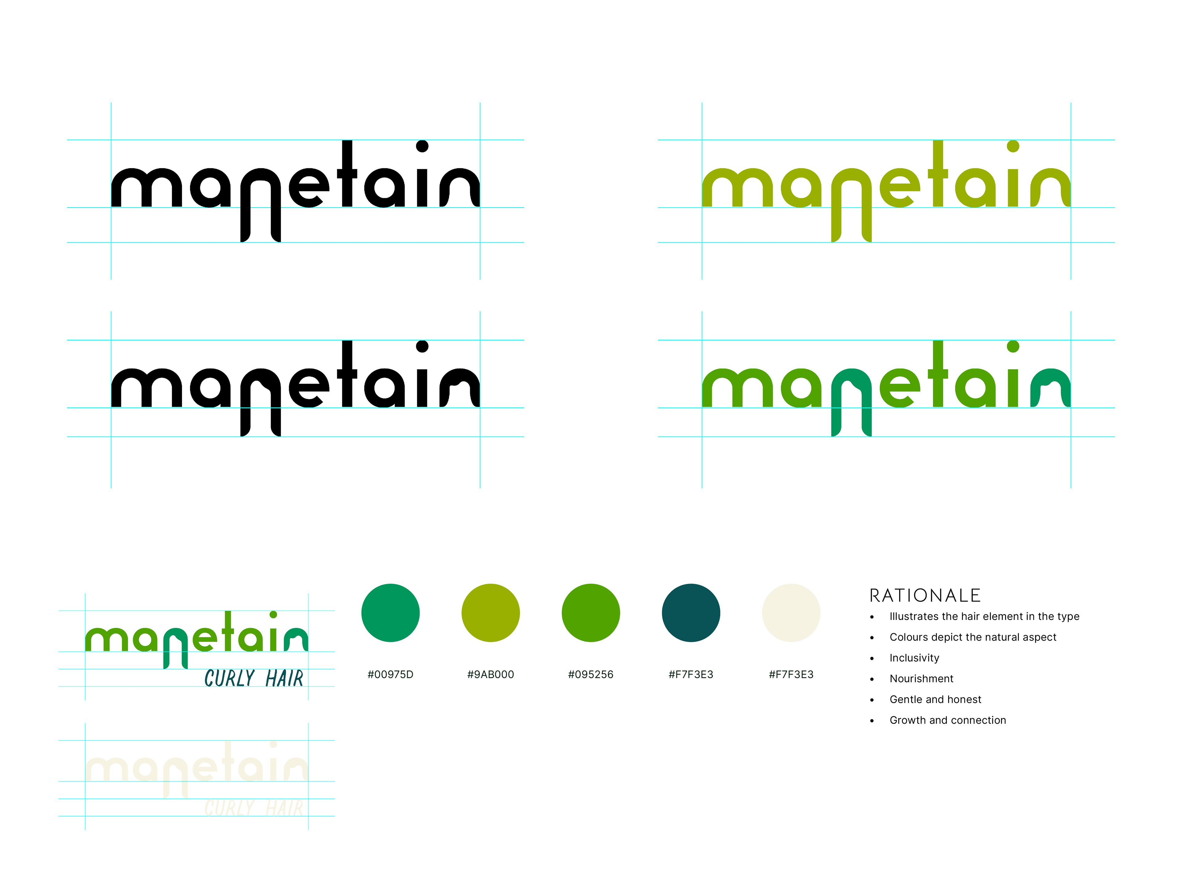
Iteration 03
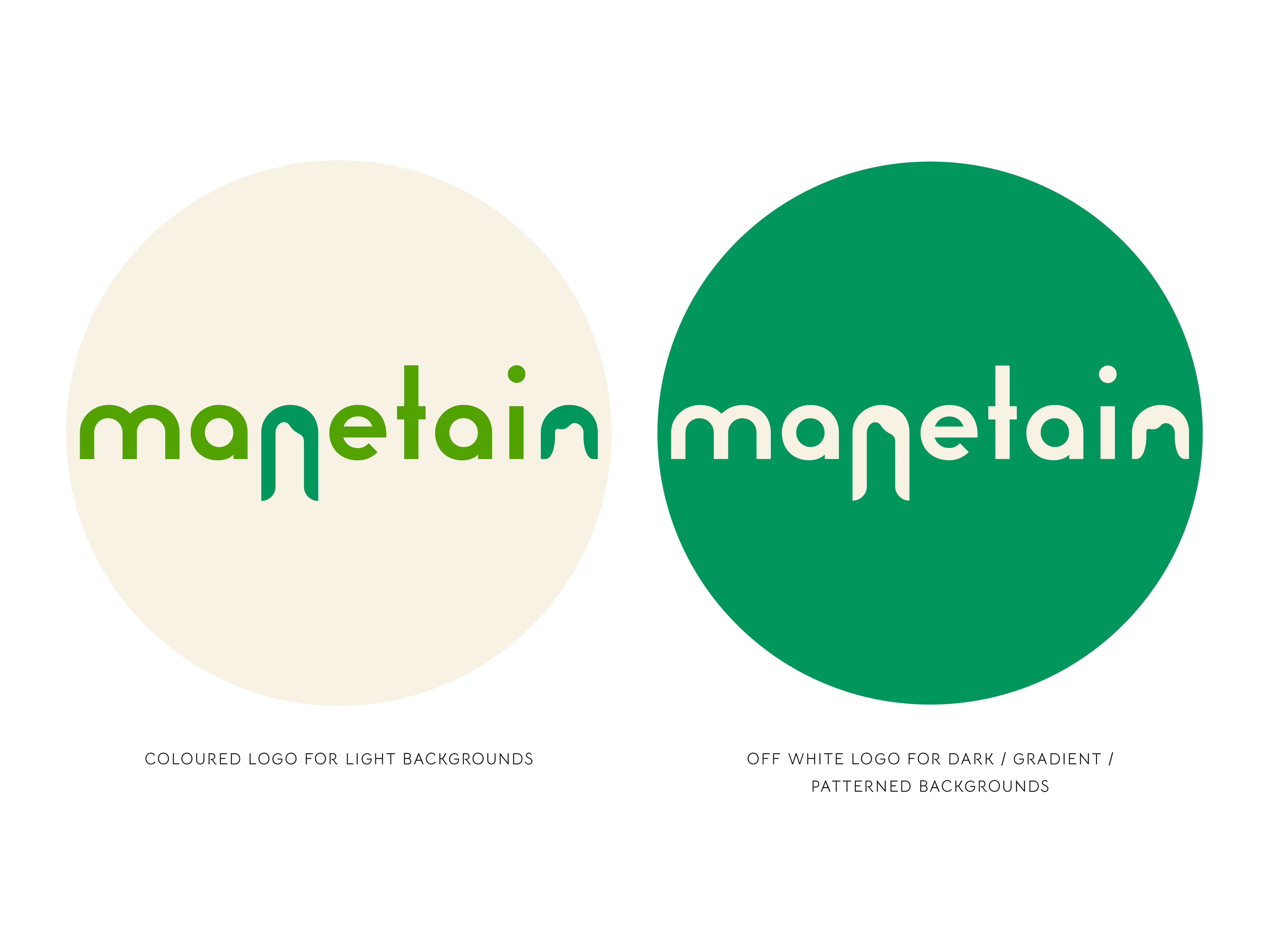
The final selected iteration of the logo (with two variants)
Packaging design
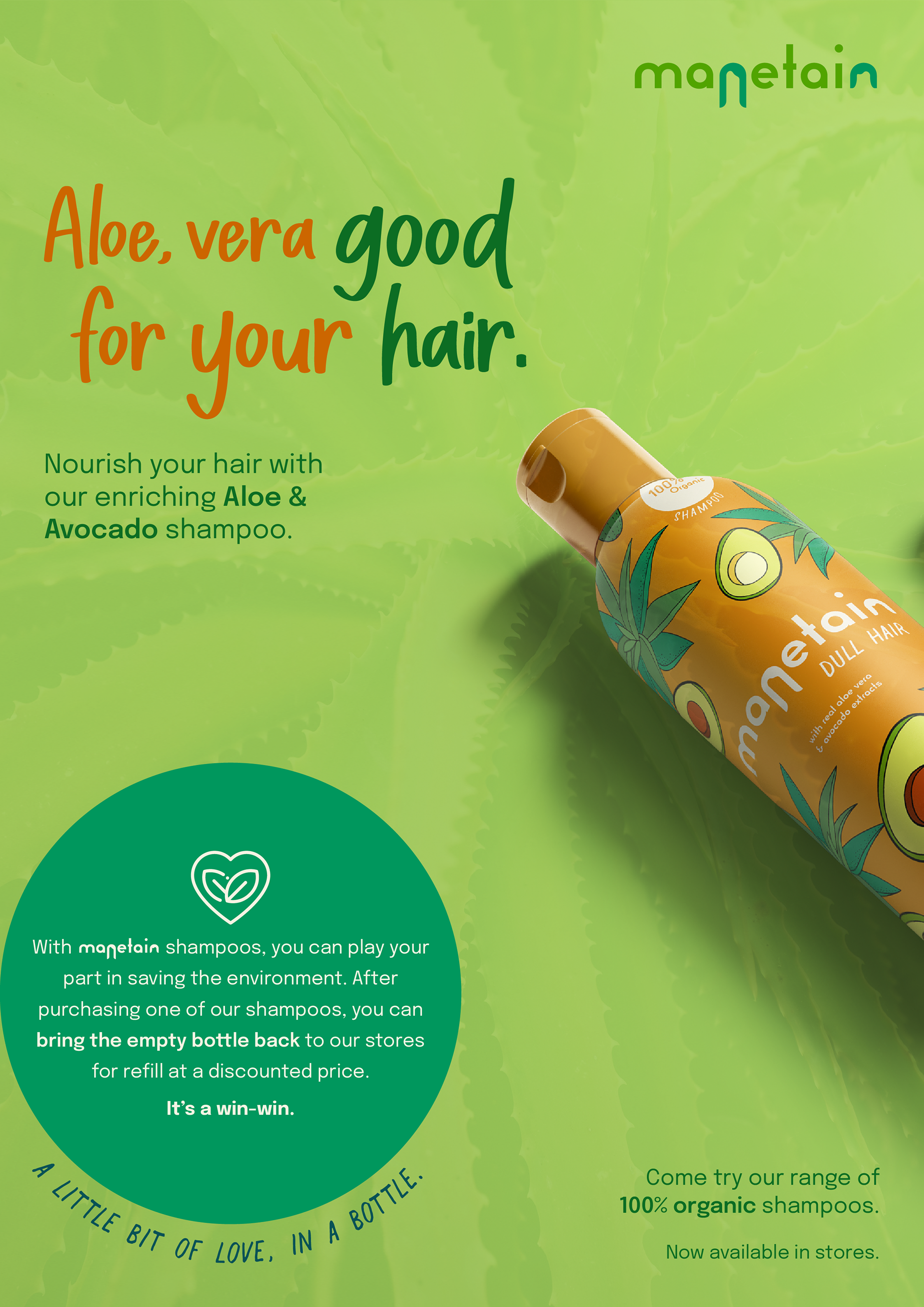
Since this was a product that consumers would have to pick off a shelf in a store, it became essential to design powerful and attractive packaging that would draw in the buyers. The main USP of Manetain was that it aimed to be a brand that is inclusive and did not cater to one specific gender or hair type. Another unique feature of the brand was its efforts in sustainability – both in purchase and consumption by the user. For this, Manetain was envisioned as a brand that utilised refillable bottles which could be brought back by buyers for refills at discounted costs.
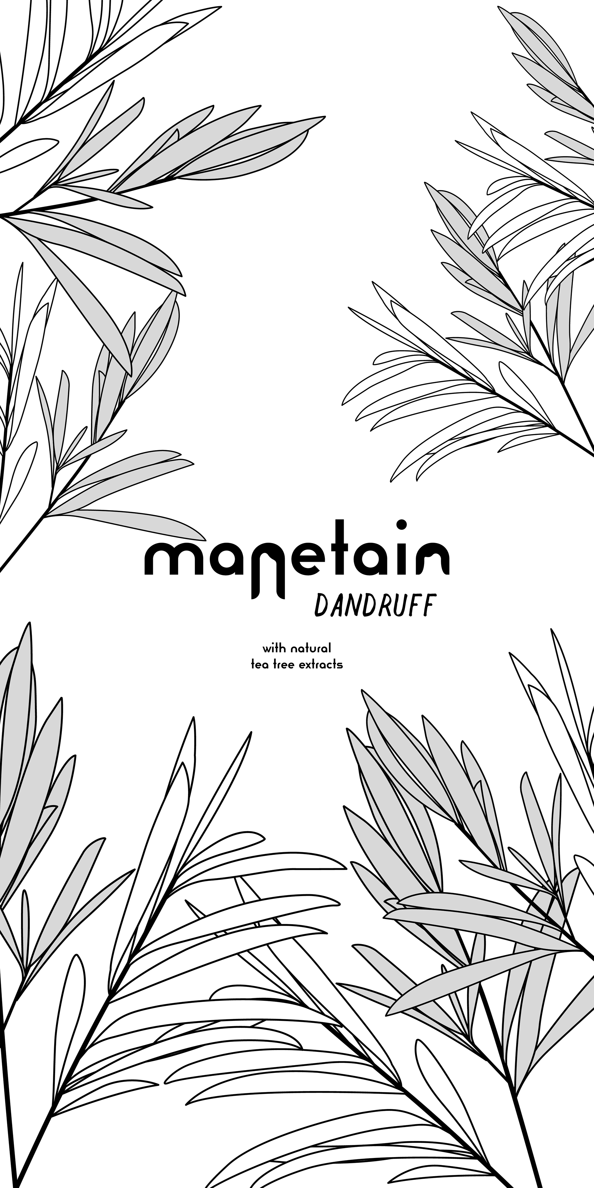
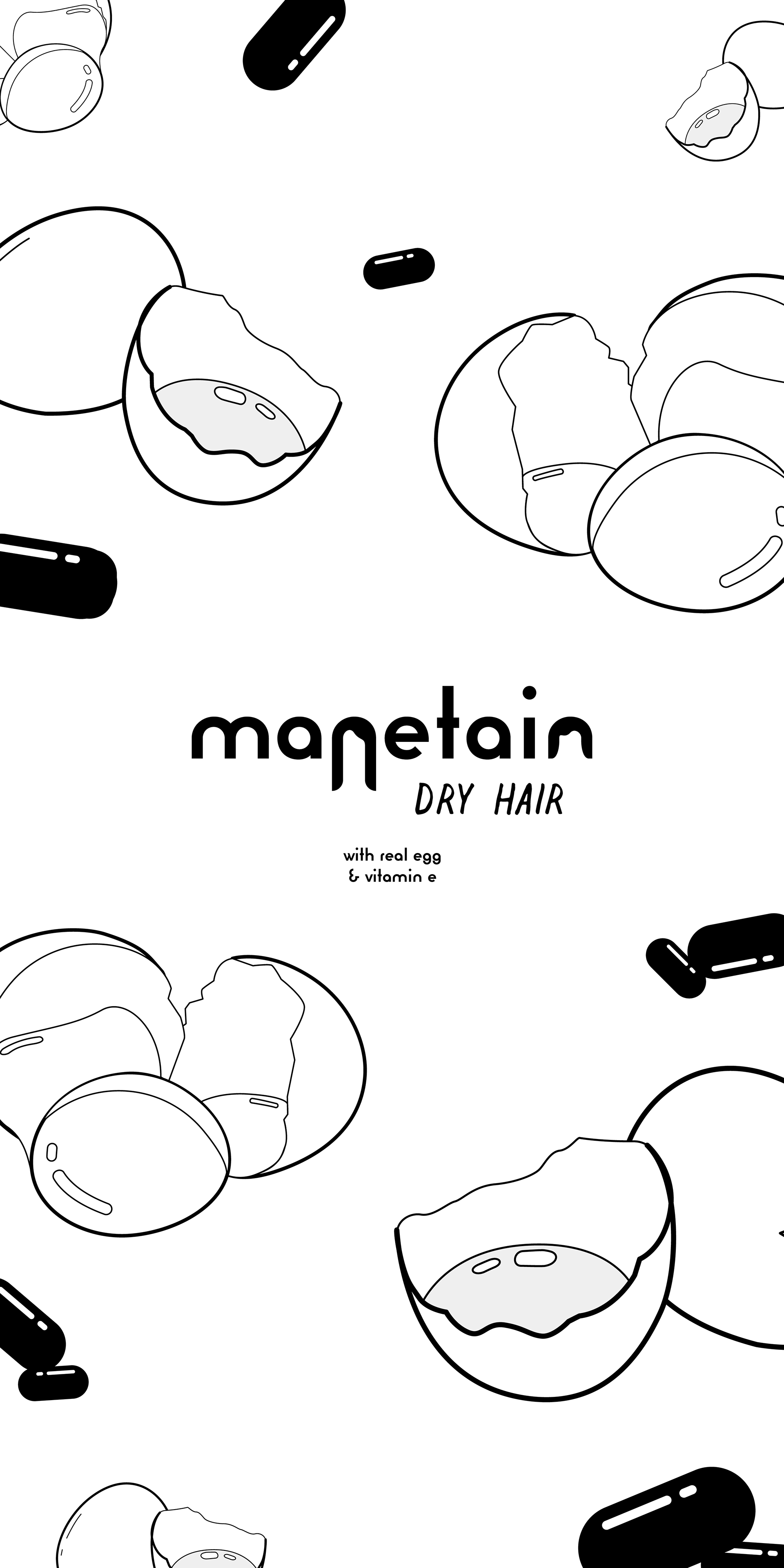
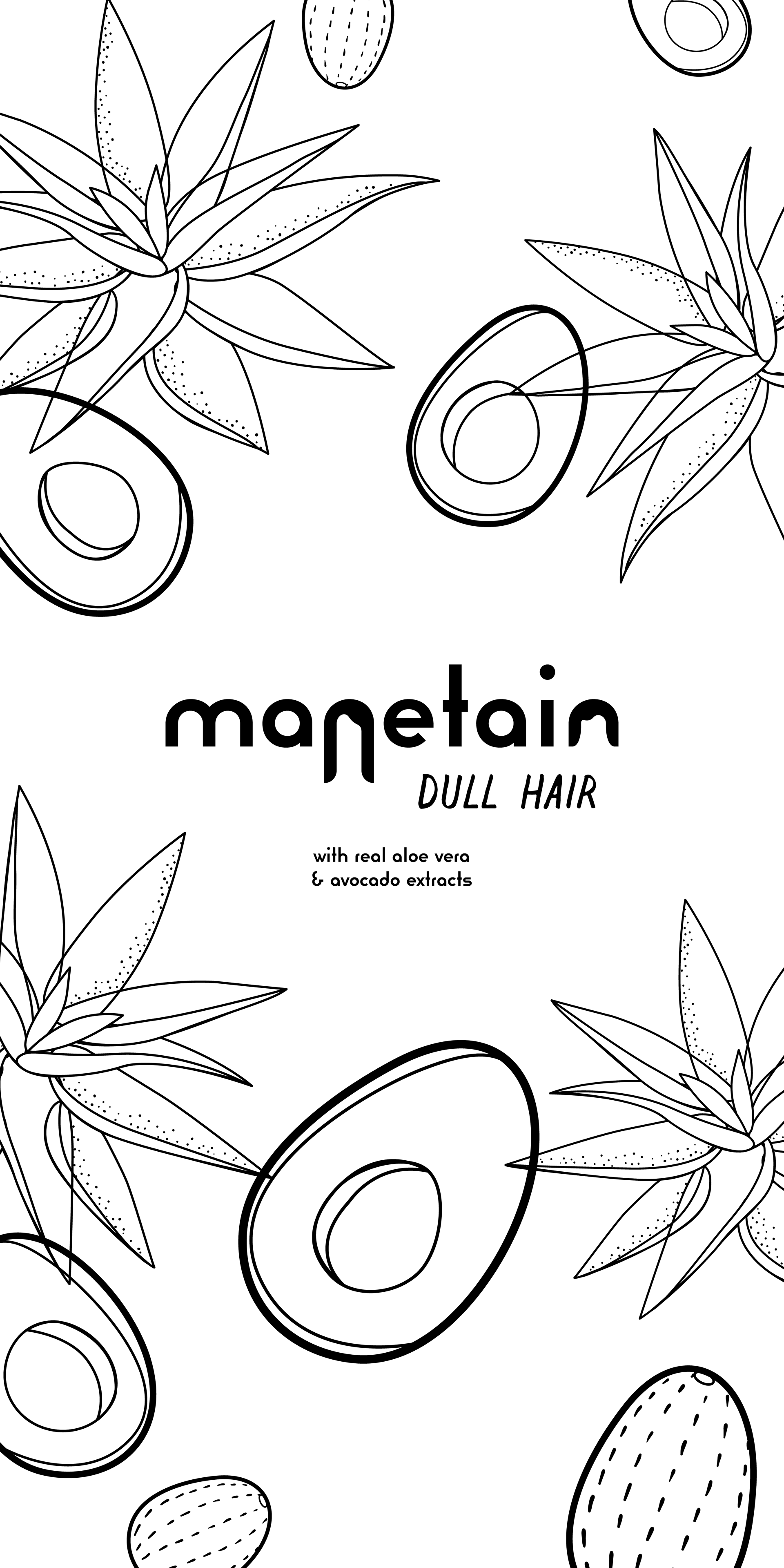
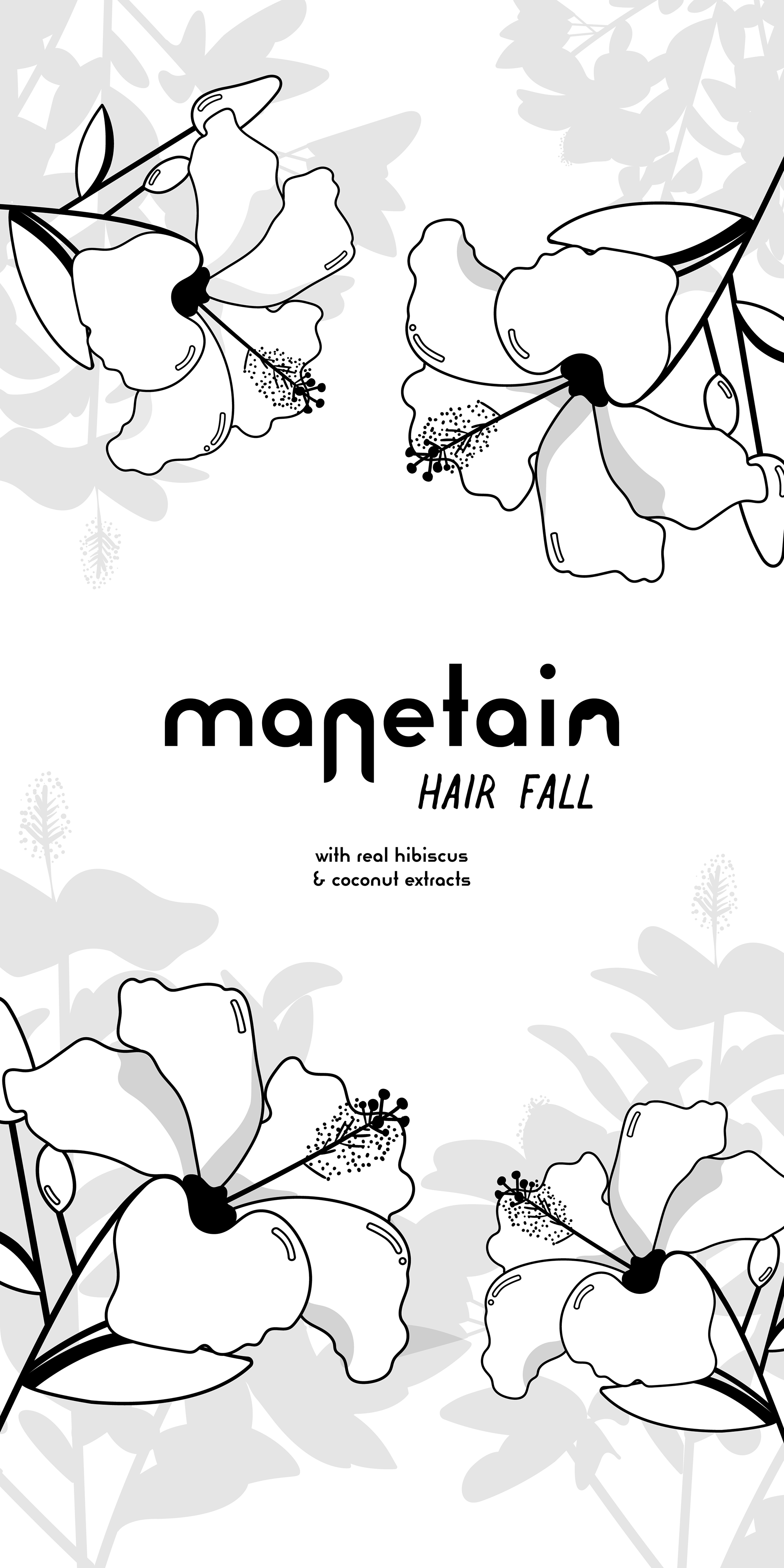
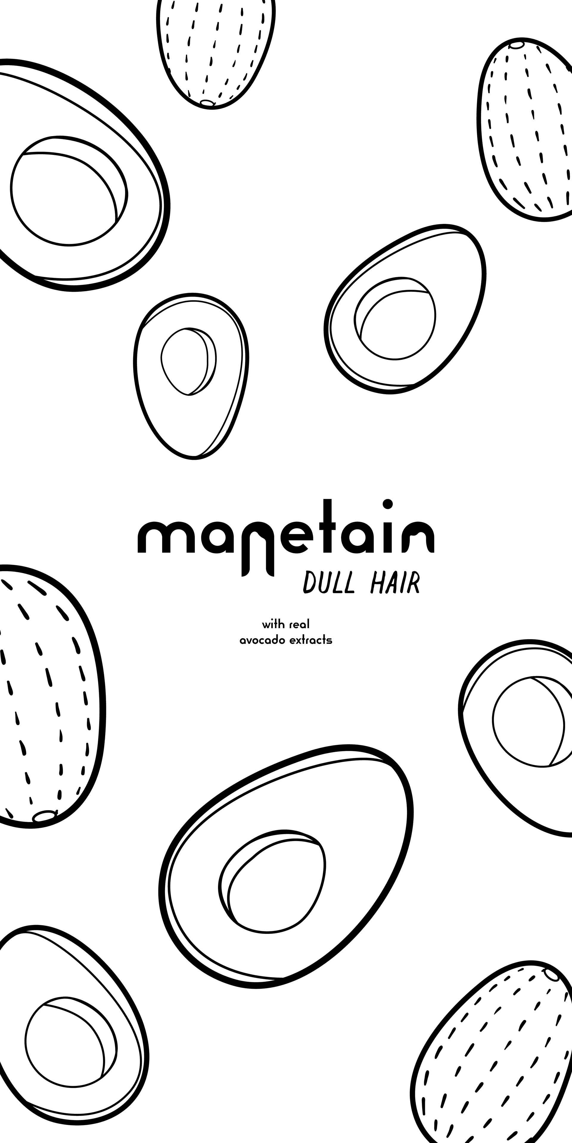
The characteristics of organic ingredients and inclusive design had to be showcased in the packaging. For the bottles, I decided to do illustrations of the key ingredients being used in vibrant colours that would catch the eye of the buyers when placed on a shelf amongst several other brands.
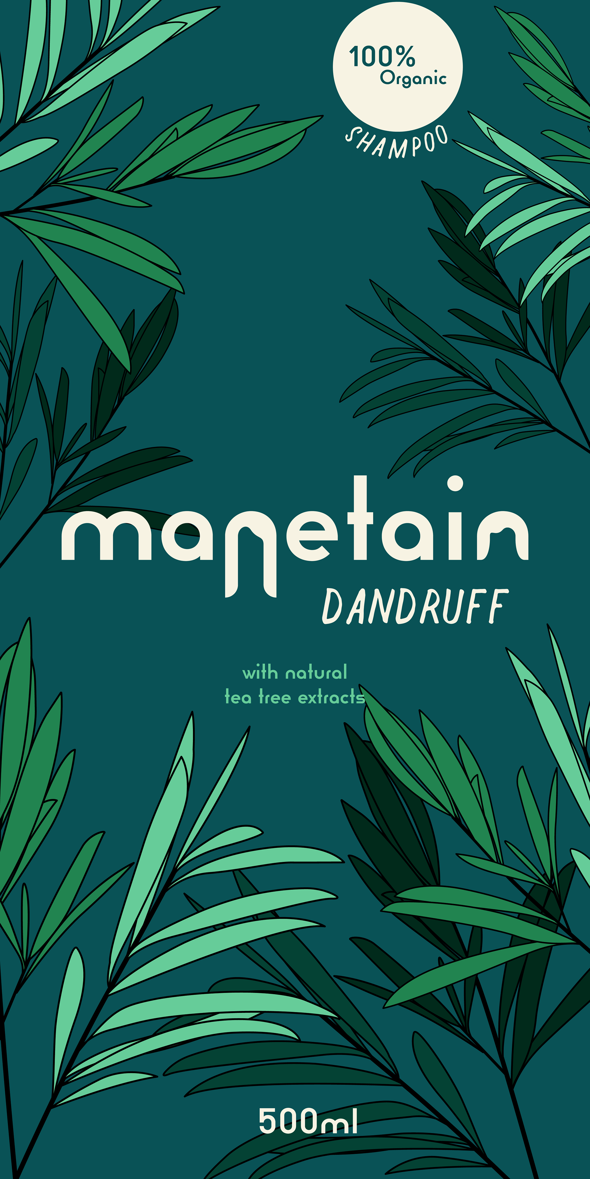
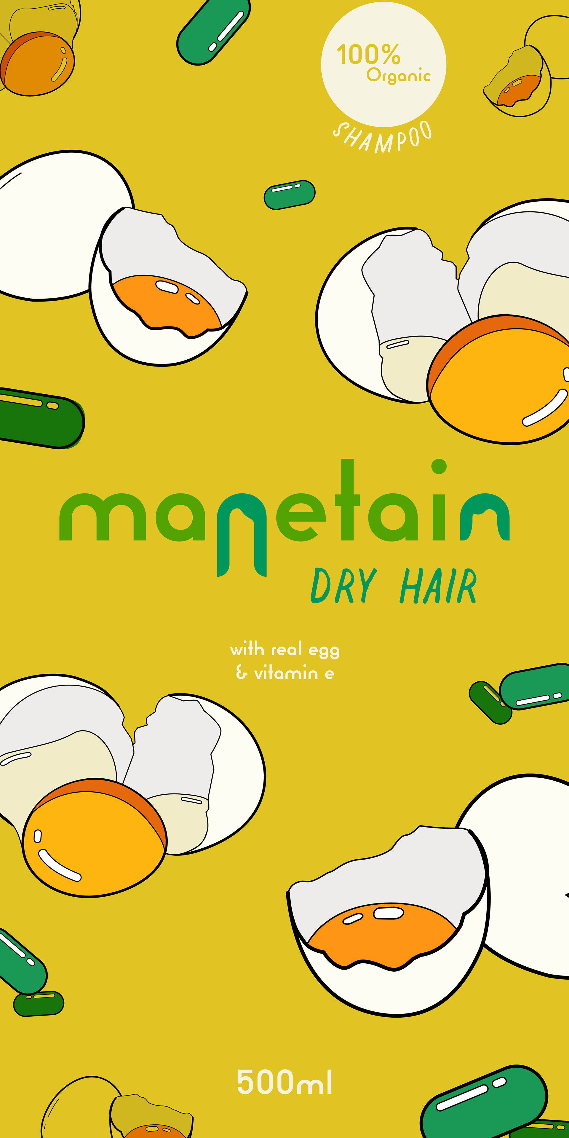
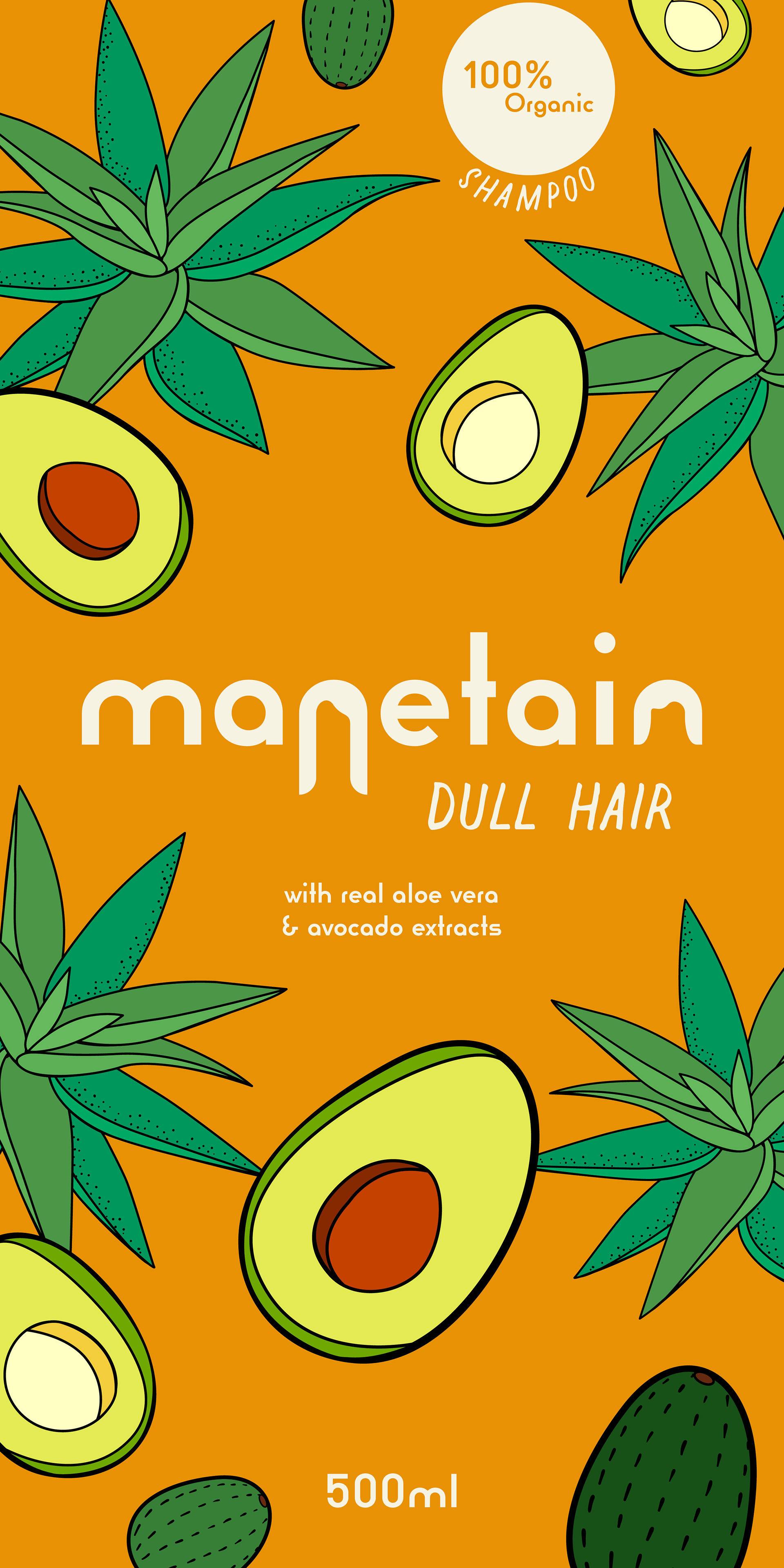
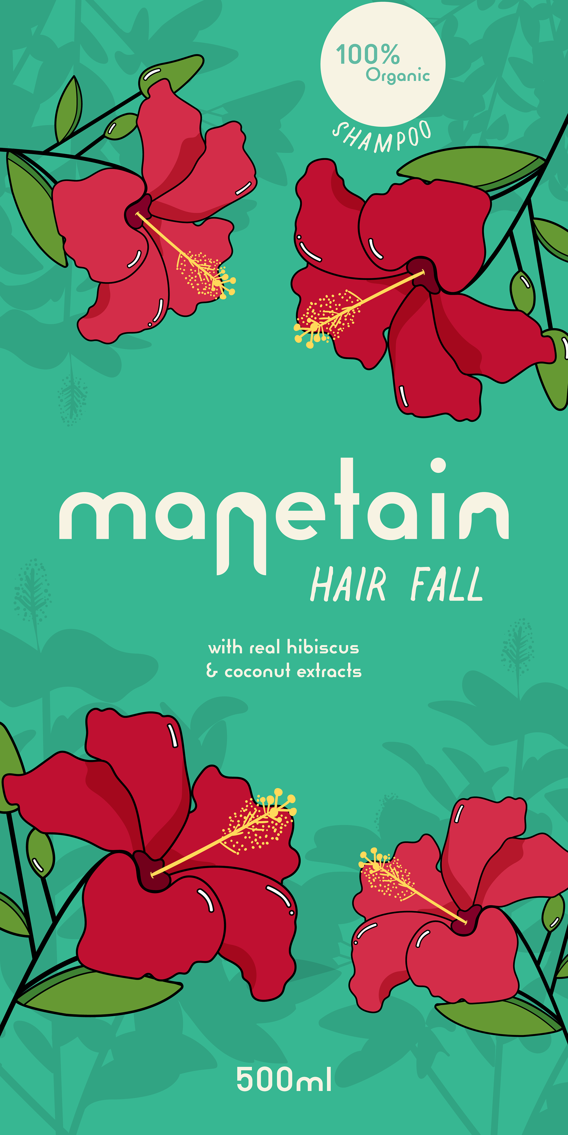
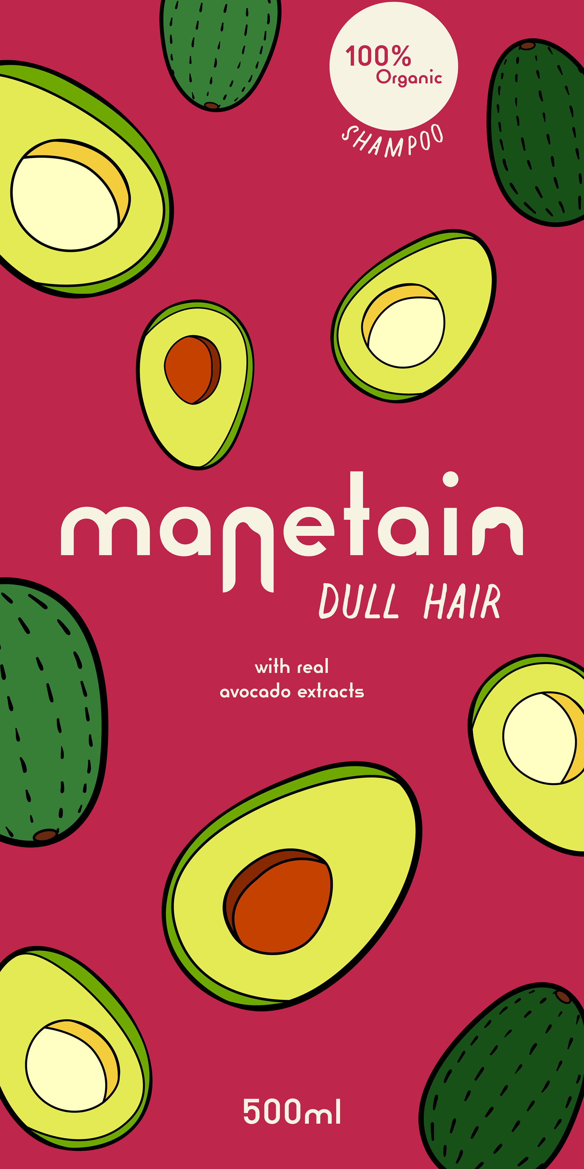
Manetain's vibrantly, illustrated bottles with a focus on 100% organic ingredients and a colourful, inclusive design.
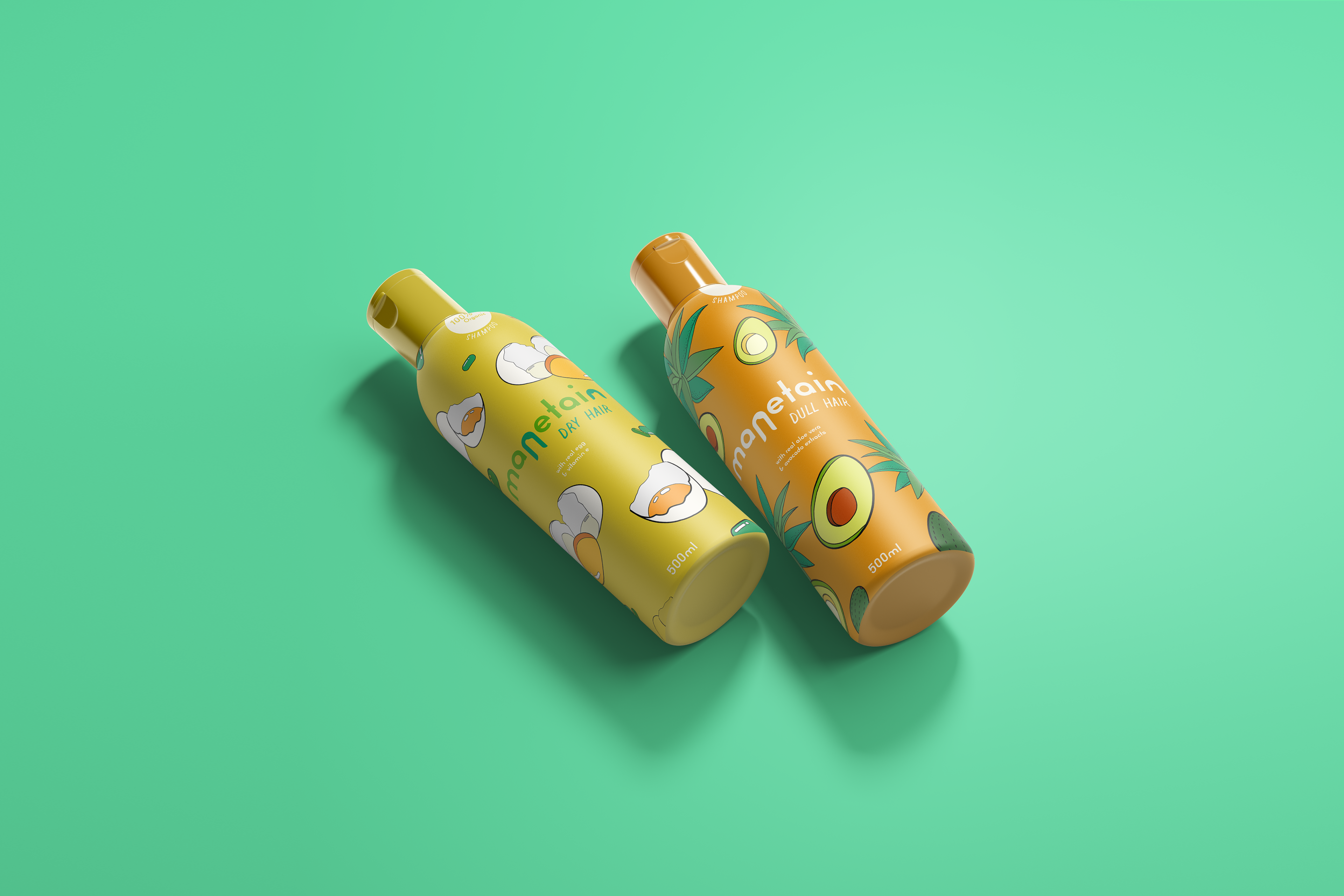
The Egg & Vitamin E shampoo for Dry Hair alongside the Avocado & Aloe Vera shampoo for Dull Hair
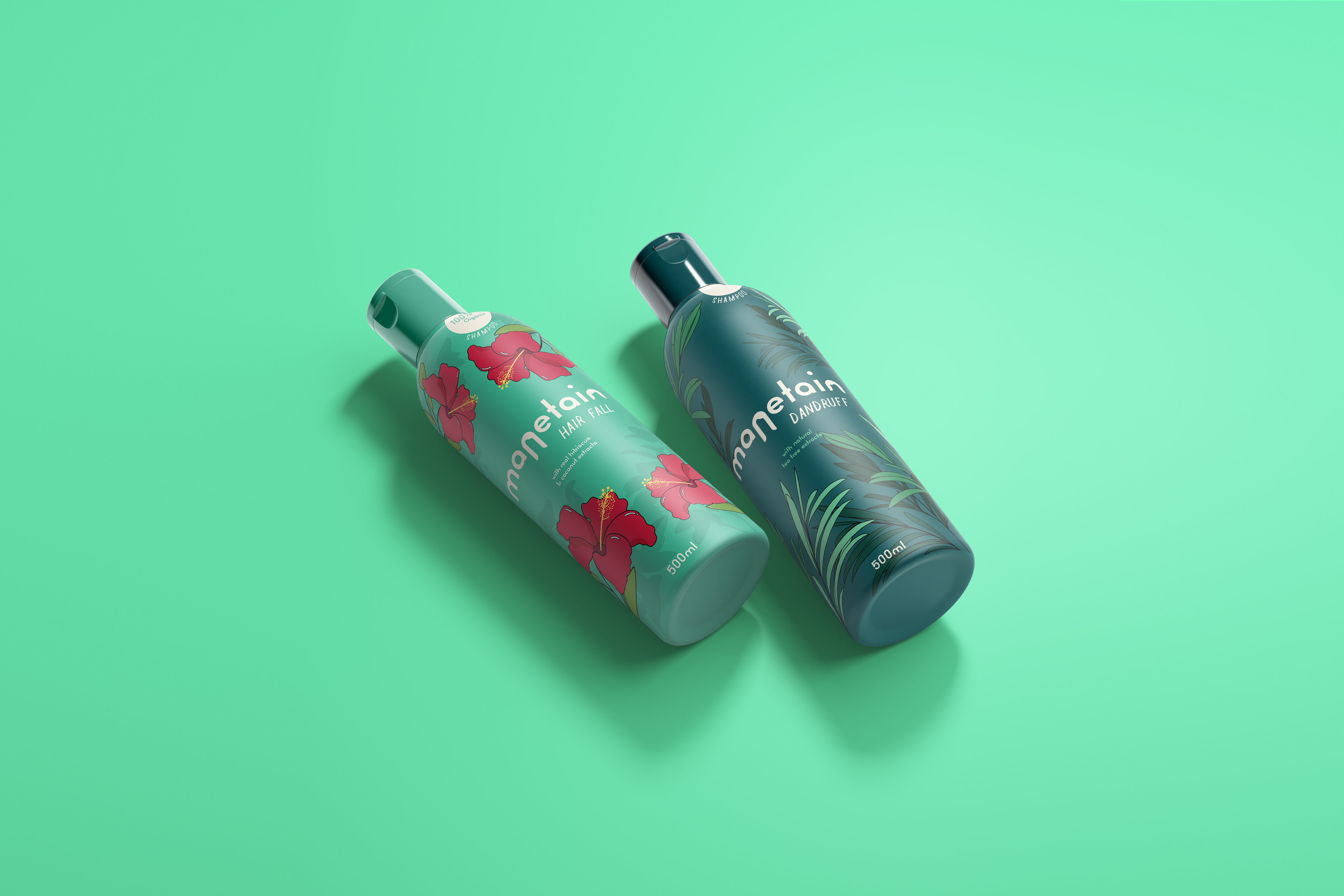
The Hibiscus & Coconut shampoo for Hair Fall alongside the Tea Tree shampoo for Dandruff prone Hair.
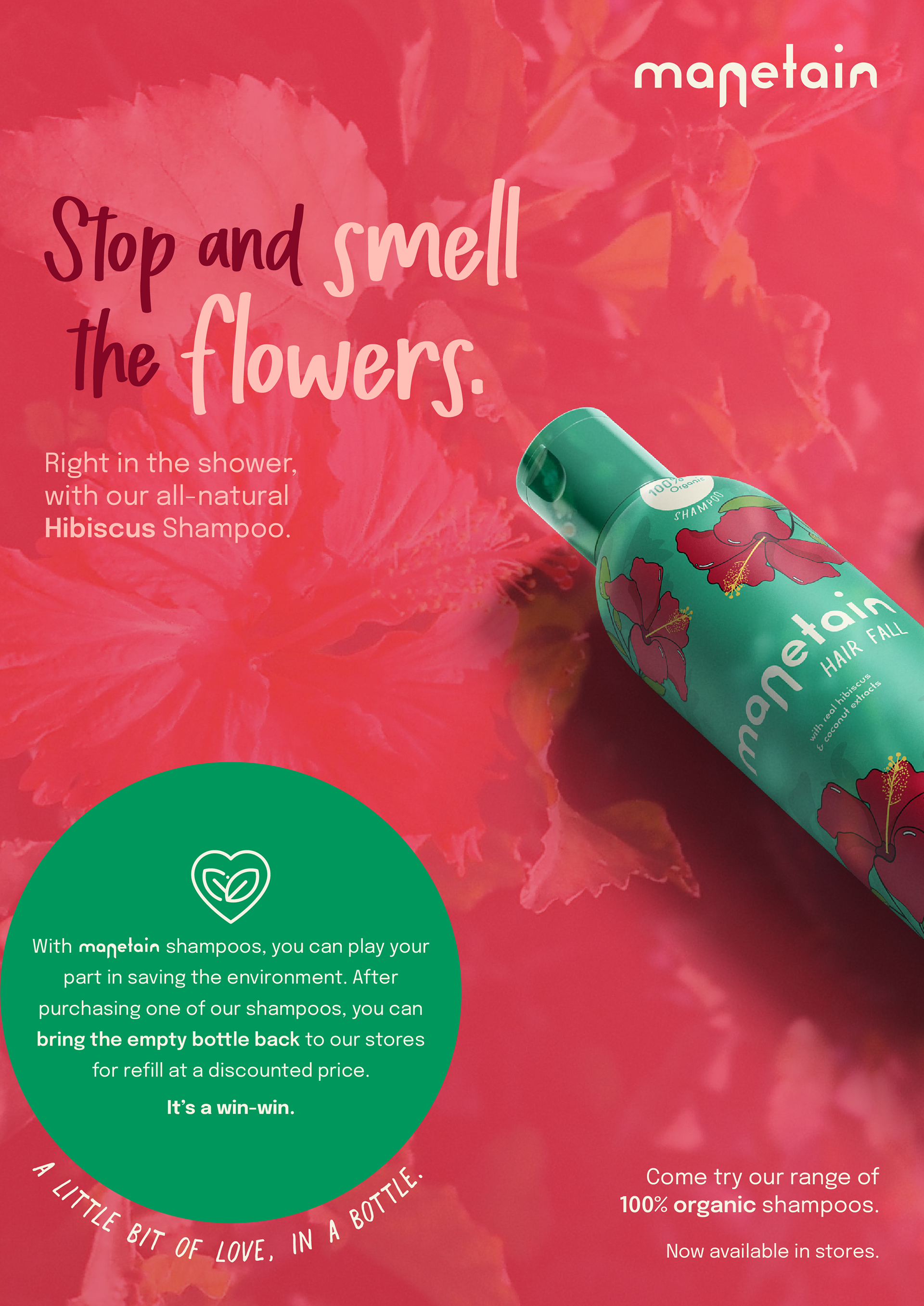
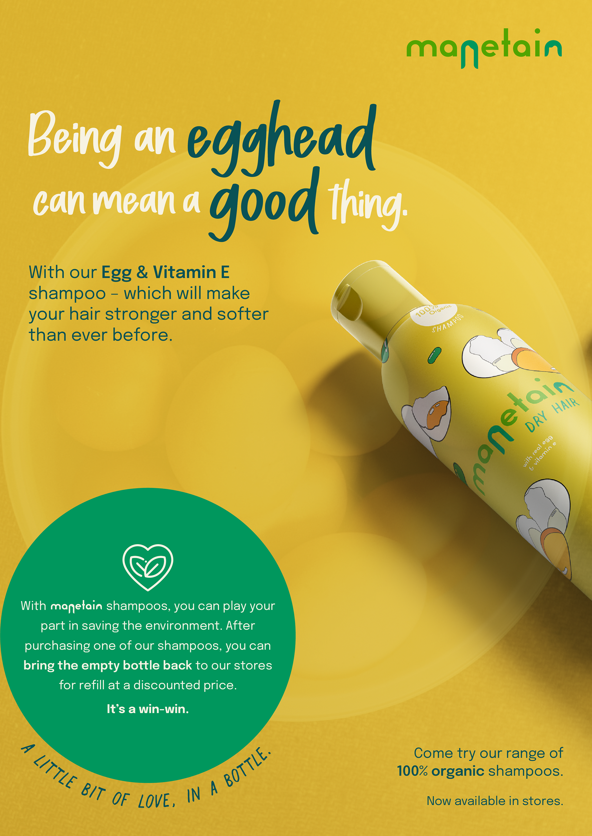
After designing the packaging, I had to start ideating the advertising collateral for the brand. This was extremely crucial as it is what targets the consumers and also gives them more information about the product and its features. The aspects I wanted to focus on through my advertising campaign were the following:
• 100% organic, natural ingredients
• Fun, loving and young personality
• Sustainable packaging
• Refillable / reusable bottles
Thank you. Hope you enjoyed this project!