Roles: Research / Creative visualisation / Illustration / Layout design / Information design / Design thinking
The objective of this project was to redesign the packaging for an existing product package by identifying the gaps and possibilities for improvement through the effective use of information visualisation.
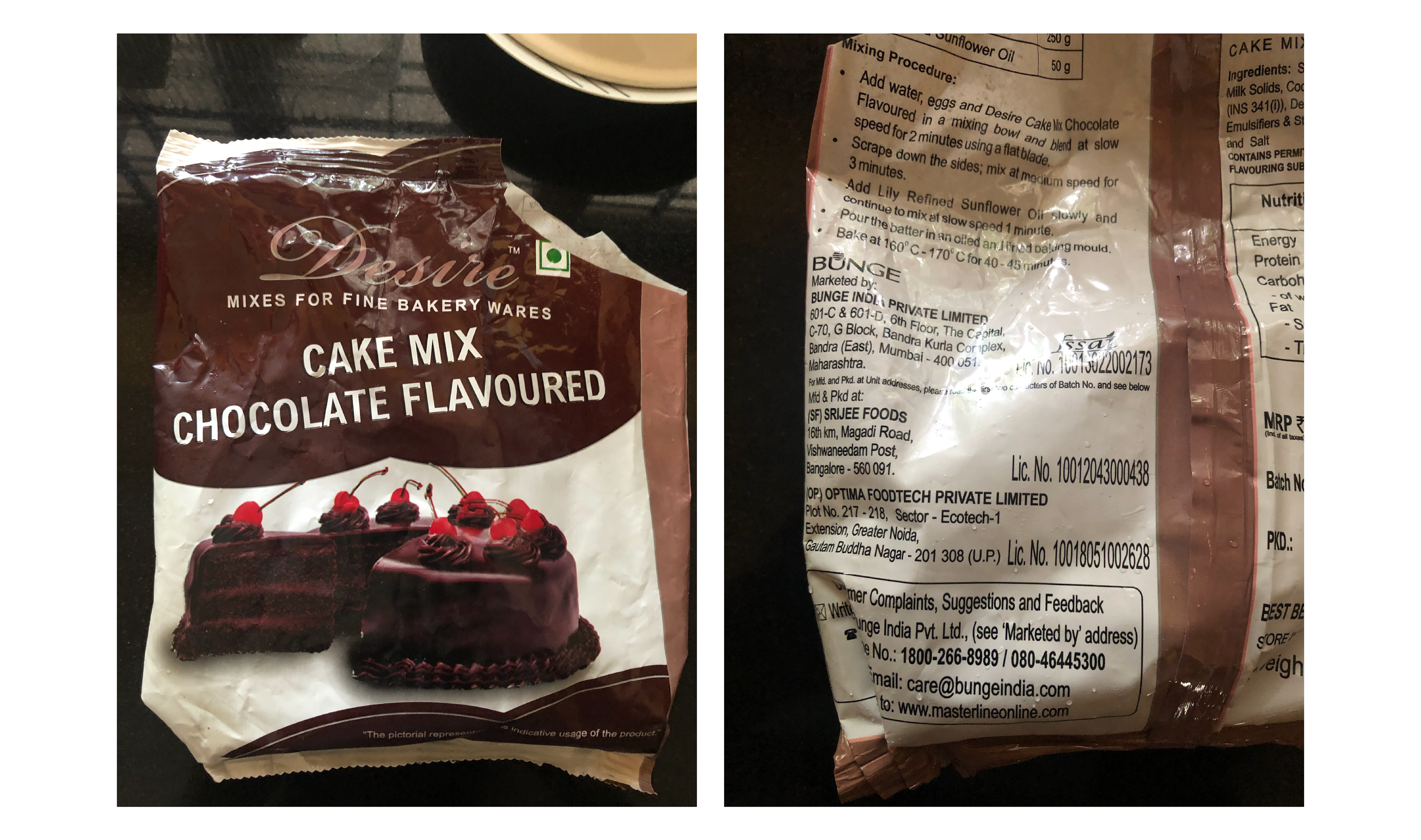
During the time of this project, I was at the store buying cake mix to make cake for a relative's birthday. The packaging for the product was dull and unappealing (in my personal opinion). For an end-product that is associated with fun and celebration, the product packaging had no semblance to it whatsoever. It was then that I decided to redesign the packaging for this product and see how I could potentially improve it, using the skills and principles I had picked up during this course.
Tools Used: Adobe Illustrator / Adobe InDesign / Adobe Photoshop / One by Wacom
Original Packaging
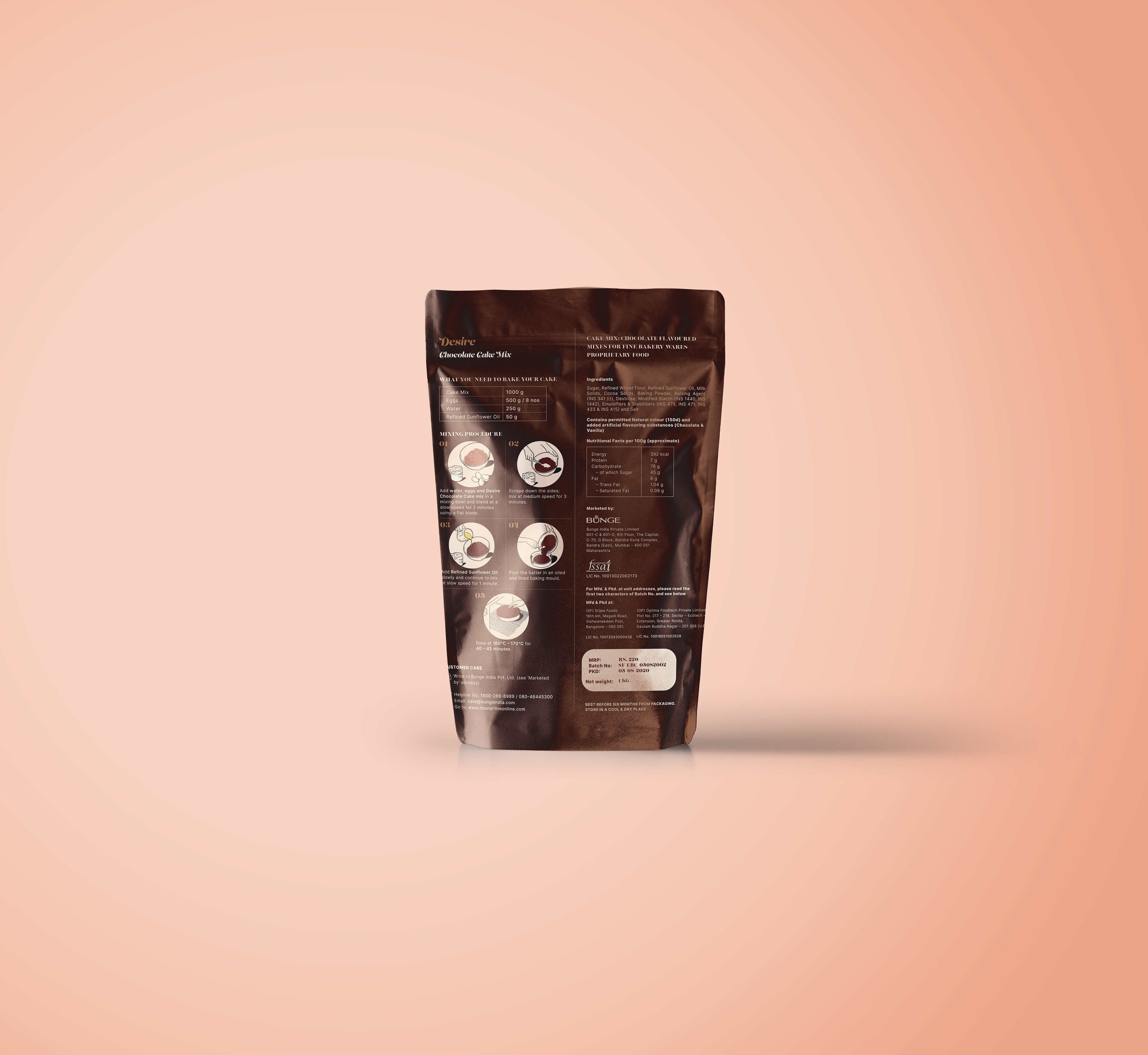
Insights
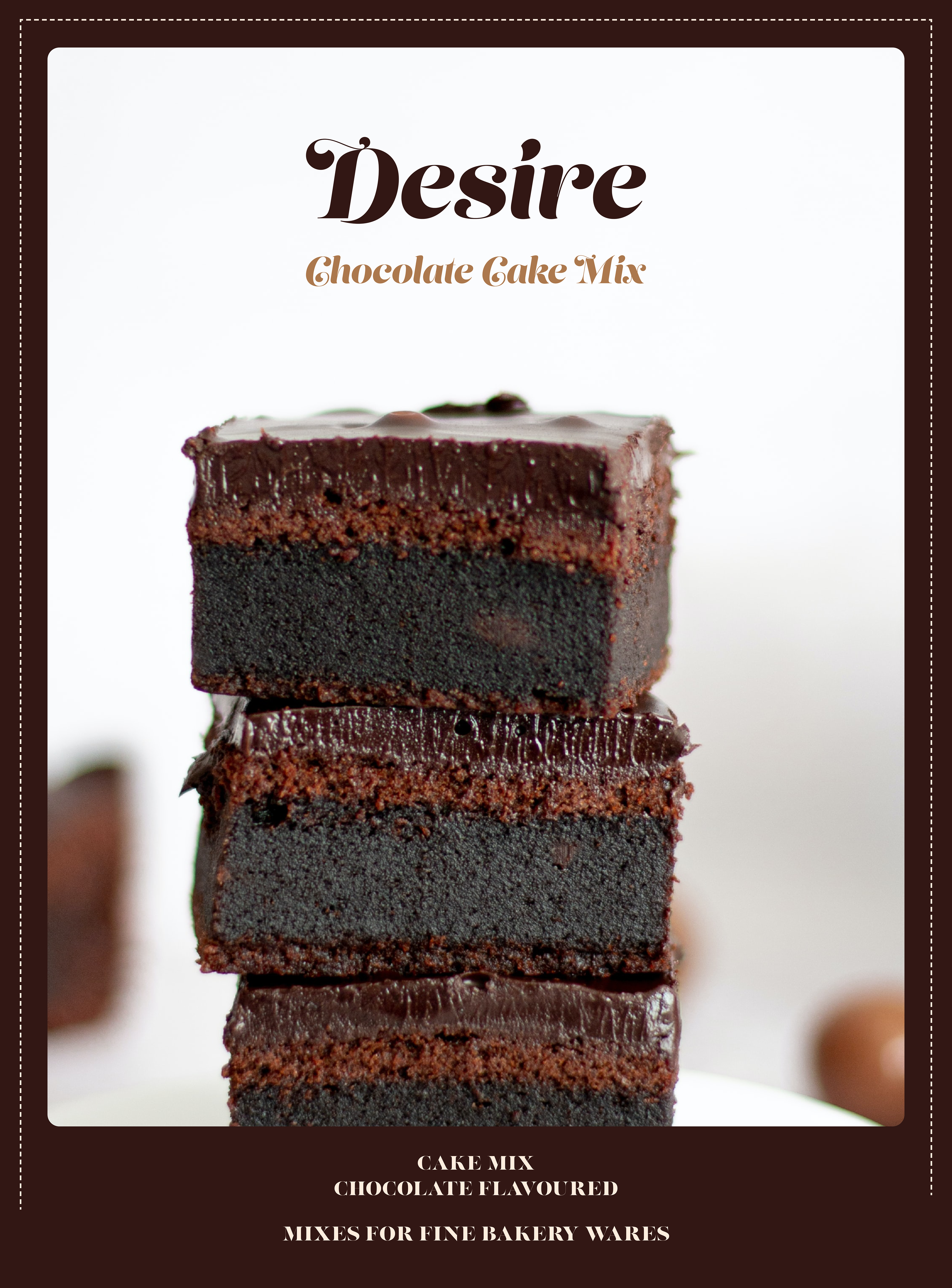
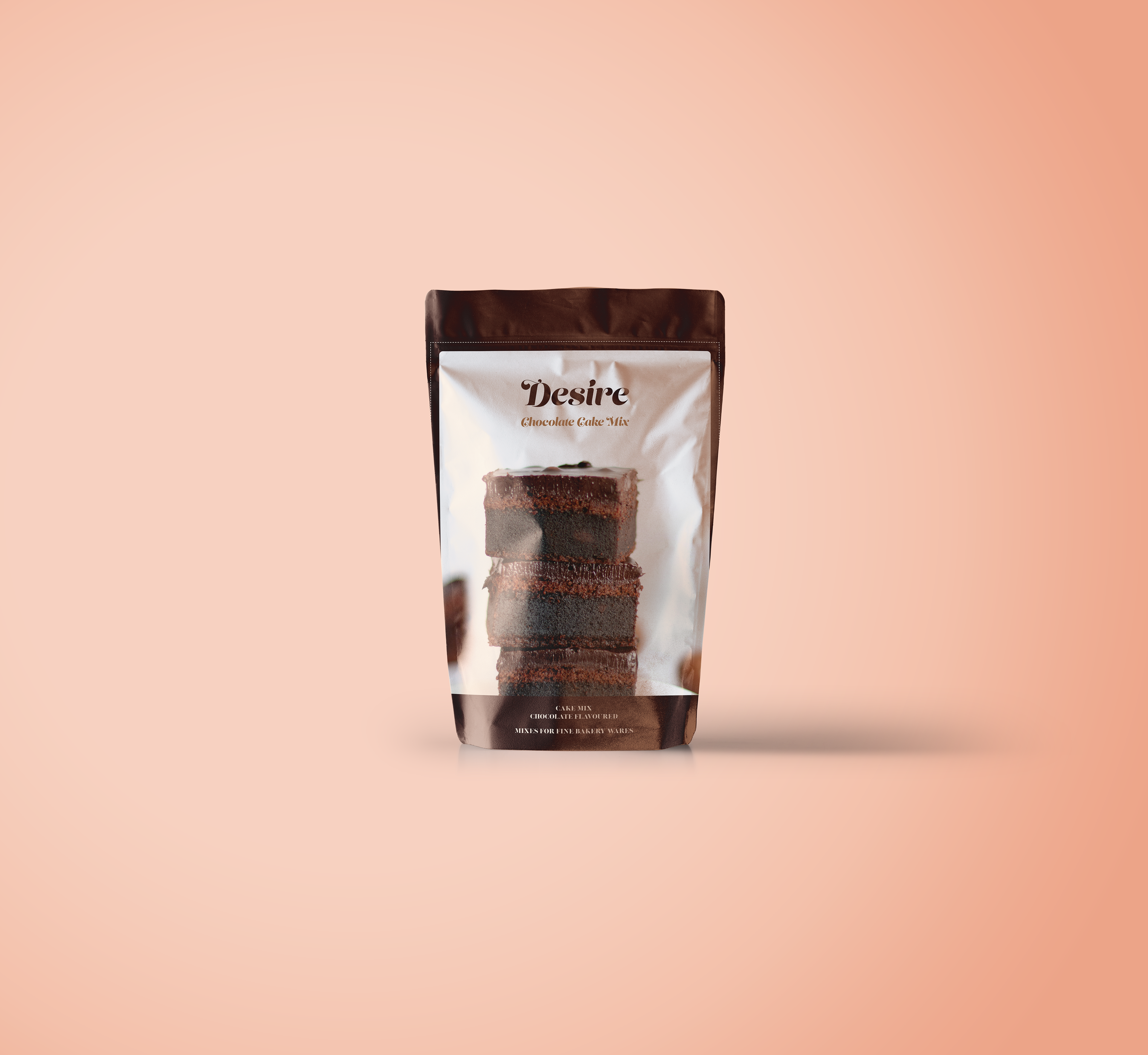
As a consumer, I aimed to make the product packaging more lively and appealing. I sought to ensure it stood out on shelves with attractive, unique designs. I explored two approaches: one with vibrant illustrations focused on catching attention, and the other with carefully chosen imagery closer to the actual product, accompanied by a rebranded cover.
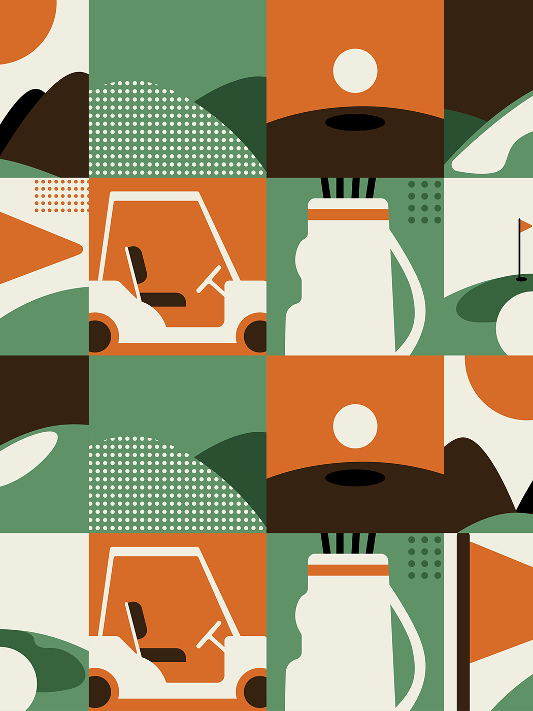
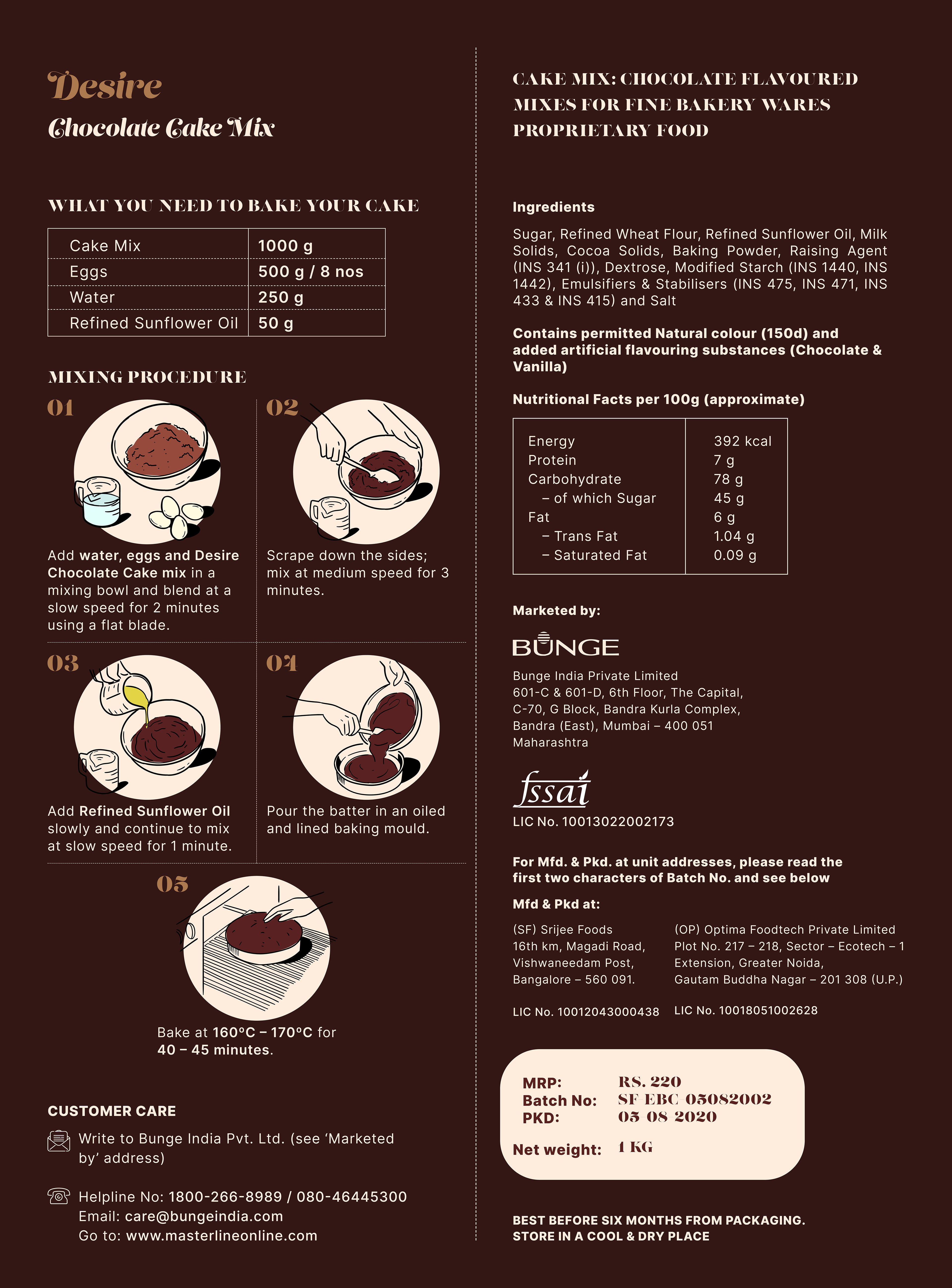
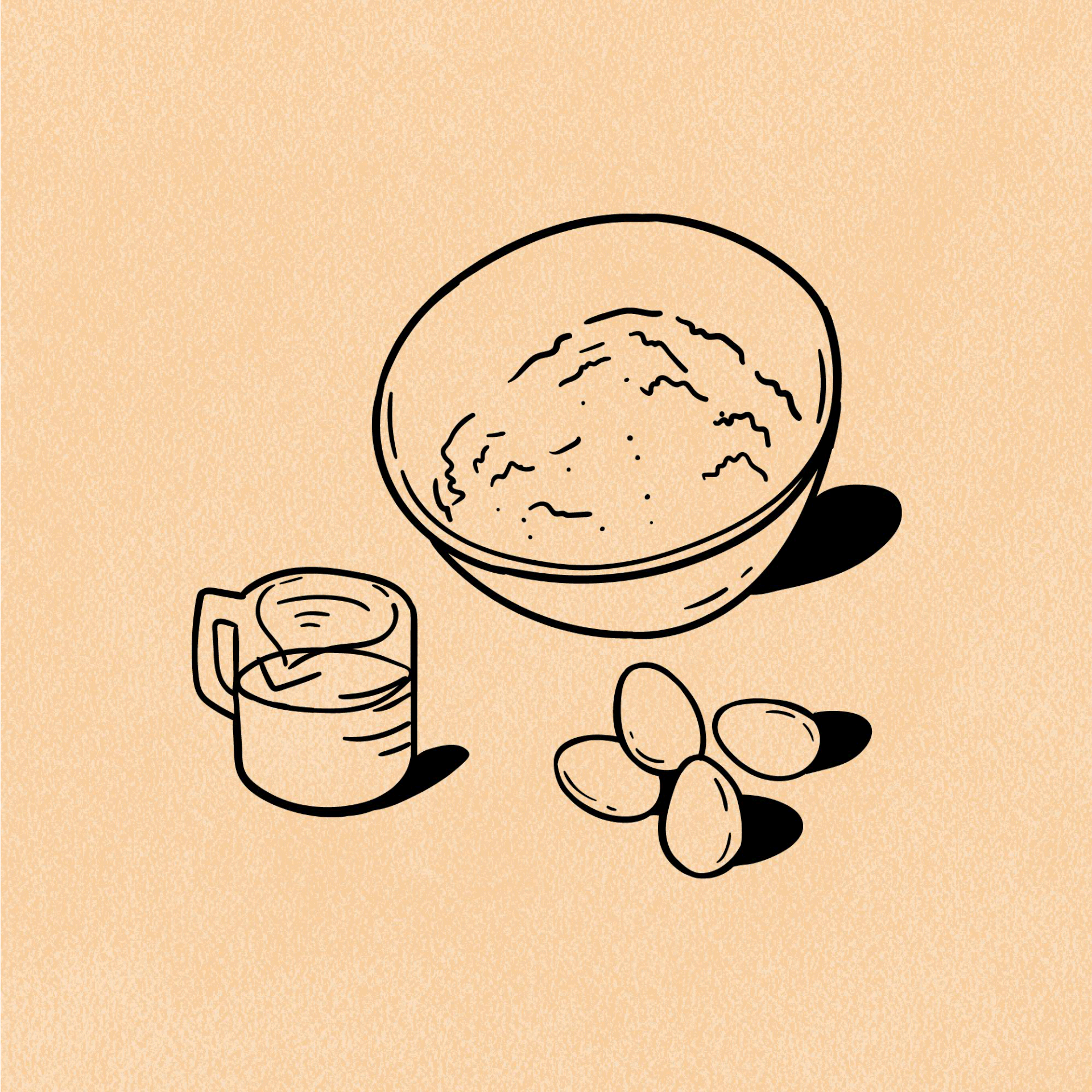
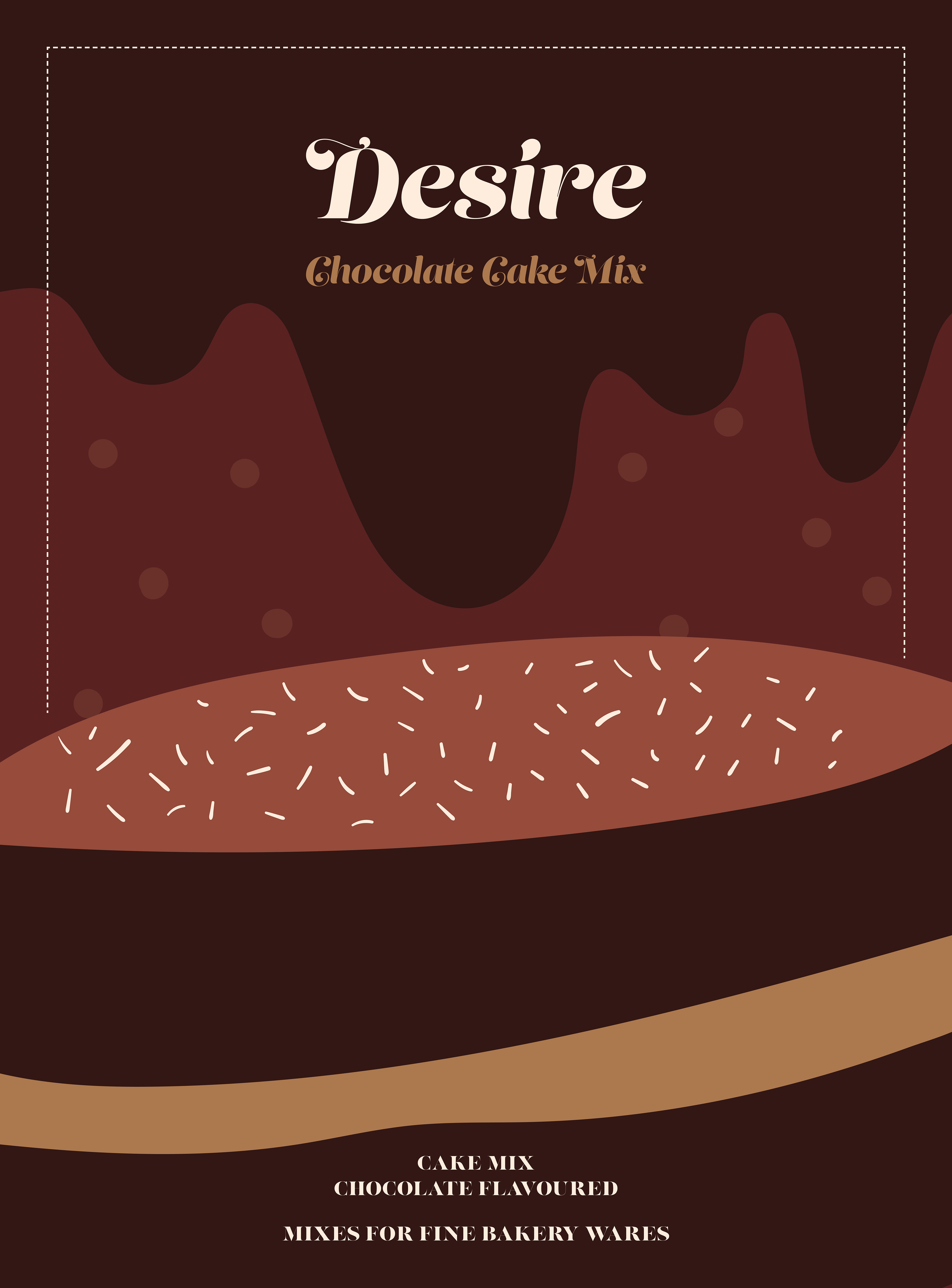
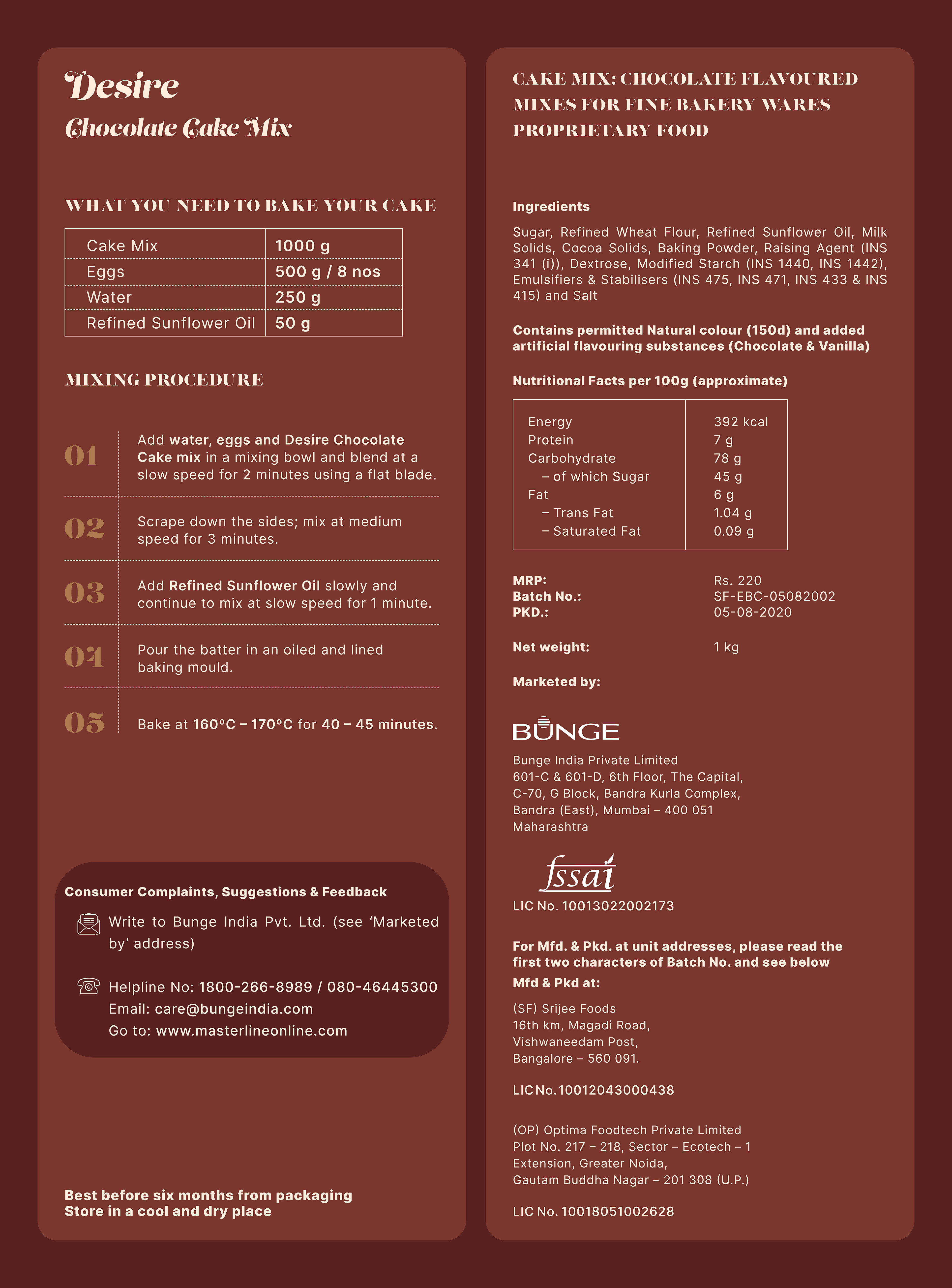
This design prioritises enticing, well-crafted imagery to captivate customers. In addition to featuring a prominent image on the front, I recognised the need for detailed cake-making instructions on the back—a crucial element I found lacking in the original packaging. To address this, I employed strategic illustrations, not only enhancing functionality but also injecting a playful charm into the product's cover.
Illustration
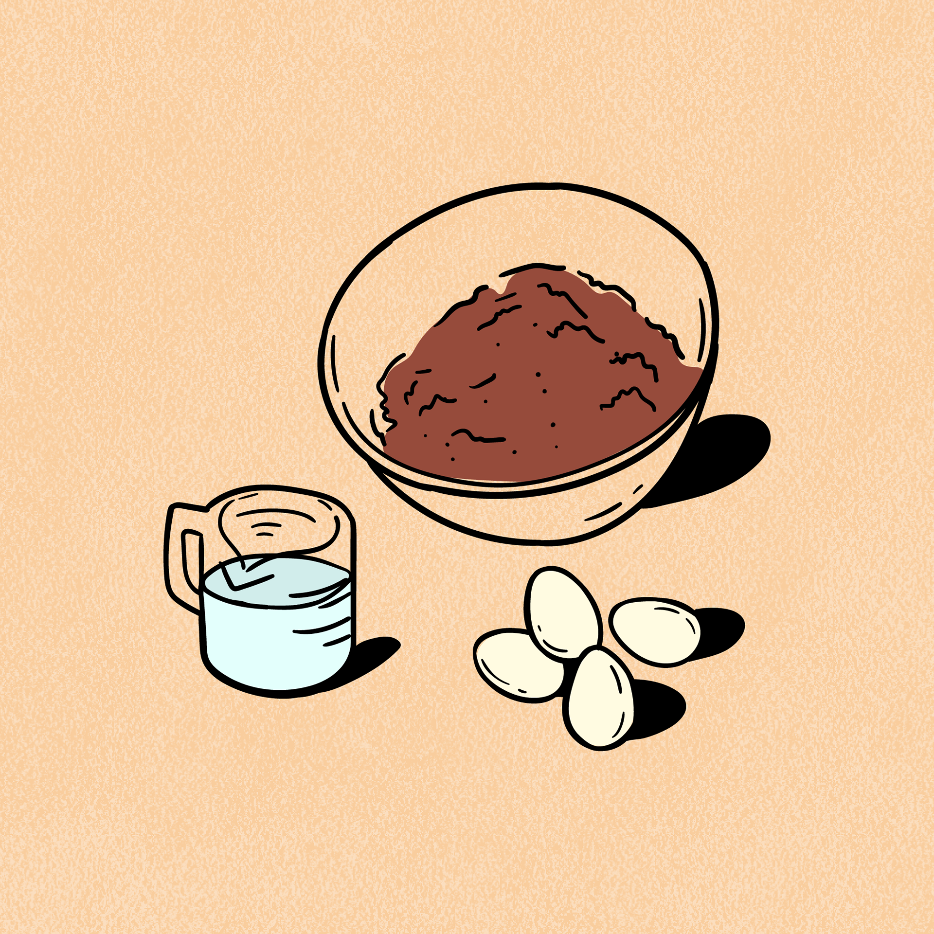
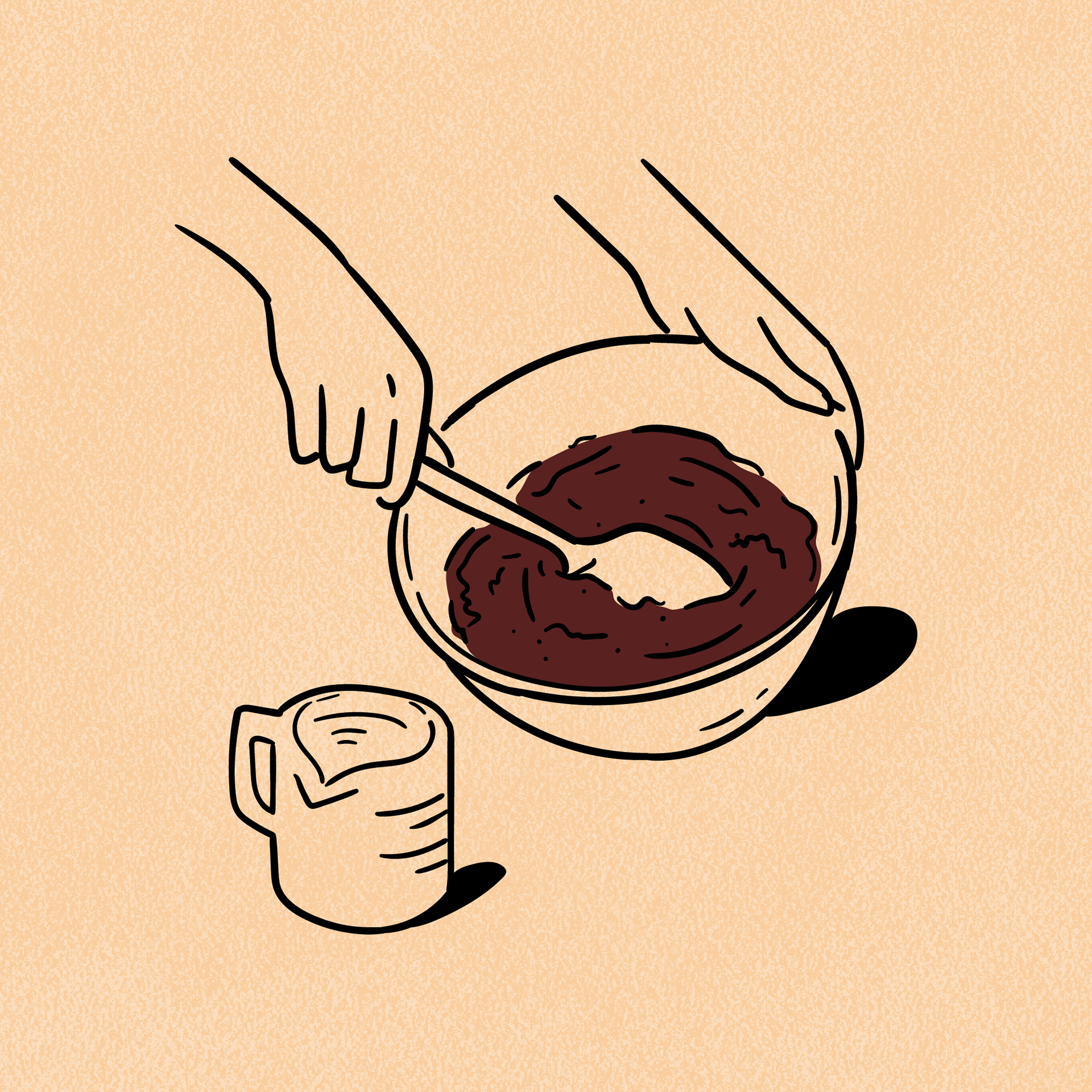
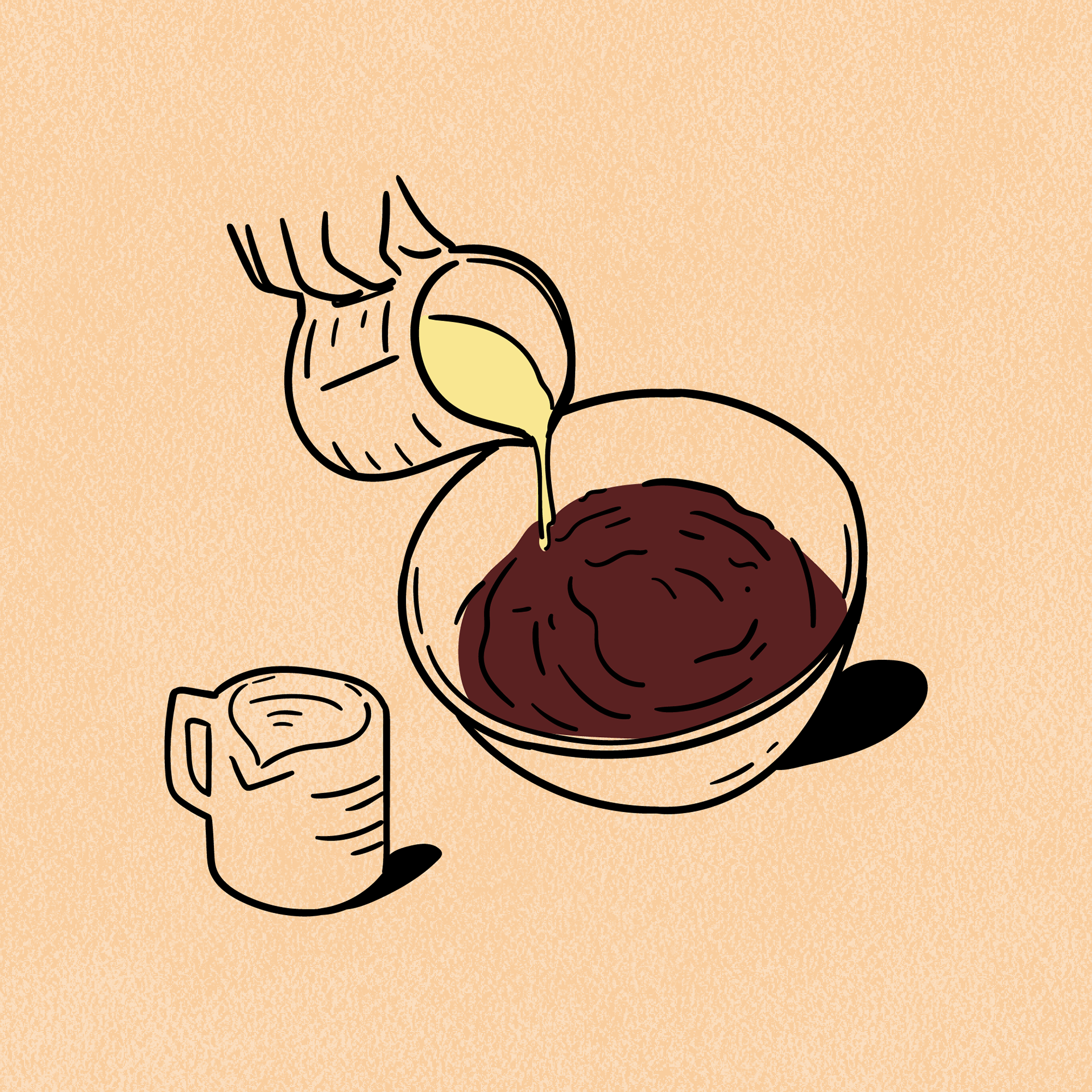
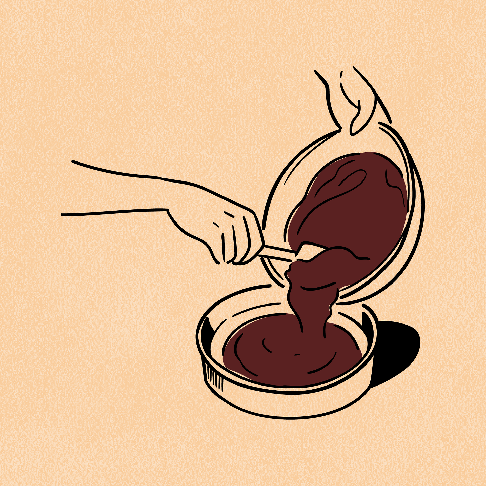
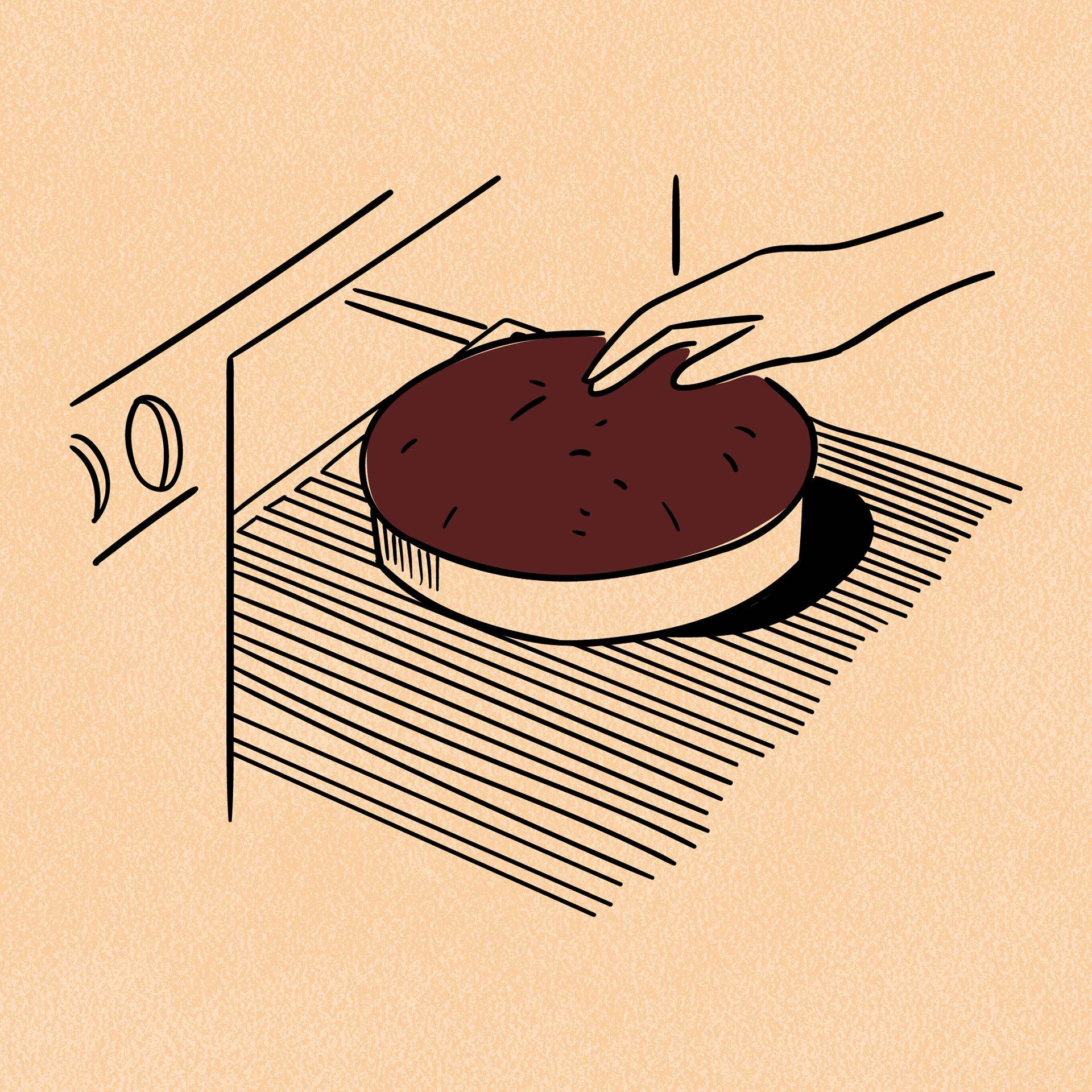
Illustrated instructions for making the cake was a good way to ensure the instructions would be accessible for everyone and easy to comprehend through visuals. This was a good alternative to huge chunks of text which could affect the packaging design.
Visual Design
For the illustration-centric approach, I crafted a packaging design that embraced abstract vibrancy, standing out remarkably from typical supermarket displays. My goal was innovation, aiming to elicit excitement with a distinctive colour scheme that harmonised with the product.
The chosen palette centered around browns, tailored to match specific cake mixes—for instance, cream and beige tones for a vanilla cake. To maintain balance, I opted for a minimalistic approach on the back cover, featuring straightforward text-based instructions while avoiding excessive use of illustrations.
Thank you! Hope you enjoyed this project as much as I enjoyed making it.