Roles: Design research / Writing / Illustration / Iconography design / Graphic design / Branding & identity / Layout design
East Point Golf Club (EPGC) in Vishakhpatnam approached a friend to reimagine their branding. He brought me on to the project to support the process and together we worked on designing a brand new look and feel. I worked on a complete revamp of visual language elements introducing vibrant brand patterns and brand icons, as well as the consolidated brand guideline book for them, which were in line with their fresh, new image.
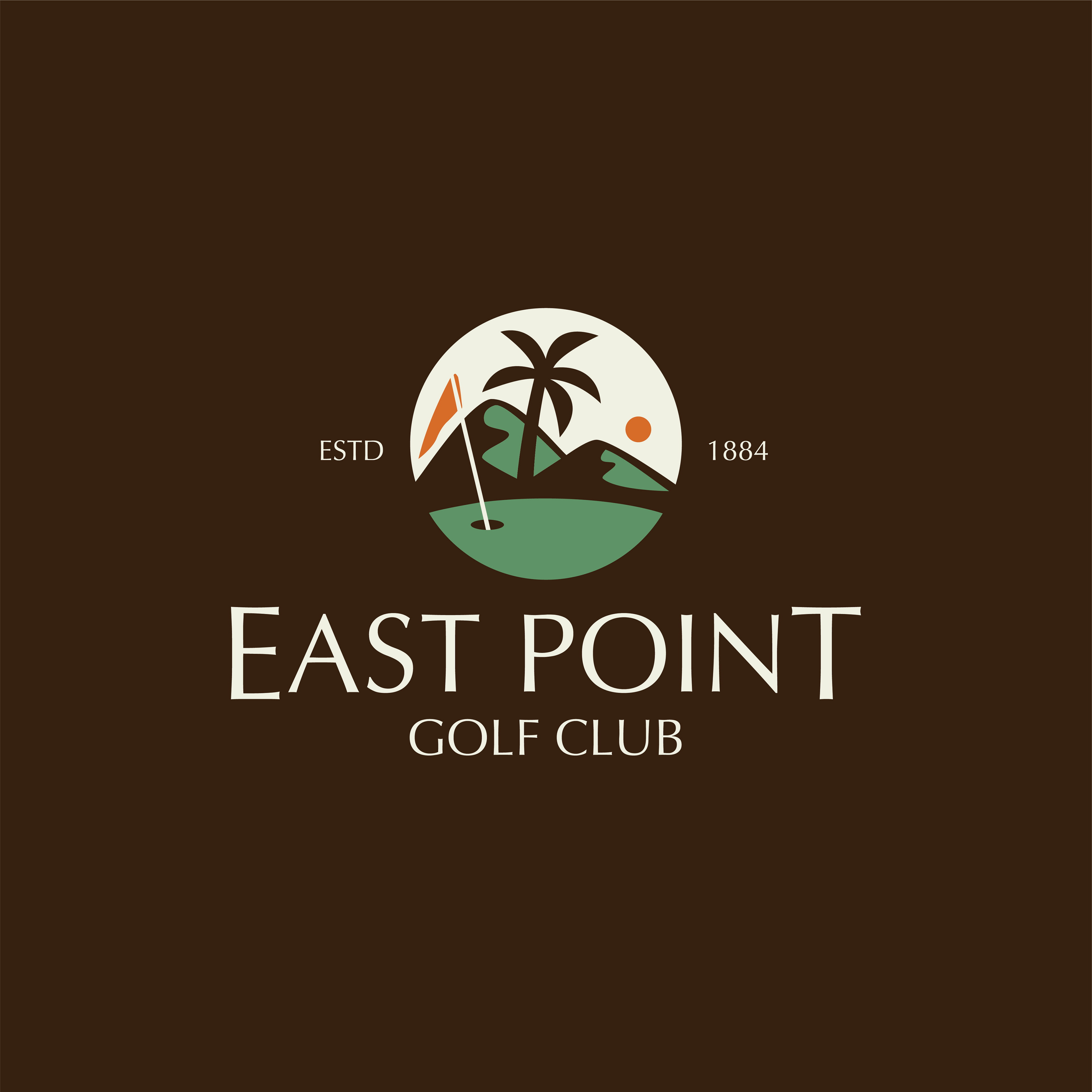
East Point Golf Club (EPGC) is a reputed golf club that was established in 1884. Due to its early inception, we felt it was time to rebrand and design an identity for the brand that would communicate its personality and allow it to garner more visibility amongst its other competitors in the market.
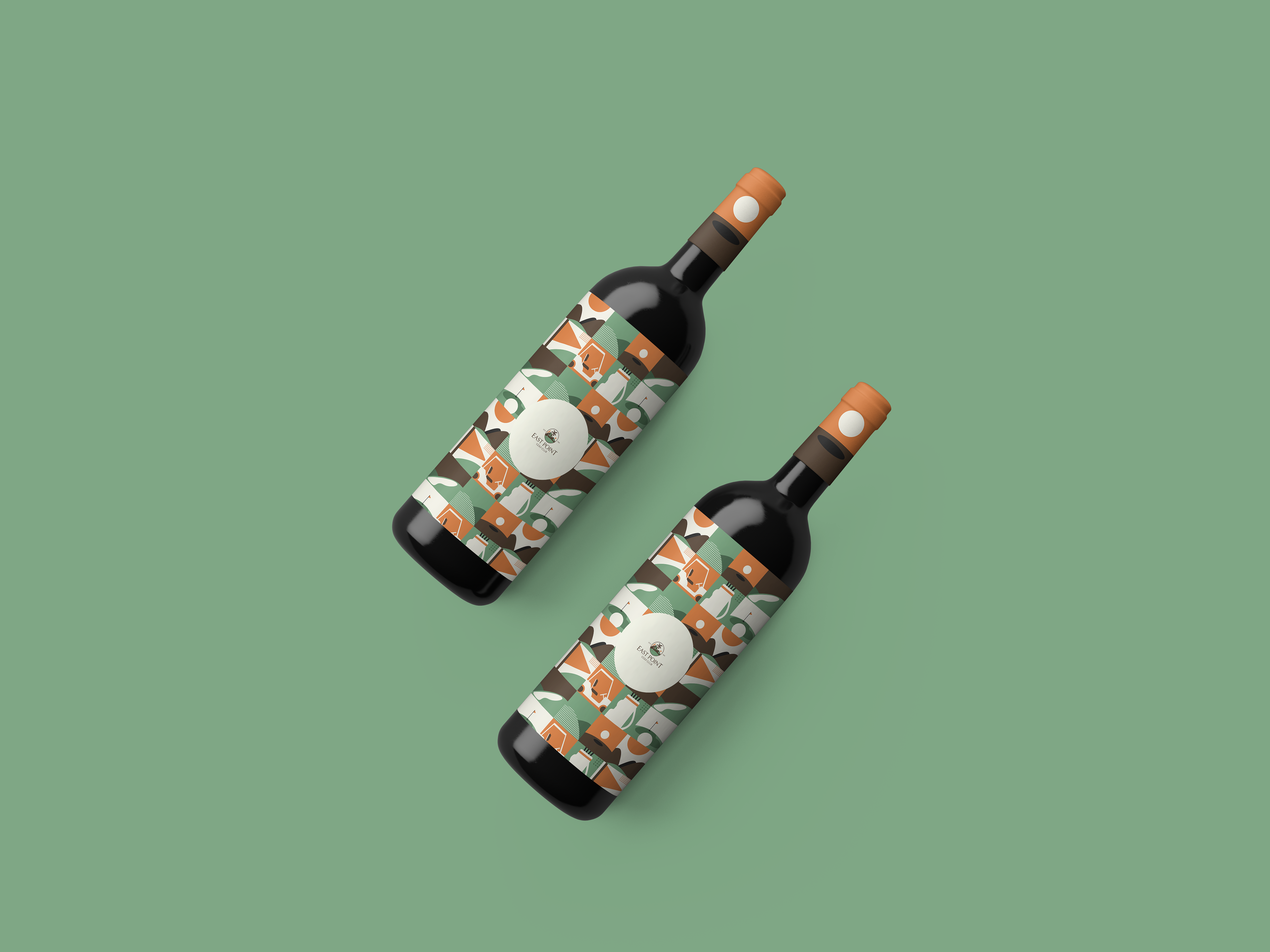
After the logo was redesigned, we worked on creating the brand patterns and brand icons which would be used for the club's collaterals and communication as well as the brand guideline book which would contain instructions on the logo usage, etc.
Logo Refresh
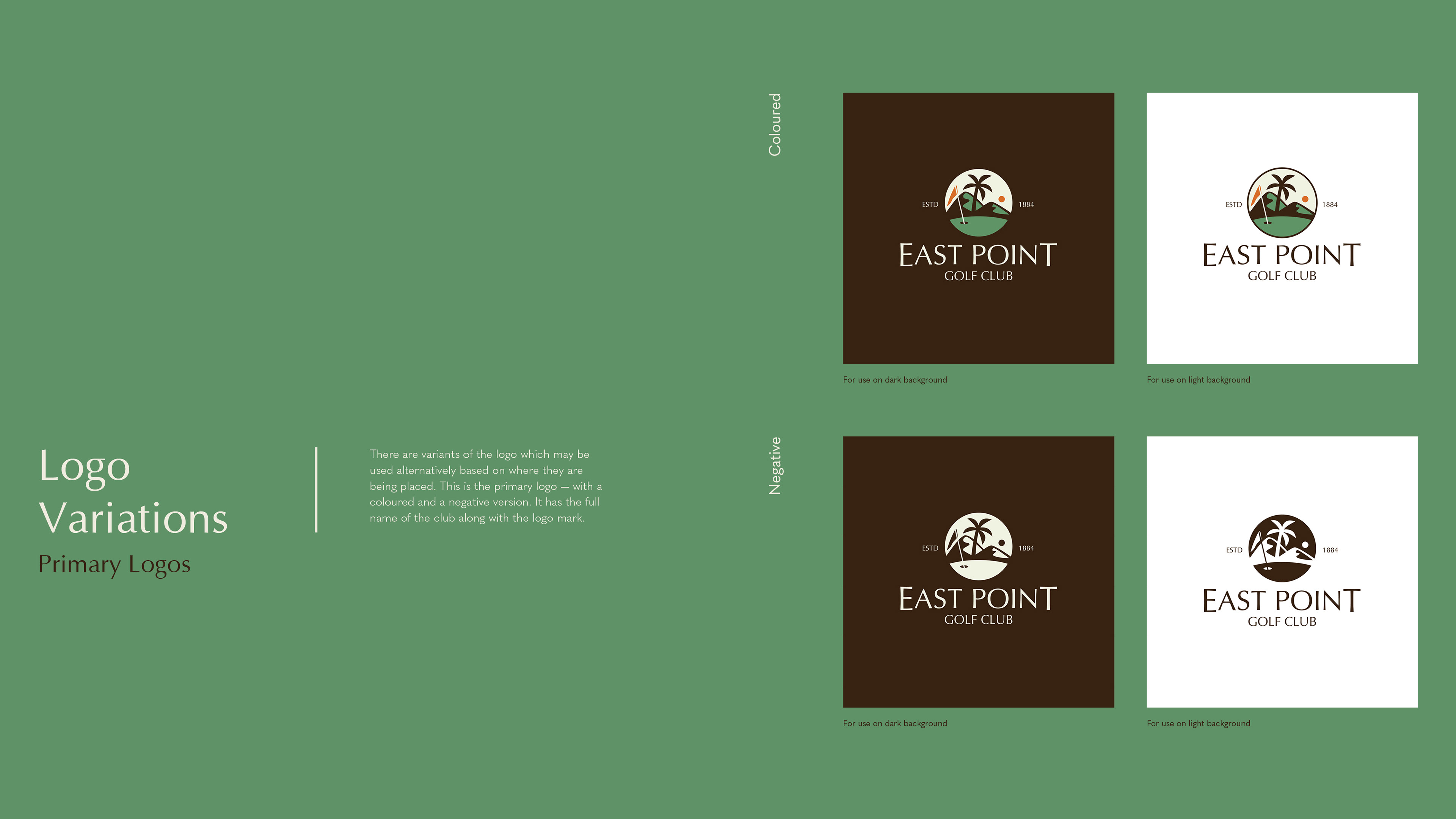
To begin with, the logo was redesigned keeping in mind the specialties of EPGC. All the elements of EPGC's old logo were retained only changing it in illustration style and colour choice. This was done to ensure that the club's identity would be retained and members would still be able to resonate with and identify the brand.
Development of Visual Elements
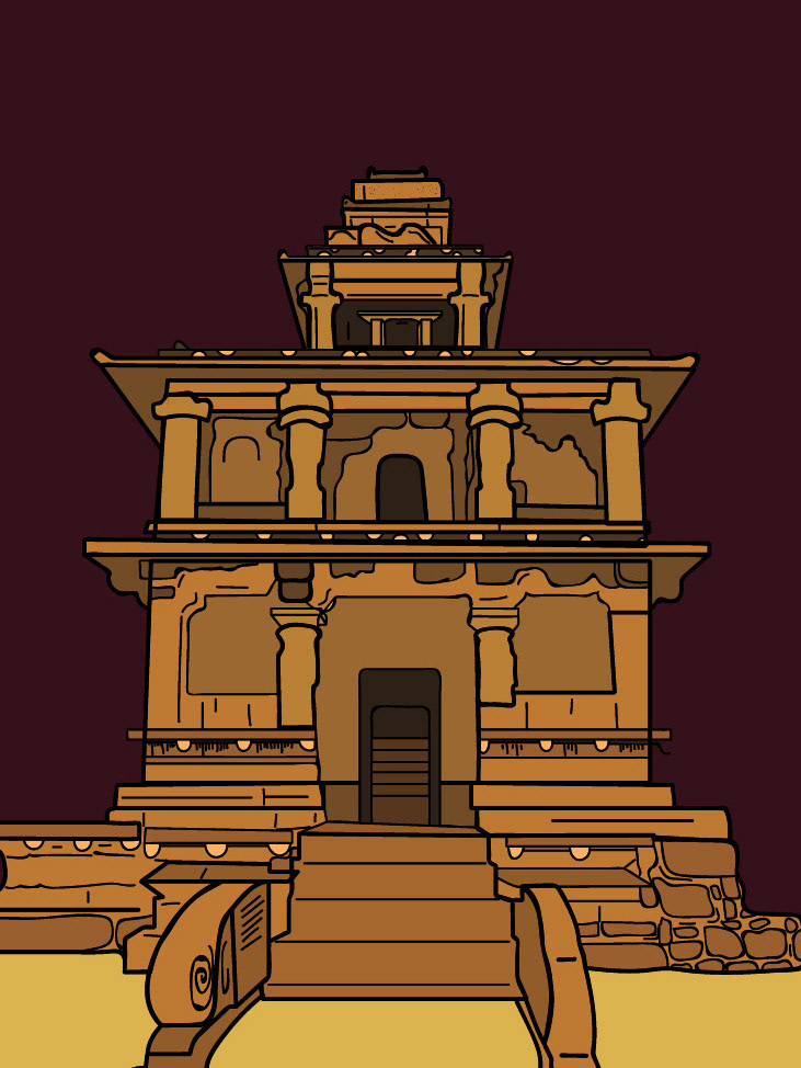
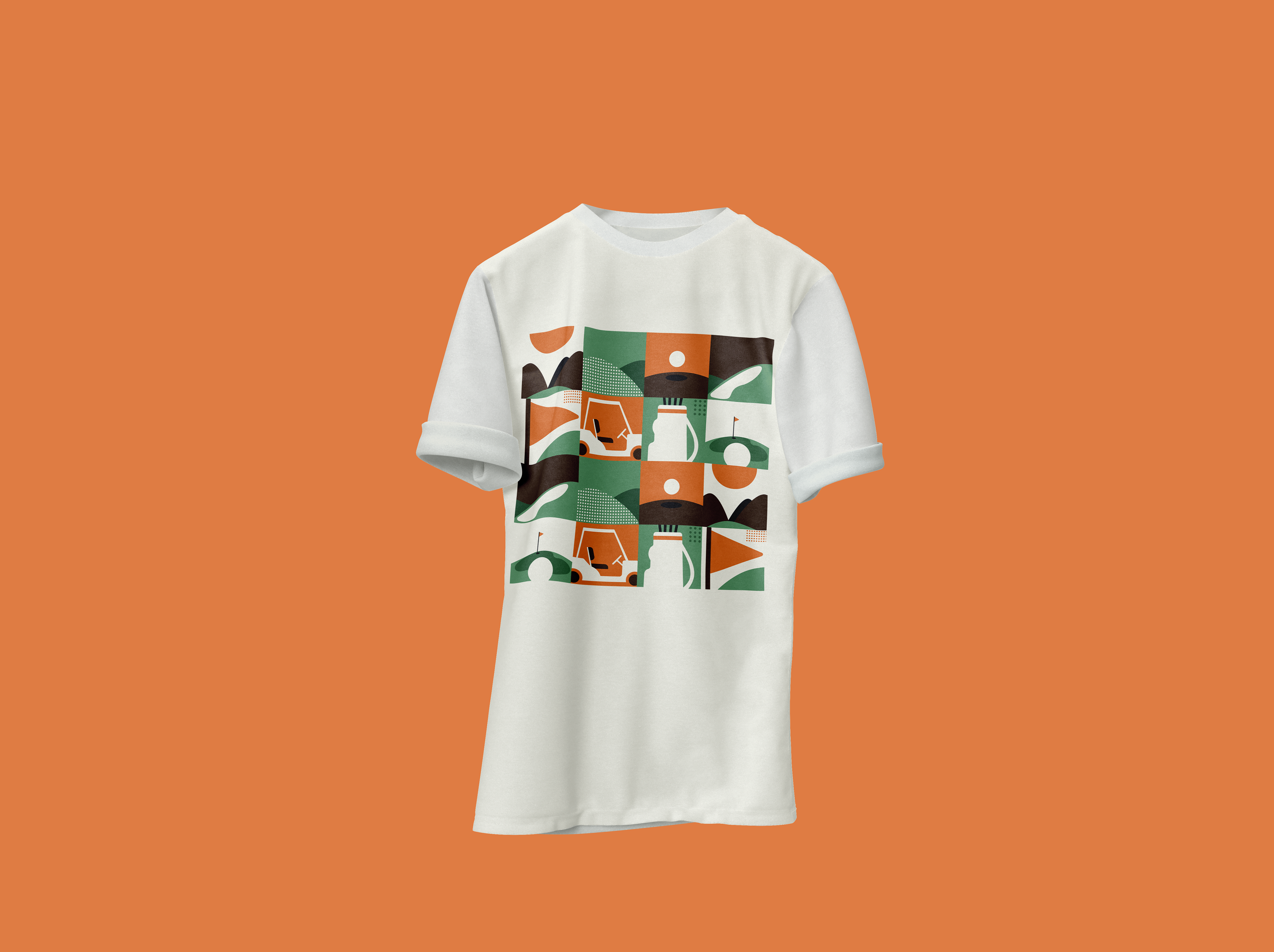
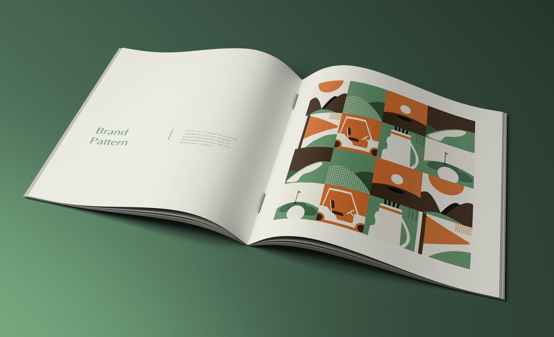
Based on the logos as well as the club's reputation for having a diverse range of courses for golf enthusiasts — we had to think up a brand pattern which could be used for the club's collateral. For instance to be used on tee-shirts, caps or so on.
I started by creating multiple illustrations which depicted different elements of golf or different areas of a golf course. These separate illustrations were then placed in a 4x4 table to create a repetitive pattern.


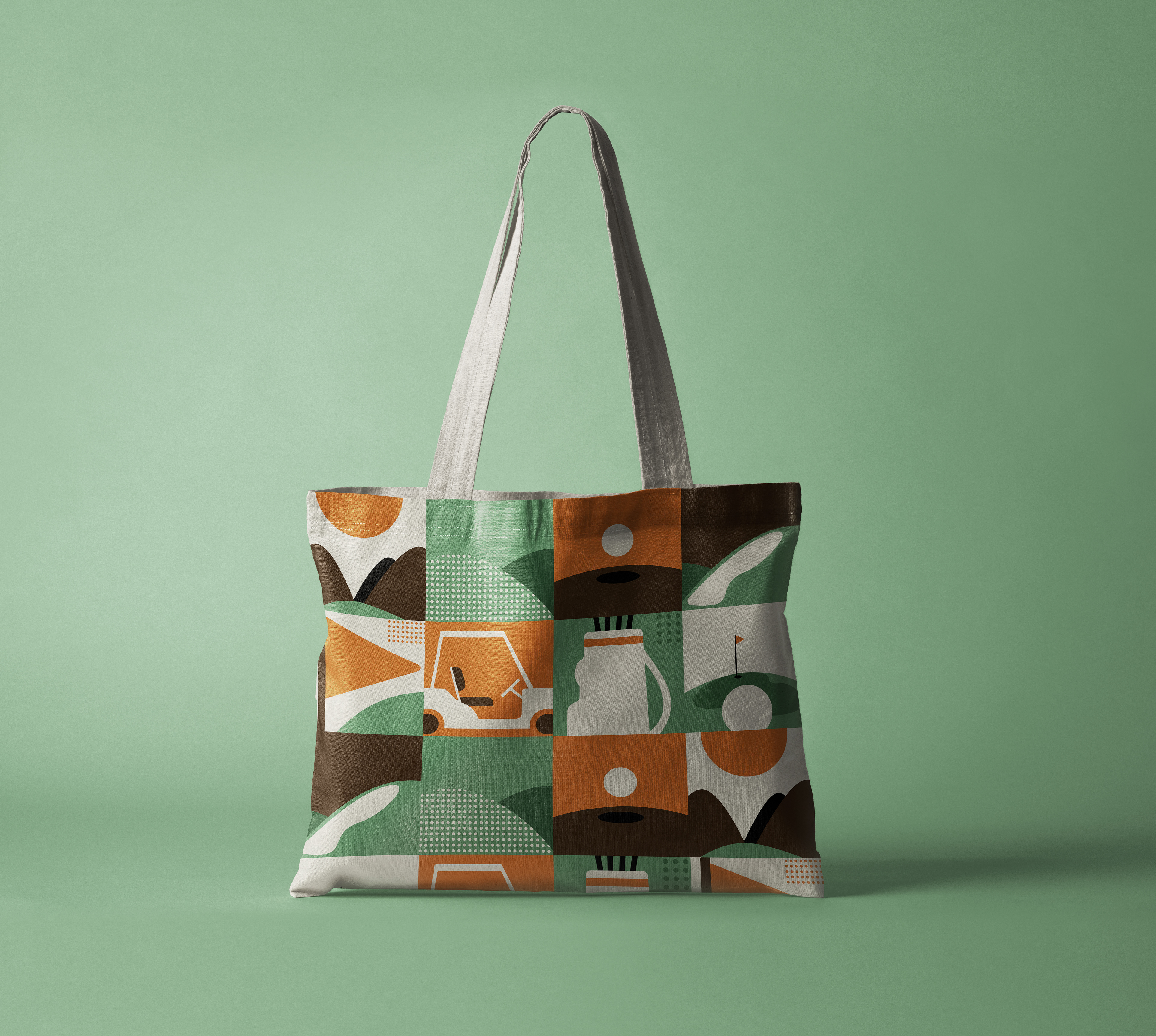
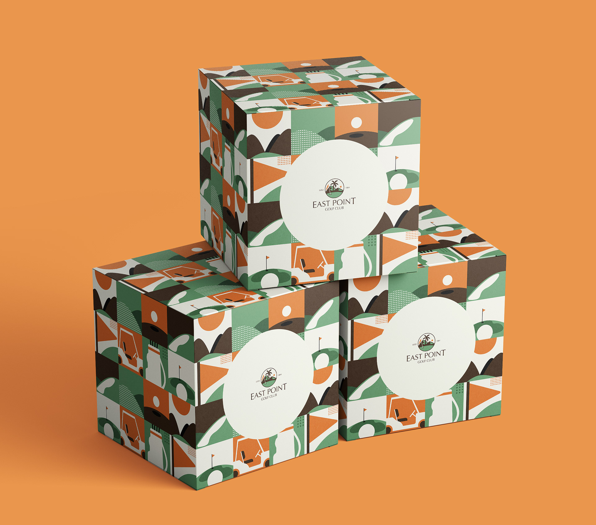
We decided to keep the iconography for EPGC simple — using an outline style with only one accent colour from the brand colours. The icons were created for the club's various areas and for communication purposes.


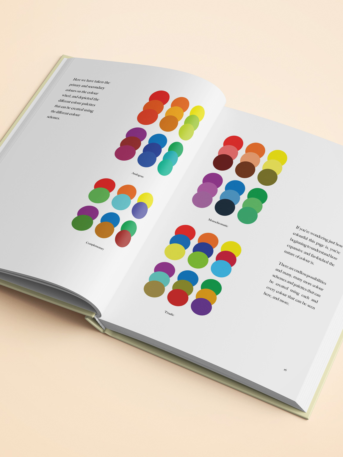
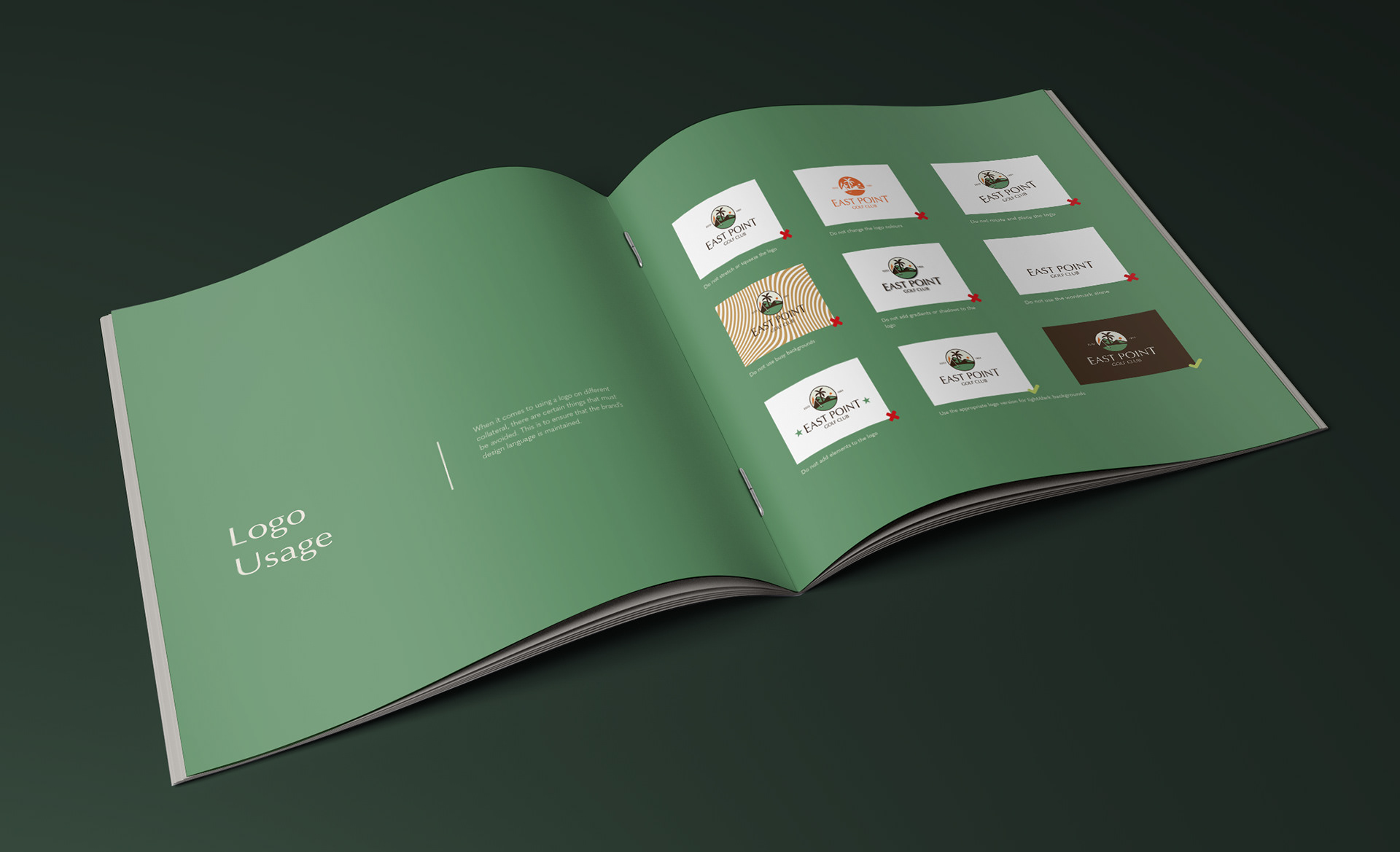
The final task was assembling all these elements and creating a brand guideline book which would serve as a guide for anyone who needs to use the brand logo/elements in the future for design/communication purposes. The brand guideline book allows designers to understand what the do's and don'ts of the brand elements are and how to ensure uniformity of the brand's design style.
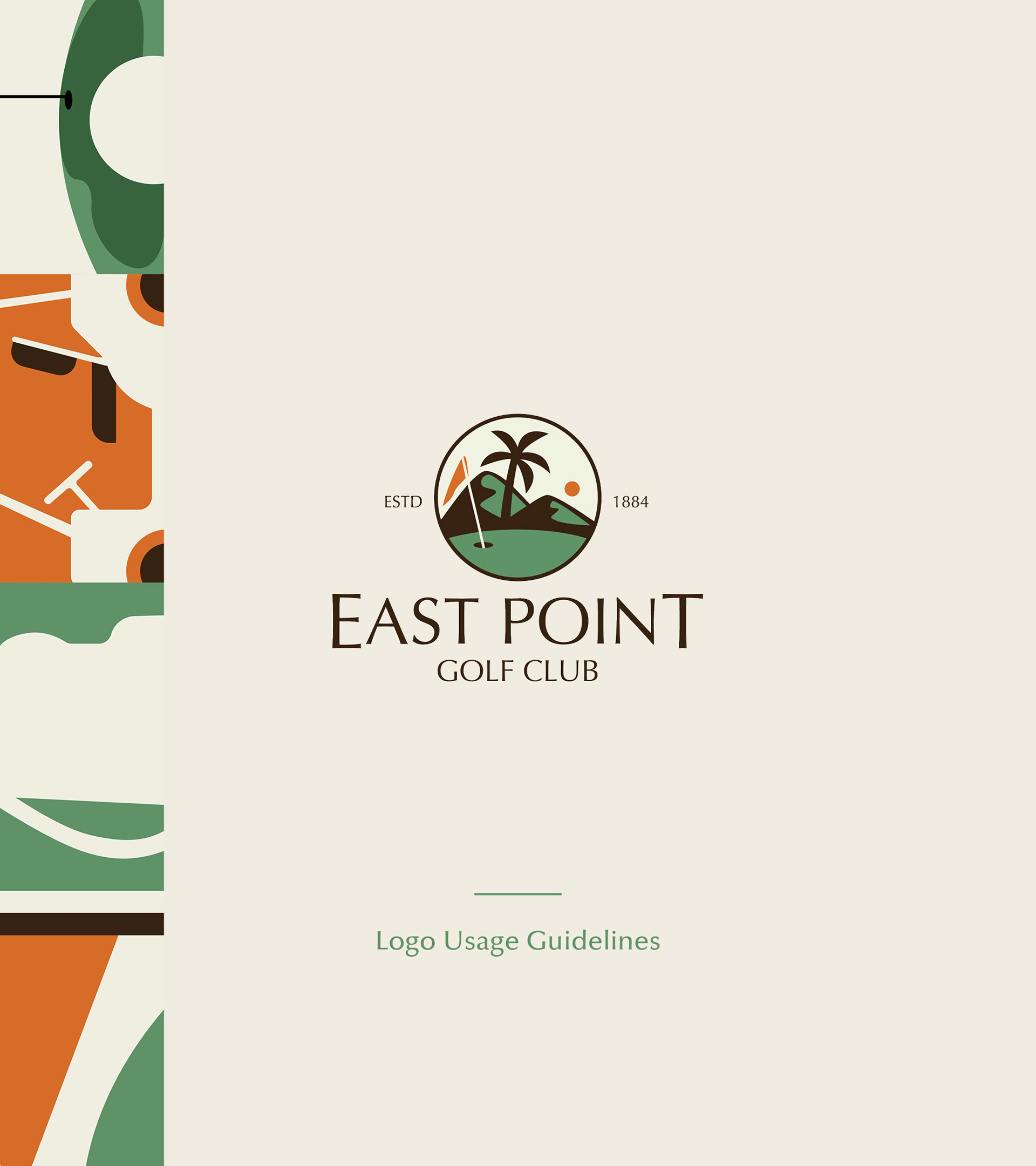
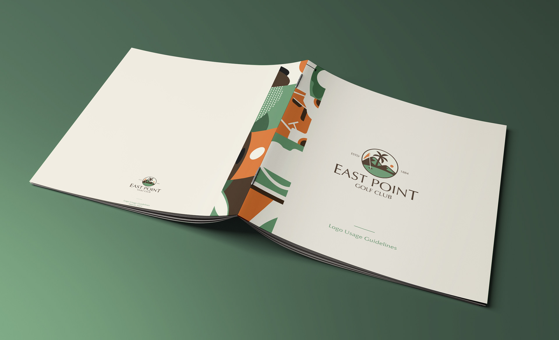
The cover page of the brand guideline book — designed using the brand typeface and brand pattern
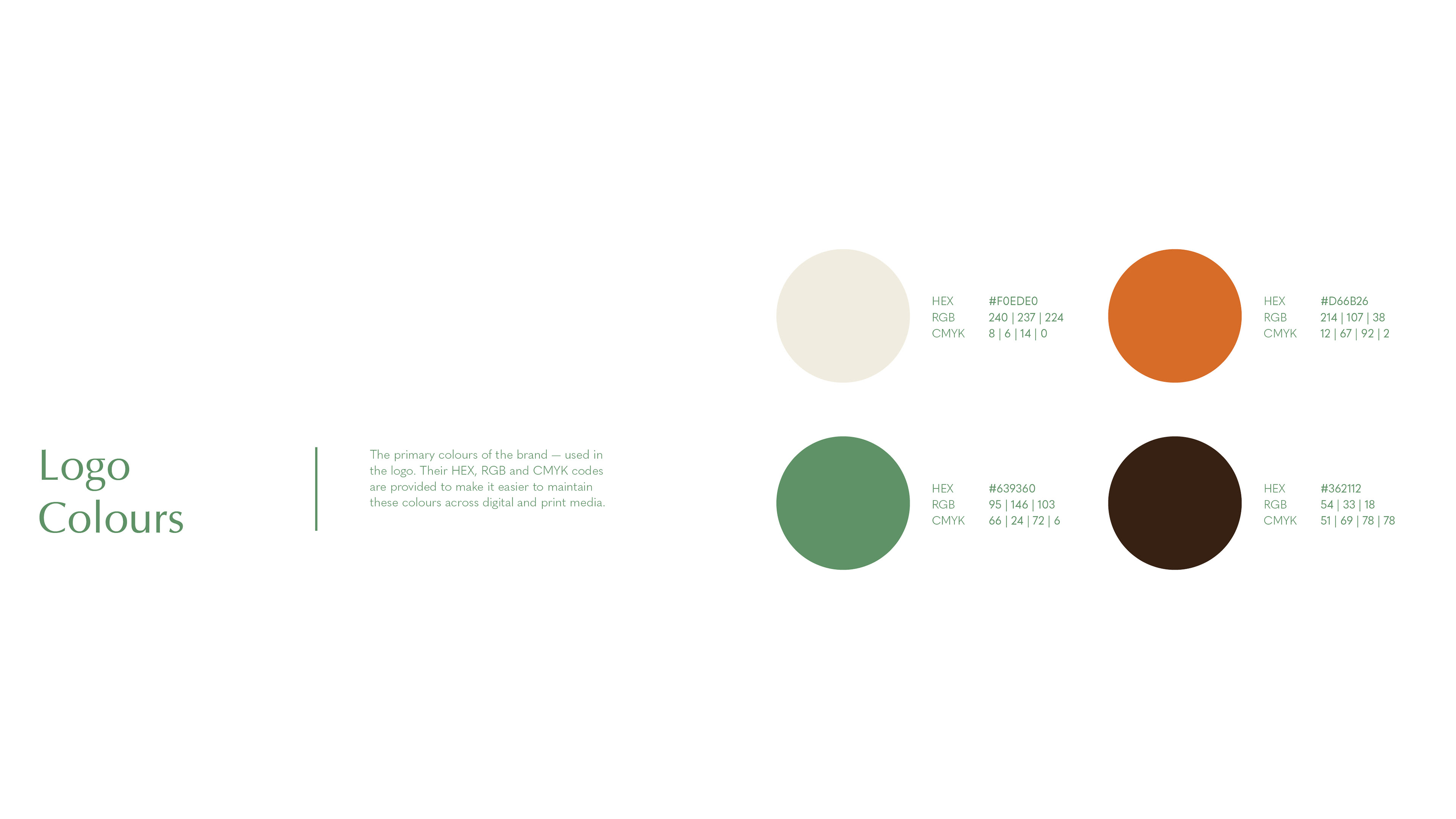
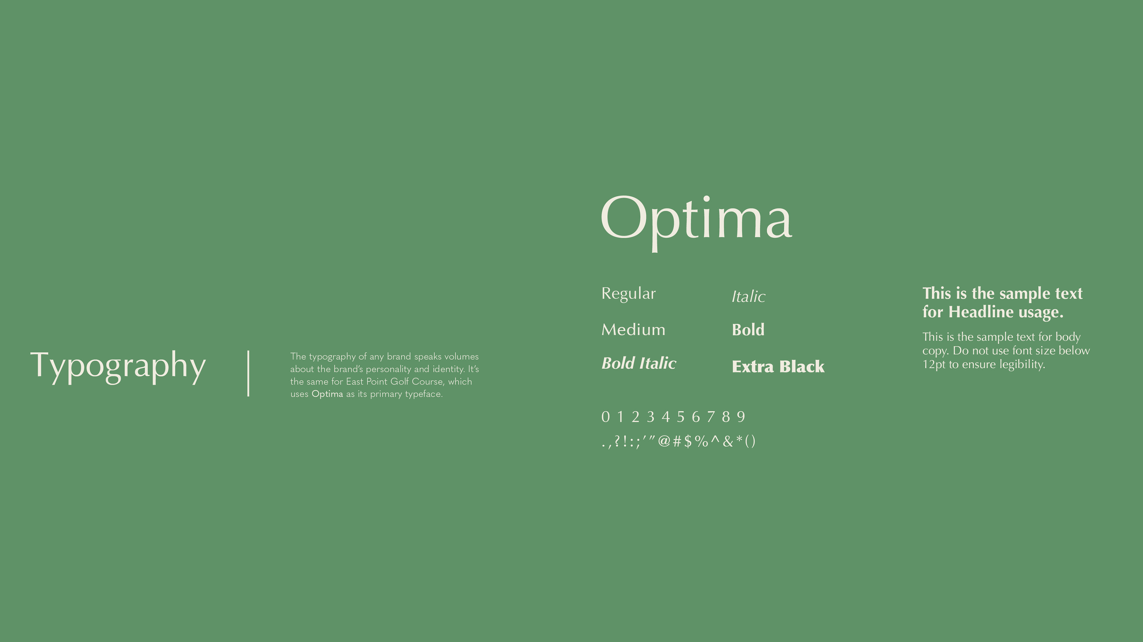
Some of the spreads from the EPGC Brand Guideline book:
Thank you! Hope you enjoyed this project.